Control of the Week: Pinterest-style PackedColumns efficiently fills space with tiles of varying heights
Image-sharing site Pinterest is the current darling of the social media world, and the core of its user experience is its attractively-designed home page:
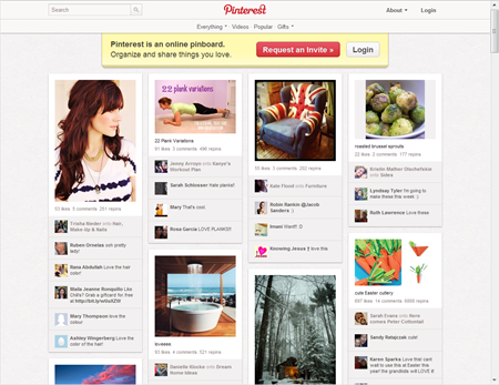
This page takes good advantage of available window real estate. As the user makes the window wider, the page re-lays out the columns of image tiles (or “pins”, in the parlance of the site) to take advantage of the extra width:
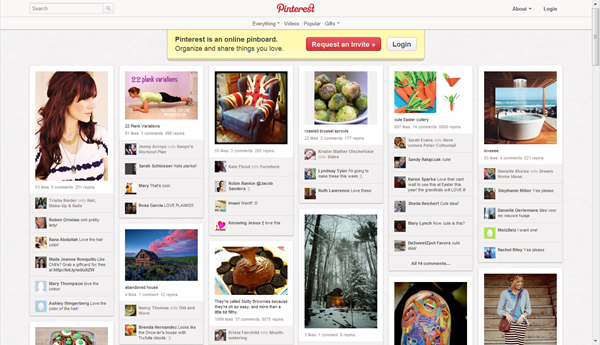
The page must accommodate a wide range of tile heights, as the photos have different aspect ratios, and the number of comments per pin can vary. If the page simply laid out the tiles in a strict grid, it would waste a great deal of space. To use the space more efficiently, the page employs a “packed columns” layout.
Key attributes
The packed columns layout algorithm is straightforward:
- Divide available width by the standard item width to determine how many columns can fit.
- Make all columns initially empty.
- For each item in turn, add the item to the column which is currently shortest.
The simplicity of this algorithm is such that it’s been independently recreated multiple times. The algorithm has some nice properties:
- It’s fast.
- As much horizontal space is used as possible (while still showing entire items). If a user gives the site more width, they’re rewarded with more information.
- The arrangement is visually interesting.
- The positions of the first few items are stable.
- At any given page width, the overall heights of the columns will be roughly equivalent. If the user scrolls to the bottom, they won’t find an unbalanced amount of space under any particular column.
- The relative vertical position of any two items is preserved across resize operations. If item A appears above item B at one window size, then item A will always be above (or on the same row) as item B at any other window size. The user doesn’t need to understand this; it just means that if some interesting item is “near the top” before a resize, then after the resize the same interesting item will still be “near the top”.
The last point speaks to another benefit of the algorithm which doesn’t show up in Pinterest, but does show up in other applications: the consistent relative positions of items means you can offer users the ability to specify an order or prioritization for the items that affects (but doesn’t completely determine) where items end up. I used this years ago in the design for a home page for Microsoft Money, a personal finance application whose home page included a user-customizable set of home page modules. A Settings dialog let the user specify the priority of those modules by dragging the modules within a one-dimensional list. While the ultimate two-dimensional position of the modules depended on the window width and the modules’ current heights, the priority of any given module determined how close to the top of the page that module would end up. This limited degree of customization was sufficient to meet many users’ needs without having to create a full-blown customizable layout UI.
PackedColumns
I’ve added a PackedColumns control to the QuickUI Catalog. There’s a link to a demo that simulates the general appearance of Pinterest’s home page. (I initially centered the items in the demo the way Pinterest does, but turned centering off to make it easier to observe the layout behavior.)
Usage: Use PackedColumns to arrange a collection of child elements whose widths are fixed but whose heights vary substantially. If the heights are relatively consistent, users will likely find a traditional grid presentation easier to interpret and use.
Commentary
Given the simplicity of the algorithm, this wasn’t all that hard to code up. I expect it’s not necessarily the actual cost of a layout like this that deters sites from adopting it. Rather, it’s the current need to independently discover or reverse-engineer behavior like this that most inhibits its adoption. As design knowledge gets coded into controls, however, such UI should become more pervasive.
In essence, an ability to easily create and adopt create web components will lead to a commodification of user interface elements. Today Pinterest’s insight and ability to create a packed columns layout may confer a slight competitive edge, but someday commodification will quickly eliminate such edges. This will be true not just for UI elements that can easily be independently created, but for nearly anything. The day after a new site launches with a cool new UI trick, that trick will be copied and packaged up as an openly available and readily adoptable UI control anyone can use.