There must be 50 ways to close a popup: menus, dropdowns, tooltips, palettes, dialogs, and more
Apps often need to pop up something over the main UI; common examples would be menus and dialogs. Unfortunately, while apps need popups, documents don’t, and until recently HTML was relentlessly document-focused. It’s frustratingly difficult to do a popup well in a contemporary web app, and so it’s not surprising to see so many apps do them poorly or inconsistently.
As a case in point, consider the ways a user might want to dismiss a UI element which has popped up over the main UI. Depending on the specific form of popup, there are a surprisingly large number of methods the popup might support for leaving it:
- Click outside the popup. This is the most common means to dismiss a lightweight popup like a menu. The user is saying, “I see you, popup, but don’t want to interact with you; let me get back to the main UI.” When the user clicks on the main UI in the background, a key question arises: what happens with that click? This isn’t an easy question to answer; see below.
- Click inside it. Perhaps the user has hovered into an element that’s popped up a tooltip, and maybe the tooltip’s under the mouse. If the tooltip is nothing but static content, the user can generally click anywhere within the popup to dismiss it.
- Make a selection. This is a special case of the above point. If the user’s dropped down a combo box and has clicked in an item in the resulting list, they’re not only making a selection, they’re also saying they’re done with the dropdown.
- Click a button that explicitly indicates completion. Another special case of point #3. A classic example would be an OK button in a modal dialog, which is essentially a heavyweight form of popup.
- Click a close box. A modeless dialog or persistent palette window often relies on a small “×” icon in the upper-right corner as the primary means to dismiss it.
- Press Esc. Popups of many flavors can be dismissed by pressing the Escape key.
- Wait. A tooltip or transient message may go away all on its own after giving the user time to read its contents.
- Hover into another control that produces a popup. The classic example here is menu riffing in Windows or OS/X menu bar. The user must click a menu to open it, but once that first menu is opened, the user can open the next menu simply by hovering into it. (This aspect of menus is worth a closer look in a subsequent blog post.)
- Move the focus to another window. Most forms of pop ups are temporary enough that the user doesn’t expect them to stick around. If the user opens a right-click context menu in Google Docs, and then switches to work in a different window, they don’t expect to come back to Google Docs later and find the context menu still open.
- Press the ALT key. On Windows, the ALT key or (considerably more obscurely) Shift+F10 are used as the keyboard shortcuts to activate the menu bar (or, in some cases, the selection’s context menu). If the user already has a menu or other popup open, this generally dismisses the popup before activating the menu bar.
-
Scroll the page with the mouse wheel. Some apps handle
this, some don’t. But if a tooltip or context menu was invoked from
something that’s being scrolled out of view, there’s probably no reason for
the popup to remain open.
[… Are there other ways? There are a wide range of other user actions that could dismiss a popup, but the others I can think of close the popup as a side effect of a click outside the popup or a loss of window focus.]
Most web apps that create popups seem to consider only a small fraction of these cases. For example, it’s common to have a web app’s menu stay open even when the Escape key is pressed (point #6 above) or the tab or window has lost focus (#9 above).
Some of the above cases have complexities that get overlooked. Point #1 above — handling a click outside the popup — raises the question of what should happen with that outside click. The choices are: a) absorb the click so that it has no effect other than closing the popup, or b) let the click affect as usual whatever element outside the popup the user clicked on. On the web, the latter choice can be easier to handle, but this raises a significant usability risk: if the user clicks outside a menu, and just so happens to do so by clicking on a link, do they really intend to trigger the link’s normal navigational response?
As an illustration, suppose a Facebook user has dropped down the menu on the right side of their current toolbar, and then they decide to close the menu by clicking outside it:
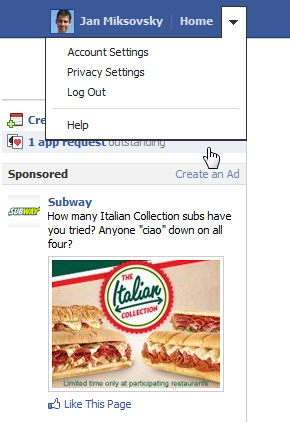
Careful!
That click outside the menu isn’t just going to dismiss the menu—the click is also going to activate the partially obscured “app request” link. If the mouse were just a few pixels lower, the user would end up launching the process to create an ad.
Most OSes and client apps will absorb a click made outside a popup like a menu so that the user doesn’t accidentally trigger an unintended action. Web apps usually don’t absorb the click. It’s hard to know whether this is intentional or not. I think it’s simply a reflection of the fact that absorbing the outside click in a web app takes more effort. I personally think that effort is worth the trouble to avoid usability issues that can arise if, in the course of dismissing a popup, the user ends up accidentally triggering a background UI element. I think that work is even more worthwhile if it can be folded into a shareable component so that most designers and developers don’t have to ever think about this issue.
Related to the concept of a popup is that of an overlay. To help the user see a heavyweight popup like a modal dialog, many web apps display a “lightbox effect” or other visual treatment. This layer sits visually behind the popup but over the main UI in the background. This overlay is really a distinct UI element, albeit one whose existence is probably seldom noticed. The overlay may not even be visible — it may be entirely transparent! But a transparent overlay is precisely the means one would typically use to absorb clicks outside a popup: a click on the overlay prevents the click from reaching a UI element in the background.
The Popup control and its related classes
Over the past week, I’ve overhauled the Popup base class as part of work towards a new Menu control. One of my goals was to create a base class that handled more of the cases above automatically. For example, I wanted a Popup to absorb outside clicks by default so that most designers won’t have to even think about this, while still leaving the option of letting the outside click go through if the designer really wants that behavior. Similarly, I wanted the various Popup subclasses (like Dialog) and related classes to handle their respective situations better so that anyone using them has an edge in producing UI with good usability.
The base Popup class now gives the designer and developer the ability to smoothly handle many of the dismissal cases above: outside click, inside click, loss of window focus, pressing Esc, etc. Special cases like menu bar hover behavior can be addressed in subclasses (like the forthcoming Menu control).
A Popup control will normally create a companion overlay control to absorb outside clicks. This overlay is generally an instance of the Overlay class. By default, the first click on an overlay dismisses the popup and removes the overlay. A subclass called ModalOverlay can be used for modal dialogs that want to absorb all outside clicks (not just the first), so as to force the user to explicitly dismiss the dialog. The generic appearance of the ModalOverlay class includes a basic lightbox effect. A Popup can also be created with no overlay in situations where it’s important to let outside clicks have their normal effect.
A related class called PopupSource is available for the common case where a persistent UI element (a button, say) invokes an attached popup. PopupSource takes care of positioning the popup in relation to the button which invokes the popup. If space allows, the popup is shown below the button and left-aligned, but if this would cause the popup to extend beyond the viewport, the popup may appear above the button or right-aligned as necessary. PopupSource is used as the base class for ComboBox, so a dropdown produced by a combo box may actually drop up if there’s more room above the combo box and not enough below. This is standard behavior on client OSes, but rare in web sites that have created their own combo box-like elements.
Implementation notes
In dealing with popups, one naturally has to dive into the details of how browsers render one element on top of the other. In this study I was aided by an excellent summary of how DOM elements stack. Having read that, it now seems likely to me that any occurrence of the CSS rule, “z-index: 1000”, can also be read as, “z-index: I don’t really know how this works”.
Predictably, creating a general-purpose Popup class that works reasonably well in a wide variety of configurations on all the mainstream browsers entailed a substantial amount of testing and debugging. IE8 was particularly problematic in this regard.