The Web Components spec should add support for multiple, named, DOM-valued properties
At last week’s Google I/O 2012 conference, Chrome engineers Alex Komoroske and Dimitri Glazkov gave a talk called, The Web Platform’s Cutting Edge, a good overview of Web Components and custom elements in particular. The demo code shown in that presentation does point to an issue with the current Web Components spec that could seriously constrain the ease with which components can be written and shared. I’ll lay out the case here in hopes this problem can be fixed at an early stage.
But first: A word of appreciation
Authoring a spec for a new standard like Web Components is generally a thankless task, as is the tireless work of promulgating the standard through presentations like the one at Google I/O. So, before saying anything else: a big Thank You to Alex and Dimitri for their work on HTML Templates, Custom Elements, and Shadow DOM. Everything which follows is meant to support your work, not put it down.
Background of the problem
As I’ve blogged about before, I’m a passionate fan of web UI components and believe they will transform UI development. The ability to define new elements for HTML is something designers and developers have long wanted but, until now, could only dream about. In the demo, Alex and Dimitri use Chrome’s early implementation of the proposed spec to create custom elements. They elegantly combine these elements to produce a custom UI component for a user poll:
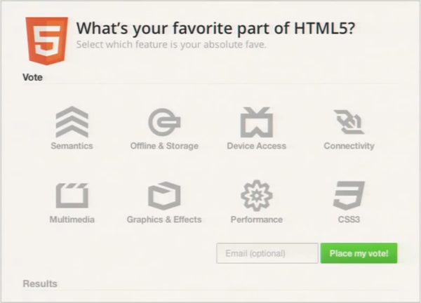
This poll user interface is a large component comprised of sub-components for accordions (or, later in the demo, tabs) and the big iconic choice buttons in the poll for “Semantics”, “Offline & Storage”, etc. All these components are defined with declarative markup.
I enthusiastically agree with the presenters that declarative HTML, including the ability to define custom elements, results in UI code that can be easier to read than a comparable imperative solution in JavaScript. And to its credit, most of the demo code shown in the presentation is self-explanatory.
However, one aspect of the code really jumped out at me as a serious limitation of the current spec: a component host can only pass a single DOM content subtree to the component. As I’ll try to show, I believe that could seriously limit the degree to which a component can expose a meaningful API.
Consider the markup behind those big “choice” buttons. Each choice component includes an icon, a short text summary used as a label, and longer descriptive text that appears in a tooltip on hover. You can think of that per-choice data as, in effect, three public properties of the choice component:
<element name=”x-choice” extends=”div” constructor=”ChoiceControl”>
    <template>
        <div id=”choice”>
            <div id=”icon” class=”mask”></div>
            <content select=”h3:first-of-type”></content>
            <aside>
                <content select=”*”></content>
            </aside>
        </div>
    </template>
    …
</element>
The code above makes use of the proposed <content> element to select specific portions of the DOM tree (using CSS selectors) and incorporate them into the component’s shadow DOM. With that in place, the code for the overall poll component (i.e., the choice host) can instantiate choice buttons with the following markup:
<x-choice value=”semantics”>
    <h3>Semantics</h3>
    <p>Giving meaning to structure, semantics are front and…</p>
</x-choice>
<x-choice value=”offline-storage”>
    <h3>Offline & Storage</h3>
    <p>Web apps can start faster and work even if there is no…</p>
</x-choice>
…
So the first code fragment effectively defines a choice component with three public properties (although these aren’t actually class properties). The second code fragment shows the creation of two instances of that choice component, filling in two of the three choice properties. It’s not shown where the icon property is filled in, but it’s presumably done through styling.
All looks fine so far, but there are some serious issues lurking here.
Problems
The root issue here is that, as currently speced, Web Components can only accept a single DOM-valued content property via markup. This leads to a profusion of problems:
-
Asking developers to tease apart component content will mean work for devs, and produce inconsistent results.
Why, exactly, is the choice component using the <h3> tag to specify the text label for the button? Because this component has two textual properties, and the current Web Components spec only lets the developer pass one DOM content subtree to a component. So the component’s author developer has to somehow let the component’s users pack more than one property into the content, and then the dev has to crack that content to extract those properties. The question of how to crack that single content subtree into multiple properties is left entirely up to the developer. The tool given to the developer for this purpose is CSS selectors, which at first glance seems powerful. Unfortunately, it’s also a recipe for inconsistency. Every developer will have the freedom—and chore—to approach this problem their own way, guaranteeing the emergence of a handful of different strategies, plus a number of truly bizarre solutions. It’s as if you were programming in a system where functions could only accept a single array. As it turns out, we already have a good, common example of a such a system: command line applications. Every command-line application has some main() function that’s handed a single array of command line options, and the application has to decide what to do with them. Although conventions eventually arose with respect to the order and meaning of arguments, there’s still a wide variety of approaches. Some apps rely on argument position, some rely on single-letter flags (“-a”), some rely on full-word named parameters (“–verbose”), some have idiosyncratic microgrammars (e.g., chmod permissions), and many applications support a rich combination of all these approaches. Parsing arguments is tedious, boring work. In the early days, a developer throwing an app together might do the absolute minimum work necessary. The result was often inconsistent or incomplete argument support. The dev might eventually be forced to hack on their app until they finally had a roughly functional command line parser. These days, developers can rely on language features, or libraries like Python’s argparse, to “crack” the argument array into a meaningful structure which can be more easily inspected. In particular, it’s invaluable to a developer to be able to directly inspect specific arguments by name. The use of CSS selectors does remove some of this tedium, but it still leaves devs without a consistent way to refer to component properties by name, thereby leaving the door wide open for inconsistency. A dev might decide to use DOM structure, HTML tags, element classes, or a combination of all of these to demarcate properties. This will make it much harder for devs to share components, to swap out one component for another, and so on. It would be better if we could learn from the command-line argument example now and head off this inconsistency. -
HTML semantics are nearly meaningless when used to identify parameters.
In the Google I/O demo, the developer of the choice component elected to use HTML tags within the single content subtree to identify properties. In this case, they decided that the first <h3> element in the content would identify the summary text, and everything else would be used as the longer text description. But why use <h3> for this purpose? The W3C spec says a heading tag like <h3> should be used to, “briefly describe the topic of the section it introduces”. These choices aren’t introducing sections, so that can’t be the the case here. Neither is this <h3> being used to reflect the rank of an element in a hierarchical document structure. In all likelihood, the <h3> is used here, as it often is in practice, to mean something like, “somewhat prominent, but not too prominent”. Visually this usually translates to, “bold text, a little bigger than the body text”. At least, that seems to be how <h3> is being used in this component. There’s nothing really wrong with that, but it’s clearly arbitrary. Other developers might easily make a different decision. Later, in the very same demo, the code for the poll component accepts the text label for a different Voting button through the use of a <label> element. So in one place in this app, a button’s label is specified with an <h3>, but elsewhere in the same app, a button’s label is specified with a <label>. I don’t think this reflects any particular negligence on the part of the demo’s developers. I think it’s a latent issue in any scheme that relies on HTML elements for something than the original purpose. Perhaps the code’ s developers did have some reason in mind for using <label> in one place and <h3> in another, but the point is that the reason is not obvious to another party looking at the code. The same arbitrary nature of tag choice here applies to use of the <aside> tag to identify the choice description. Try this: show the poll screen shot above to 3 web developers, and ask them which HTML tag they would use to specify the tooltip that should appear when the user mouses over a choice button. I’d be surprised if even one of them picked the <aside> tag. Is the tooltip content here really, as the W3C description says for the <aside> element, “tangentially related to the content around the aside element, and which could be considered separate from that content”? Well, not really. But, maybe; that’s a debatable point. The fact it’s debatable is what’s at issue here. In contrast, here’s a tautological statement which wouldn’t generate debate: the choice description in the tooltip is the choice description in the tooltip. The local semantics here aren’t in question. So it’s a shame the property can’t be described in contextual terms like “description”, or “tooltip”. The fact that the component is using HTML elements to identify arguments appears sensible, but in practice will be nearly meaningless. Every single time a dev needs to create a new component property, they’ll pick from the 100-odd HTML elements. Their selection may depend on their experience, their mood, the phase of the moon, and which handful of HTML elements they haven’t already used for other properties on the same component. It’s highly likely a different developer (or the same developer on a different day) would make a different selection of HTML elements for the same properties. Imagine an object-oriented programming language that forced you to give class properties one of 100 sanctioned property names: “index”, “count”, “name”, etc. Evereyone’s classes would look consistent, but it would be an utterly false consistency. That’s effectively what we’ll get if component authors are forced to choose HTML tags to identify component properties. -
Use of CSS selectors hinders a developer’s ability to add new properties.
Suppose the author of this component needs to add a new property to this choice component. Maybe they want to add a “More about this choice” link to each choice; this link should navigate to another page with more details on that poll choice. Following the example of the <h3> for the choice summary, they decide to define this link property by extracting the first <a> tag in the content to be the link to the “More about this choice” page. Perhaps, following their use of the “h3:first-of-type” selector above, they decide to pick out this <a> tag with the similar CSS selector “a:first-of-type”. If they do so, this component author will inadvertently screw up any component user who happened to include an <a> tag somewhere in the description. Suppose a user of this component has already created some code for a choice like this:<x-choice value=”semantics”> <h3>Semantics</h3> <p> Semantics in <a href=”…”>HTML5</a> applications… </p> </x-choice>The “a:first-of-type” selector for the “More about this choice” link will accidentally pick up the existing link, thereby breaking this use of the component. The component author could issue a “Breaking Change” notice, warning everyone to include an <a> tag before the choice description. But even that wouldn’t help someone who, for whatever reason, needed to embed an <a> inside of the <h3>. The use of selectors here could be made more robust by using the child selector “>”, as in “> h3:first-of-type”. But this gets verbose, and again, isn’t likely to be a universal convention, and inconsistent use of the child selector will only add to the confusion. The fundamental problem is that using CSS selectors for this purpose is inherently fragile. -
Arbitrary parameter structure is brittle.
The fragility of using CSS selectors remains even if one tries to avoid the use of arbitrary HTML elements. Suppose you decide to use element position to identify components. You’ll still up a component which is hard to update. Here, a relevant case study is the existing of positional function parameters in most programming languages. To take just one example, consider JavaScript functions. Suppose you’ve defined a function with three parameters: “function foo(a, b, c) {…}”. If you now want to add a new parameter “d”, you have to add it to the end of the argument list to avoid breaking existing users of your function. This can easily produce a function whose parameter order feels unnatural. And to use the new “d” parameter, a function caller must supply the intermediate arguments a, b, and c, even if those are irrelevant to the function call at hand. To avoid these problems, programming languages tend to eventually evolve named function parameters. Functions with named parameters are inherently more future-proof and, importantly, allow callers to only specify the parameters they care about. The lesson of positional function parameters applies to trying to parse component properties out of the DOM content subtree. Having learned this lesson in countless programming languages, it would be nice to just jump straight to a reasonable solution which allowed for named component properties. While CSS selectors represent a powerful parsing tool, much of that power is completely unnecessary in this context — and some people will inevitably put that extra power to poor use. -
Subclasses will compete for parameters with their base classes.
The above situations quickly deteriorate further when one envisions extending an existing component via subclassing. Subclassing is a crucial means of efficiency in component development, in which the behavior of one component can be specialized for new purposes. As just one case, over 33% of the controls in the QuickUI Catalog are subclasses of other Catalog controls. For example, both DateComboBox and ListComboBox extend ComboBox, which itself extends PopupSource. This separation of concerns is vital to keep the code clean, organized, and maintainable. Such subclasses would likely become unworkable as Web Components, because each level of the class hierarchy will be competing with its ancestors and descendants as they all tried to extract properties from the single DOM content subtree permitted by the Web Components spec. If the choice class extracts an <h3> element from the content, then that element is effectively invisible to the <content> selectors of its subclasses. (Or, if you let subclasses have first shot at the content, then the elements they pull out are effectively invisible to their base classes.) This significantly complicates point #3 above (using CSS selectors to pull out properties from the DOM content subtree makes it hard to add new properties). Consider a subclass of the choice component above called, say, special-choice. Perhaps the author of special-choice has decided to use the HTML <h4> element to identify a particular property. Now the author of the base choice component decides to add a new property, and elects to use <h4> for this purpose themselves. This has the effect of breaking the special-choice subclass. Obviously, such naming conflicts can arise in regular OOP classes, but here the likelihood of conflict is much greater because of the highly constrained vocabulary of HTML elements. Using DOM structure to select properties (point #4, above) is even more brittle when one considers subclasses. If a component class decides to use DOM element position to select content for a given property, and someone creates a subclass that likewise uses element position, the original base class’ API is effectively frozen. Suppose the base class defines a <content> element with selector “:nth-child(3)” , and the subclass goes ahead and uses a <content> with selector “:nth-child(4)”. How is the base class supposed to add support for a new property now? They can’t use position 4, because a subclass is already using that. The situation could be worked around by requiring not just specific tags, but also specific class names, but this has problems of its own (see below). As currently drafted, the Web Components spec seems highly likely to close off the possibility of rich component hierarchies. Most component developers will probably elect to just copy-and-paste useful code from other developers, rather than subclassing them, to preserve the ability to modify their components in the future. -
Class names could help identify properties, but will probably just complicate everything.
One way to skirt the problems above is to use HTML element classes to identify properties by class name, and reference these classes in the CSS selectors. If you gave up on specific HTML tags, and just used a <div> and a named element class for all properties, the second code fragment above could look like this:<x-choice value=”semantics”> <div class=”summary”>Semantics</div> <div class=”description”>Giving meaning to structure…</div> </x-choice> <x-choice value=”offline-storage”> <div class=”summary”>Offline & Storage</div> <div class=”description”>Web apps can start faster…</div> </x-choice> …This could potentially work if everyone agreed to always using an element class name to identify a property, and consistently applied those classes to a single element type (likely <div>) which everyone agreed upon would stand for “parameter”. Unfortunately, the more likely result is that throwing element class names into the mix will just complicate everything further. Some devs will write their components that way, but others will insist the use of HTML elements as shown above. Some will require the use of both specific HTML elements and specific class names. E.g., the choice component’s summary property will be forced to be identified with <h3.summary> to avoid possible conflicts with other <h3> elements in the content. This would be verbose and, worse, as a component user you’d have to remember and specify two things, when one should be sufficient. -
Invisible component APIs foreclose the possibility of inspection and reflection.
The choice component in this example effectively presents its hosts with an external API that allows the host to fill in two text properties. Unfortunately, that API is implicit in the design of the <content> elements and their selectors. That makes it hard to programmatically understand what a component is doing. At design time, there’s no easy way to statically analyze the code to inspect what those <content> elements are actually being used for. You could potentially parse the HTML to find the <content> elements, then parse their CSS selectors, but that still wouldn’t give you any hints as to what those <content> elements were being used for. At least a formal property name gives you a real idea as to its purpose. And at runtime, there would be no easy way to ask a choice component instance questions about which properties it supports: “How many properties do you have?”, or “Do you have a ‘description’ property?” Such run-time inspection of a component’s API (also known as reflection) can be a powerful tool. In this very presentation, Google’s developers point toward the benefits of programmatic inspection when they observe that giving web developers the ability to create new custom elements (via the <element> tag) will open new possibilities in researching possible improvements to HTML itself. For example, researchers could statically inspect Web Components actually used by production web sites to determine, for example, the names of the most common custom elements. That in turn could help guide the formal adoption of new HTML elements in future versions of the language itself. That’s just one example of what’s possible when APIs are explicit. Such explicitness should be extended beyond component names to cover component property names as well.
A proposal to fix this: Support multiple, named, DOM-valued component properties
All the issues above could be eliminated or dramatically improved if the Web Components spec were amended to let developers create components that accept multiple, named, DOM-valued properties. (Presumably, this support would actually be added to HTML Templates, used by both <element> and <decorator> elements.)
Here are some possible syntax suggestions:
-
Proposal A: Use a consistent tag for component properties.
A convention of using <div> elements to hold properties (see point #6 above) is a bit odd, because the <div> tag is used simply as a placeholder. The convention could be improved by formalizing a new element specifically for this purpose. Perhaps the existing <param> tag, currently limited to use within <object> elements, could be given new life by being repurposed for use within components. Its definition would need to be extended to support a closing </param> tag form that could encapsulate a DOM subtree:<x-choice value=”semantics”> <param name=”summary”>Semantics</param> <param name=”description”>Giving meaning to …</param> </x-choice> <x-choice value=”offline-storage”> <param name=”summary”>Offline & Storage</param> <param name=”description”>Web apps can start …</param> </x-choice> …If <param> can’t be redefined this way, then a new tag like <property> could be created. If HTML semantics zealots insist on mapping component content to HTML elements, it’d be possible to let define a component author identify a backing HTML semantic tag that should be used to treat the property’s content for search and other purposes. E.g., syntax within the <element> definition would indicate that the “summary” property should be backed by an <h3> element. This is exactly the way that the <element> tag’s “extends” attribute is already spec’ed to work. The author indicates that an <x-choice> element is backed by a <div>. In the exact same way, the author could indicate that a <param> (or <property>) of name=”summary” should be backed by an <h3>. As noted above, the particular choice of backing HTML element might be inconsistent or meaningless, but at least use of a backing element confines the problem to a much smaller audience. That is, the component users shouldn’t need to know that summary property behaves like an <h3>, just like they don’t have to know that an <x-choice> behaves like a <div>. Rather, that would be something only the component author would need to concern themselves with. -
Proposal B: Expand data- attributes to support data- elements
HTML developers can already attach arbitrary string data to HTML elements as data- attributes (that is, element attributes prefixed with “data-”). Web Components could build on this precedent to allow data- elements that specify DOM subtrees nested within the component’s content. For example:<x-choice value=”semantics”> <data-summary>Semantics</data-summary> <data-description>Giving meaning to …</data-description> </x-choice> <x-choice value=”offline-storage”> <data-summary>Offline & Storage</data-summary> <data-description>Web apps can start …</data-description> </x-choice> …In the case where the property values are pure text, a <data-foo> element could be interchangeable with the corresponding data-foo attribute within the component tag. So one could also write:<x-choice value=”semantics” data-summary=”Semantics”> <data-description>Giving meaning to …</data-description> </x-choice> <x-choice value=”offline-storage” data-summary=”Offline & Storage”> <data-description>Web apps can start …</data-description> </x-choice> …The data- element form would only need to be used when specifying a real DOM subtree with subelements; otherwise, the data- attribute form could be used. -
Proposal C (preferred): Let developers define custom property elements
The above approach could be tightened further by dropping HTML’s historic obsession with restricting the set of tags. By dropping by the “x-“ in the custom element tag, and the “data-“ in the custom property tag, we end up with something much cleaner:<choice value=”semantics”> <summary>Semantics</summary> <description>Giving meaning to structure, …</description> </choice> <choice value=”offline-storage”> <summary>Offline & Storage</summary> <description>Web apps can start faster …</description> </choice> …As with the data- element approach above, this custom property element approach could also support the use of a data- attribute on the element tag itself when specifying a simple string property value. The cleanliness of the code above comes at the cost of an ambiguity: if you can define your own element tags and property tags, how does the parser know which is which? In the code above, is <summary> a property of <choice>, or is it a custom element in its own right? One resolution would be a precedence rule, e.g., if <summary> is a child of a parent that has a summary property, then treat it as a property, otherwise instantiate it as a custom element. Another resolution would be to follow what Microsoft did with XAML’s property element syntax: allow (or require) the property to be written as <choice-summary>. As noted above, if HTML powers that be insist on mapping component content to a fixed set of HTML elements, that could be handled by letting a component author indicate the HTML element which should be used to back each property. Again, that would relegate the problem to something that only the component author would have to worry about. The writer of the code above that hosts the choice component wouldn’t have to obsess over the question of why <aside> was picked instead of <label>; that detail would only be visible by reading the code for the choice component. The host author only has to deal with <summary>, which has local meaning. In any event, the above code sample is clean, and should serve as a goal. Such code would be a joy to write — and read. It moves HTML definitively towards the creation of domain-specific languages, which is where it should go. It’s somewhat absurd that we can only define markup terms according to global consensus. That’s like waiting for a programming language committee to approve the names of your classes. The web will move forward at a much faster pace if we can let individual problem domains (online stores, news sites, social networks, games, etc.) define their own tags, with semantics they care about and can agree upon. As the aforementioned uses of <aside> and <label> illustrate, forcing developers to use HTML elements may give the appearance of consistent semantics, but that consistency is merely a facade. In contrast, letting polling organizations define the meaning of a <summary> property for a <choice> component could produce meaningful consistency within that industry.
There’s still time to fix this
In their presentation, Alex and Dimitri indicated that their goal is not to spec out a complete replacement for web UI frameworks. Rather, the goal of their work is to lay a solid foundation on top of which great web UI frameworks can be built by others. In this light, it is hoped that the Web Components spec can be amended to support multiple, named, DOM-valued properties — because that’s exactly the foundation a great web UI framework is going to need.
The QuickUI framework, at least, is more expressive with regard to component content than is possible within the current Web Components spec. That is to say, the existing Catalog of QuickUI controls (and the many others controls written in the service of specific QuickUI-based applications) could not be ported to the current Web Components spec. Or, perhaps, those controls could be ported — but then, for the reasons given above, the collection would then become so brittle that its evolution would come to a halt. That would be a shame.
To be sure, the Google team, and the others working on Web Components, are smart folks, and it’s likely they’ve already given at least some thought to the problems raised in this post. But more input, particularly when informed by real application experience by potential users of a standard, is always valuable in weighing decisions about what should go into the standard. And it’s in that spirit that this post is written.
If you yourself have worked with component frameworks, and have experiences that bear on this issue, please share them with the folks at Google. A good forum for feedback might be the Web Components page on Google+. (Be sure to thank everyone for their work!)