UI Control of the Week: Coding a ListInlay pattern that lets user expand list items in place
I think the concept of a pattern language is a useful lens with which to consider interface design, but we don’t have to settle for patterns as static, textual descriptions. The first pattern language was grounded in the domain of physical architecture, and while the concept was deeply insightful, many people have applied it to the domain of software user interface design without, I believe, recognizing that the constraints of building architecture don’t apply to software design. Given a properly expressive UI framework, many UI techniques described as patterns can be implemented in code.
I’ve been a fan of attempts to catalogue UI patterns since I first came across Jenifer Tidwell’s Common Ground. Tidwell’s latest work is presented in her recent second edition of Designing Interfaces. Many of the patterns it describes contain some non-trivial element that can be given a functional manifestation in code. To use an analogy from programming languages, UI patterns are somewhat similar to abstract base classes. Such a class defines some, but not all, of the behavior necessary to create a useful result. In my mind, the more interesting a UI pattern is, the more likely it is that some aspect of the textual description can be identified and coded in a reusable UI control.
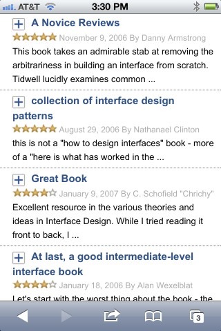
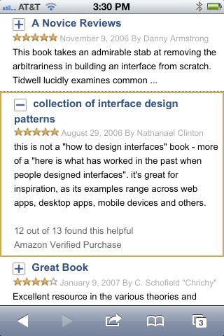
Take, for example, the List Inlay pattern, in which a list lets the user expand an item to see more detail in place. Tidwell points to Amazon’s mobile review UI as one example:
Each list item shows a capsule review. Tapping a review expands the item in place to show the full review text and some additional details:
Key attributes:
- All list items are typically collapsed by default.
- Clicking a list item expands it to reveal more information about that item, possibly including interactive controls. Clicking an item which is already expanded generally collapses it.
- The list may either allow multiple items to be expanded simultaneously, or may permit only a single item to be expanded at a time.
A List Inlay can also be used to implement the common “Accordion” user interface pattern as well. As far as I can tell, there’s not much hard difference between these two patterns. A List Inlay is essentially an Accordion which shows live data, whereas the UI elements described as Accordions tend to have static headings that have been hand-authored to summarize their contents. Beyond that, to me these two patterns seem nearly the same.
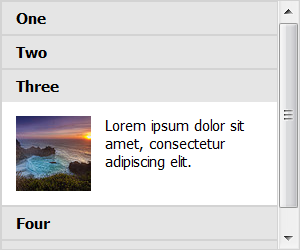
ListInlay control
Here, the above attributes of the List Inlay pattern are fairly straightforward to code. With those requirements in mind, I’ve created a ListInlay control for the QuickUI Catalog:
Usage: Tidwell suggests using a List Inlay when…
Each item has interesting content associated with it, such as the text of an email message, a long article, a full-size image, or details about a file’s size or date. The item details don’t take up a large amount of space, but they’re not so small that you can fit them all in the list itself. You want the user to see the overall structure of the list and keep that list in view all the time, but you also want her to browse through the items easily and quickly.
In contrast, if the item details are complex, or offer substantial editing capabilities, it may be more appropriate to navigate to the details in a separate window or dialog, or show the details in a separate detail pane, rather than expanding them inline.
The ListInlay class permits a single item to be expanded at a time, so clicking a new item to expand it will collapse any previously-selected item. I’ve also created a multiple-select variation called MultiListInlay that permits multiple items to be expanded at once.
Caution: Some applications use a variation of this UI for navigation, e.g., as an accordion pane on the left side of an app window. It’s not uncommon for such apps to dock the list items to the top or bottom of the navigation pane (with the selected item filling the remaining space in the middle). I believe such a UI is likely to exhibit usability problems: at large window sizes, a user looking at the navigation items docked to the top of the pane could easily overlook additional items docked to the bottom.
Implementation notes
This control was a pleasure to code up. A ListInlay is just a subclass of the previously-discussed ListBox meta-control that, by default, uses a Collapsible to represent list items. Combining these two controls worked right away, and from there it was simply a matter of customizing how ListInlay renders a list item’s selected state. Instead of just adding a CSS “selected” class, the list also needs to invoke the Collapsible’s collapsed() property. (I.e., when an item is selected, it’s collapsed property should be set to false.)
The real treat was that basing this control off of ListBox means that, with no additional work, ListInlay offers basic keyboard navigation. The control’s generic appearance doesn’t show the selected state, but once the list has focus, you can navigate the list with the Up and Down keys. It was a pleasant surprise to see that the navigation UI played well with the expand/collapse animation; score one for Separation of Concerns.
It’s hard to describe, but this sort of coding reminds me a lot of coding in Lisp. In Lisp you can make use of higher-order functions like mapcar to concisely express complex calculations. In the same vein, coding in QuickUI often entails using a meta-control like ListBox to quickly create the reasonably complex behavior of something like ListInlay.
Of course, the point of a control like ListInlay isn’t that it’s a polished, production-ready result in its own right. As with an abstract base class, what makes it useful is that it could form the basis of something interesting. As I’m going through “Designing Interfaces”, it’s possible to pick out those patterns whose interaction details are consistent or specific enough that they could similarly be translated directly to code. I’m adding the most interesting such patterns to the QuickUI road map for future work.
I'll be traveling this week to Dublin, Ireland, for the Interaction 2012 conference. If you'll be there, please drop me a line!