Make web menu bars more usable: open a menu on hover only if another menu is already open
The history of user interface design isn’t terribly long, but it’s long enough that designers who ignore it do so at their users’ peril. In the transition from clients apps to the web, a lot of UI history has been forgotten, ignored, or reluctantly set aside because its lessons were too expensive (if not impossible) to preserve in early browsers.
For example, it’s hard to find a web application with a menu bar as usable as the standard system menu bars in OS/X and Windows. Consider the basic tasks of opening and closing a menu in a menu bar. Last week’s post on popups listed a number of ways in which a user can cancel a menu: clicking outside of it (while not accidentally triggering whatever one clicks on), pressing Escape, resizing the window, scrolling, or moving the focus to a different window. Web implementations often overlook these aspects of closing a menu.
If we now turn our attention to the task of opening a menu, we find most web apps give this basic act similarly blunt treatment. The choices you’ll typically see in web menus are one of these:
- Menus open when the user clicks on a menu title. This is straightforward for a single menu, but problematic in a menu bar with multiple menus. Users need to scan a set of menus if they’re exploring their options, or if they’re hunting for a particular command. In these situations, having to click on each menu in turn feels clunky. And if the menu developer has done the fundamentally right thing in absorbing mouse clicks outside the menu (so the user doesn't accidentally trigger something when canceling the menu), the user must click twice to open up the next menu.
- Menus open as soon as the user hovers over a menu title. This feels responsive, and lets the user quickly scan a set of menus. On the downside, it can be incredibly distracting to have menus pop open when they’re unwanted. Consider a user who clicks in a text field, and then has to move the cursor away from the text field because the cursor doesn’t automatically disappear when they start typing. (Another bit of UI history that’s been forgotten!) Knocking the mouse out of the way, the user happens to end up parking the cursor over the menu bar, and now a completely unwanted, giant mega menu pops up, covering up their work surface. (That menu article suggests using careful timing to avoid irritating the user, but to me that seems like a band-aid on what’s fundamentally the wrong solution.) Open-on-hover does offer the ability to have a click on the menu title perform navigation, but as discussed in Why Hover Menus Do Users More Harm Than Good, users may not discover that they can click on the title like a link — if hovering into the title popped it up, then the user can easily conclude that the menu has already performed the only job it’s there for.
The odd thing is that a completely smooth way to finesse the problems of both these methods is right in front of the designer and developer, in the very same OS/X and Windows client applications they are likely using to design or code one of these problematic approaches.
Key attributes of menu riffing behavior
For ages both OS/X and Windows have used the following menu behavior:
- When no menu is open, hovering over a menu title can provide hover feedback on the title (Windows does this), but does not pop up the menu.
- Clicking a menu opens it. This required click prevents accidental menu invocation.
-
Once a menu is open, hovering into the title of another menu closes the
previous menu and implicitly opens the new one. This lets the user quickly
riff through a menu bar’s menus to familiarize themselves with
their contents or to find a specific command.
[Update: A commenter correctly points out that client OSes actually open menus immediately on mouse down, instead of waiting for mouse up. This makes it possible to riff through menus with the mouse down. If I recall, Mac OS menus originally only worked on mouse down; letting go of the mouse while over a menu title closed the menu. Windows, in contrast, would keep the menu open even after the user released the mouse button, which was easier to use. The user didn't have to hold the mouse down throughout the whole menu exploration and command selection operation. This approach was eventually adopted by the Mac OS. But both Windows and OS/X still support mouse down opening and riffing of menus.]
To me, this resolution seems about perfect, and I wish all web app menus worked this way. In contrast, how often have you used one of the clunky always-click-to-open or twitchy open-on-hover web menu implementations and said to yourself, “I wish all my OS/X (or Windows) apps worked this way!”?
To be fair, simply knowing the UI history (or being very observant) isn’t enough — there’s still the question of cost. One could argue that Apple and Microsoft have greater control over the environment than a web site within the constraints of the browser, which is true, but I think that explanation falls short. The fundamental problem seems to be the economics of homegrown UI: for most companies, it’s hard to justify the return on investment to get these details right in order to make a really usable menu bar. (Which, if they get it right, their users won’t even notice.) Apple and Microsoft can each build a perfect menu bar once that many developers can benefit from, so it’s worth their taking the time to get it right.
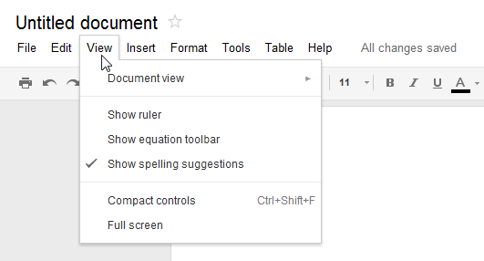
Google Docs is one web app that has taken the time to sweat the details. Their document editing suite carefully follows the same menu riffing behavior described above: you open the first menu with a click, and subsequent menus with hover:
I’m not sure if Google acquired this finely-tuned menu through Writely or one of the other predecessors to Google Docs, or if they’ve more recently decided that a good way to displace with Microsoft Office is with great usability at a much cheaper price. Either way, it’s details like this that make Google Docs feels like such a reasonable replacement for a desktop application suite. (Thought not perfect yet: Google Docs gets the menu open behavior right, but gets points off for menu closing behavior because they don’t absorb background mouse clicks. And, as referenced above, it doesn’t hide the mouse when you start to type, the way most client text editors or word processors do.)
MenuBar control
I’ve added a MenuBar control to the QuickUI Catalog, along with the usual companions of Menu, MenuItem, and MenuSeparator classes. A Menu can be used on its own, or as part of a MenuBar. When placed inside a MenuBar, the menus will exhibit the riffing behavior described above.
I like the way Google’s visual style puts both the menu title and an open menu on the same seamless surface to visually connect the two regions, so I’ve used that style for a Menu’s generic appearance (the one you get if you don’t want to do any of your own styling).
Although the MenuItem and MenuSeparator classes assume a traditional vertically-oriented list of commands, use of those classes isn’t required, and the Menu class could just as easily be used to present commands in multiple columns or any other arrangement.
Implementation notes
The tricky bit here was making the entire MenuBar and its menus accessible to the mouse, while simultaneously absorbing any background mouse click outside the menu bar or its menus. By default, an individual Menu control supplies its own Overlay so that a Menu can be used on its own or in some other menu bar-like UI construct. The problem is that an Overlay behind a single Menu control will prevent the user from hovering into other menus in the menu bar. So the MenuBar creates its own Overlay control, and turns off the Overlays of the individual Menu controls. The result is the entire menu bar and its menus sit above a shared overlay. The user can hover from one menu to the next, and any clicks on the background overlay are absorbed and cancel the currently-opened menu.
As always, it’s my hope that delivering this behavior in an open, reusable component can eventually change the economics of web usability so that anyone can benefit from the UI design history baked into a component — whether they realize that history is there or not.