From MacPaint to FiftyThree's Paper: Someday all our apps will be this great
Imagine, for a moment, that you’re living way back in the early 1980s, maybe 1984. You have access to a computer, and on that computer, you use a top-end DOS app like Lotus 1-2-3:
Then, one day, you see a marketing campaign for a new computer. Your eye catches on this image:
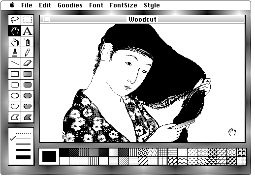
Your mind is completely blown. The user interface for this application, which you learn is called MacPaint, seems utterly unlike any application you’ve ever seen. In fact, the entire premise of this image speaks to a proposition that’s never before even occurred to you: a computer can be used to create art.
• • •
Looking back, it’s hard to convey now how stunning both this image and that proposition were at the time. When the original Macintosh was released, this was probably the first vaguely art-like computer-rendered illustration most people had ever seen. Before that moment, when (or if) the average person thought about a computer, they considered it a tool for crunching numbers or typing documents.
In retrospect, this Japanese woodcut was probably the most sophisticated illustration most people ever saw on an original Macintosh. As groundbreaking as the application was, it was simply impossible for the average user, even a fairly artistic person, to create something of this quality with a mouse. Drawing with a mouse in MacPaint was said to be, “like drawing with a bar of soap”. If you tried to create something like the above yourself, the results were laughable. You could indeed create interesting works in MacPaint, but only by relying on text, lines, polygons, and those paint bucket textures along the bottom. That is, you got the most interesting results with tools that were well-suited to software implementation and which produced effects you couldn’t easily achieve on paper.
The designer behind this image, Susan Kare, discussed it in an interview:
With the Japanese lady, [Apple developer] Bill Atkinson was experimenting with scanning, and Steve [Jobs] brought in an actual woodcut that he had bought: it was big and colorful, and that was one of the first things that we scanned. And I took the scan, which was kind of rough, and refined it to make the final illustration. It looks so crude now — in terms of scanning technology — but it seemed amazing at the time that you could get a “real” image into your computer.
The fact that this image started from a scan was both a surprise and something of a disappointment. Ah, no wonder we never saw illustrations like this — fundamentally, this was marketing! Not to detract from the groundbreaking impact of this work, but this image was clearly meant to suggest to users that they could create art freehand, using only the tools in MacPaint.
Nevertheless, MacPaint represented a watershed in application user interfaces that had broad impact far beyond its users or market. When such an event occurs, it’s possible to look at the app and say something remarkable: Someday all our apps will be this great.
The only reason the MacPaint woodblock image is no longer jaw-dropping to us today is because, within a relatively short time, nearly every application acquired a user interface that in many ways looked and worked as as well as (or, eventually, better than) the interface in MacPaint. Apps simply had to improve to stay competitive, and users everywhere reaped the benefits.
• • •
Such a moment has now happened again — or at any rate, it has now happened again to me. The moment came when I saw a post on Beautiful Pixels about Paper, an app by a company called FiftyThree:
Paper is beautiful, and I find it a joy to use. Like MacPaint before it, I think Paper represents a new watershed in user interfaces.
Earlier I’d tried Adobe Ideas, a vaguely similar sketch pad app. It’s a fairly typical touch-enabled iPad application, and follows many (but not all) iPad conventions. Judging by app store reviews of Adobe Ideas, some of its users love it, and find it very useful. I myself was underwhelmed. Adobe Ideas feels utilitarian, like a dead thing. Using it to create a sketch feels like work. After a few attempts, I stopped using Adobe Ideas.
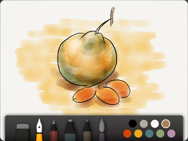
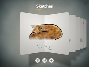
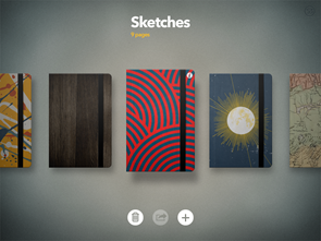
Paper, in contrast, feels like something tangible and alive. It’s delightfully fun. Since I installed Paper, I look forward to using it every day. Paper’s interface is beautiful at every level. Zooming out from a drawing (above) shows a sketchbook (below left) containing multiple drawings, and zooming out further shows your collection of sketchbooks (below right):
A stunning amount of detail has gone into every aspect of Paper’s design. Just a sampling of the tiny details I’ve noticed:
- The “paper” background of a sketch isn’t pure white; it’s very slightly off-white. This lets the pure white ink and paint appear extra bright.
- If you’re in the middle of drawing and drag your finger (or stylus) over the tool palette, the palette automatically drops out of the way so you can continue your line into the space the palette had just been occupying.
- You can paint with white watercolor to lighten things. While Paper carefully models the physics of real inks and paints, in various places it breaks with those limitations to let you do things which useful but not possible in the real world. This seems to be done judiciously; the drawing tools still feel very much like their physical analogues.
- The tools respond to the speed of your movement — but not always the same way. The pen gets thinner the faster you go, which makes physical sense, but the calligraphy pen gets thicker when you go fast. This is another case in which the physical metaphor has been judiciously broken. I’m not sure of the precise rationale behind these differences, but the result feels right.
- As you flip through a sketchbook, not only do the pages animate in 3D, their shadows do as well. Paper is built on the OpenGL 3D library, but it probably still was a lot of work to get these effects to look this good and this smooth.
Surprisingly, Paper actually delivers on the original MacPaint premise: you can create beautiful art. I’m no artist, but I was able to quickly sketch the still life with fruit shown above, and the cat in the smaller image. It turns out you can add watercolors to pretty much any pen or pencil drawing in Paper and get something that looks pretty good. My children think so too — yesterday evening I had to read the Kindle edition of Angelmaker on my phone because I couldn’t pry the iPad away from my four year-old.
(Aside: Paper is free, but you’ll have to pay to get the watercolors. You should just bite the bullet and buy all the tools — you will in the end, anyway. I think Paper’s pricing model is as clever as their interface design.)
As amazing as the artistic results are, I don’t think they represent Paper’s greatest accomplishment. At the highest level, I think the best thing Paper has really done is let you feel like an artist. I haven’t regularly sketched anything since Drawing 101 in college, and now I find I’ve bought an iPad stylus so I can do more with Paper.
FiftyThree carries this message throughout out the Paper app, as well as through their site and brand. Everything about this product is designed to lead you to believe, “I am the kind of cool latter-day renaissance person who carries around a Moleskine notebook because my free aesthetic soul may encounter a beautiful scene I want to render as art. I am that awesome.” This is, in fact, the very image in the Paper promotional video: a guy wandering around New York City sketching stuff. The video is shot from first-person perspective. That guy is you.
I think the term “user experience design” is often overblown puffery — when I get to observe someone working through an app design problem, they’re usually focused on the feature set and interface. I rarely witness someone actually thinking directly about the experience their user will have. But with Paper, I think “experience design” is an apt term for what they’ve done. Maybe even that term sells it short. It could be called something like “self-conception design”.
But, wait! Here’s the best part. Someday all our apps will be this great.
Think about that. In the not-too-distant future, every bit of software you currently use (and maybe swear at) — an online store, the Settings area for your latest device, a random tool from an IT department, the production app you spend your workday in — all those things will someday be as beautiful to look at and joyful to use as this Paper app.
And those apps will make you feel great. When send a message, you will feel like a great communicator (or socialite). When you follow a treasure map to an out-of-the-way restaurant in a new town, you will feel like a great explorer. When you follow a recipe, you will feel like a great chef. And when you create a bit of software, you will feel like a great designer.