Amazon: Please make better use of cover art to improve the ebook reading experience
As we pass through the transition from paper to electronic books, the humble book cover seems to have been dropped from important roles in the reading experience. I’m generally a huge fan of Amazon’s various Kindle devices and apps, and love the convenience that goes with them. But I’m finding some aspects of the current Kindle reading experience leave me cold, and make recalling a book harder than it should be.
We usually don’t think much about the covers of the books we’re reading, but each time you reach for a paper copy of a book, you have a chance to see a cover:
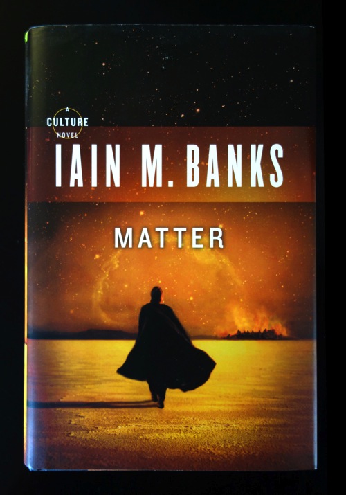
This cover is hard at work. Before you’ve even cracked the book, the art and typography have played a subtle but useful role in setting the mood for the reading experience. Yes, the cover is serving as advertising, but it’s also an earnest attempt to visually establish the tone of what follows. Details such font choice, text size, color palette, image content, and composition, all contribute to provoking an emotional shift before you’ve even reached the primary content. In this light, a cover is something like a movie’s opening credits. In both cases, subtracting the aesthetic treatment leaves behind bare content that has to work harder to make an emotional impact.
More lastingly, the cover helps to repeatedly connect the book’s title, author, and content in your brain. During the course of reading a book, you likely see its cover numerous times (even if the cover’s only facing up half the time). I’d hazard that the cover for a typical paper novel creates something on the order of 20–40 visual impressions for the average reader between the time they see it in a store and the time they put that book out of sight.
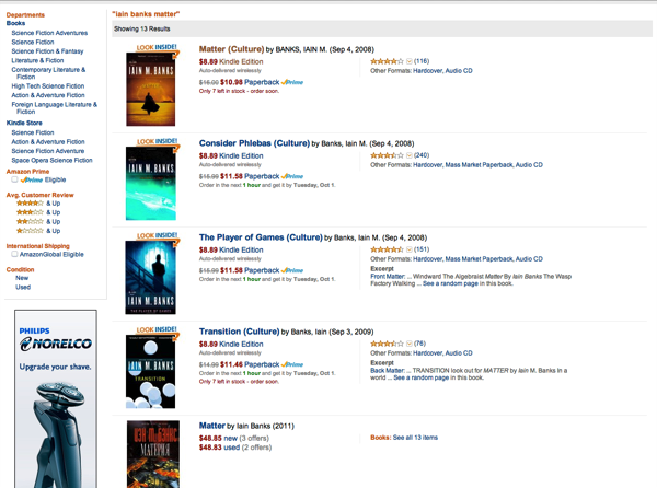
In contrast, let’s quickly consider the use of book cover art in Amazon ebooks. When you buy a book on Amazon’s Kindle store, you can see a small thumbnail of the cover art:
You can also see a book’s thumbnail in a device or app’s the Library view. But when you tap on a book to open it, you’re brought straight to the first page of text:
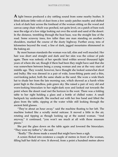
Jumping to the first page of text seems really efficient — but by skipping the cover, some things are lost. The title is presented here, but in such a subdued way that it’s easy to overlook. The author’s name isn’t even shown in portrait view. (You have to rotate the presentation to landscape, two-column view for that.) And, once you’ve begun a book, when you return to the Kindle app or device again, you’ll jump straight back to the page you were on — skipping even the small cover art thumbnail in the Library view.
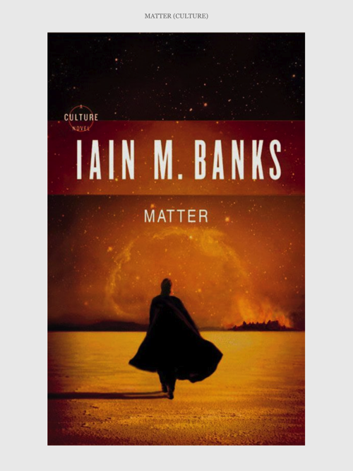
The digital cover art is typically still there in the ebook content; it’s just not shown to you by default. And if you explicitly do view the cover, you will see an odd thing: the cover art presented as an image sitting on one of the book’s pages, instead of a cover that’s the same size as a page. This makes the cover feel less like a cover, and even less important than the user interface is already treating it.
Overall, I think Amazon’s doing an amazing job with ebooks. I do think the cover art could be handled more effectively. As it stands, you can lose out on quite a bit as a reader of an ebook:
- If you can’t remember a title or author, you can’t easily recommend the book to friends. I’ve frequently found myself trying to tell friends about an interesting ebook I’m reading — a book I may have been reading for a couple of weeks — only to discover I can recall neither the title nor the author’s name.
- If you can’t recall an author’s name, you yourself might not be able to later find more books by the same author. Yes, you could dig up the name through your order history, but maybe you’re not going to bother. It’d be a lot faster if you could just recall the name and type it into a search box.
- The art probably helps aid the recall of the book’s content. Conversely, failure to show that cover likely means that information is probably harder to recall. I can still remember some covers for books I read decades ago. I doubt that persistence will remain true about the ebooks I’m reading today.
- Everything on the book’s cover, including the artwork and typography, is helping to prepare the stage for the reading experience you’re about to start (or resume). Leaving that out can make the e-book reading experience feel comparatively colder.
- Without a strong visual distinction between different books, the experience of reading ebook after ebook can make those books blur together in your mind.
Curiously, Kindle devices do show book covers, but for the wrong book. When you turn off the device, you’ll get an ad for some book you don’t yet own. I appreciate Amazon’s business need to sell more books, but this feels rather pathetic. I’ve never personally found any of these recommendations useful, and in any event I already have many ways — and better ways — to find recommendations when I visit the Amazon site. Moreover, this advertising makes the reading experience so haphazard. Because I get a different book cover each time I turn off a Kindle device, the lack of persistence makes it even harder to appreciate a multi-day reading process as a coherent experience.
What might work better? I’m sure the Kindle designers have already given this a lot of thought. I’m not an expert in ebook user interfaces, just a reader who’s been feeling underserved by the current experience, but I think it might be reasonable for the Kindle apps and devices to:
- Flash the book’s cover for second when opening a book for the first time.
- Flash the book’s cover for some shorter time (half a second?) when re-opening a book.
- Skip this cover display if the user goes away and then returns to a book within some short interval, say, less than an hour. If they’ve just flipped away to check something and come right back, even a short delay might feel obtrusive.
- Let the user turn off this cover behavior through an option if they’re really obsessed with getting that second back.
- On the Kindle devices, the cover of the current book should be shown when the device is off. Again, if the user really wants to hide which book they’re reading, perhaps the existing behavior could be retained as an option.
What has your experience been? If you know anyone at Amazon who’s in a position to reconsider the current handling of cover art, I’d love it if you could please point them at these suggestions.