I’ve posted an app that lets you
print a free wall calendar that can make your scheduling discussions go faster.
This is based on
a printed calendar I created by hand for some years now. As I noted in that post, most wall calendars
contain far too much junk. Most professionals I know track future events in an
online calendar, not a wall calendar, so among other things, you may not
actually need room to write on a wall calendar these days. But
it is handy to be able to quickly answer questions about
what day of the week a given date falls on, or vice versa. While you can whip
out a mobile device and answer those questions, this is one case where I
believe paper is faster than gadgets.
If you hang one of these on your office or conference room wall, I think
you’ll find it useful. Each year, the startup I founded continues to print out
a huge version of this calendar. (Tip: print it as a poster at Fedex). It
works great for planning agile development sprints.
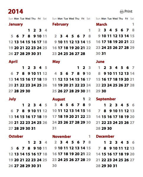
Optimizing for text legibility
I've tried to remove everything from this calendar that’s not strictly
necessary to answer the key day/date scheduling questions. In particular, to
improve legibility at a distance, I’ve tried to maximize the size of the date
numbers so they can be read from far away. In the case where a single month
requires six rows to display, I tuck the name of the month on the same row as
the first week. Such a week can contain at most two dates on the far right.
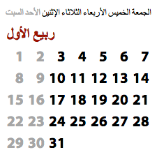
For example, in a typical U.S. calendar, this situation will come up in March
2014:
This trick lets me save a row for the tall months. Reclaiming that vertical
space means the dates can be bigger and more legible at a distance.
A web component wall calendar
Instead of creating another one-off paper calendar this year, I realized I
could use web components to create a live app without too much trouble. I
already had a
month calendar component
(available for your own web components app via Bower). This component handles
most of the date math, so it was fairly straightforward to just stick twelve
instances of this component together, then apply some styling and glue logic,
and end up with a live calendar app.
Generally speaking, that process is what I see most web app design and
development moving toward: 1) a search for the best components, 2) some
wrangling to glue them together, and 3) the application of styling to achieve
the desired aesthetic. The core
.html source for the app is tiny, weighing in at a little over 13K, and most of that is markup
or CSS. Looking just at the JavaScript, there are only about 100 lines
of code.
This web app is slightly unusual in that it focuses on printing, and the web
isn’t particularly print-friendly. As far as I know, it’s hard to say: “Scale
this text to be as tall as possible, subject to this layout, and still have
everything fit on a page.” I ended up having to be most conservative than I
would have liked, tuning the app for U.S.-centric “Letter” sized paper, which
is shorter than the A4 paper used nearly everywhere else. Some space goes to
waste which could have been used for more generous text sizing and spacing.
Falsehoods designers believe about time
A while back, Noah Sussman posted a great list of
Falsehoods Programmers Believe About Time. Designers make most of the same incorrect assumptions as well. When I read
a list like this, the lesson I take away is that most people (including me)
shouldn’t be doing date math or creating UI elements that depend directly on
it. Instead, they should be building on top of work others have done.
In this particular case, I’d already invested a bunch of time doing the work
to be able to create a month calendar component that can easily be reused in
other applications. This component avoids at least a few of the Falsehoods
About Time listed above. E.g., given a date, to calculate the next date it
doesn’t just add 24 hours, but does some gyrations to handle daylight saving
time edge cases.
A designer or developer can hopefully drop this month calendar component into
their web app and get a useful result with having to worry about (or even be
aware of) the edge cases. The component itself undoubtedly has edge cases it
fails to handle; there are Falsehoods About Time which aren't addressed
yet. But the value of doing this as a component is that at least such work is
spread across applications. Others can pitch in, and we can collaboratively
work towards a bug-free solution.
Global support for hundreds of languages/locations
In past years, people have asked me for “international” versions of the wall
calendar that have Monday as the first day of the week, instead of Sunday the
way most Americans prefer it.
Since my month calendar component already leveraged the excellent
Globalize.js library,
it was actually easier for me to just let the user pick the language/location
they want a calendar instead of having to hard-code support for specific
formats. To simplify things, I created a component that wraps the Globalize
list of supported language/location combinations. Then it was just a matter of
wiring the language/location selector to the calendar, and — boom!
— the calendar instantly got basic support for hundreds of
language/locations.
The results are likely imperfect for many places, but for languages and
locations with small populations, this printable wall calendar might already
be the best solution out there.
If you’re like me, it’s a good five minutes fun to just pick cultures and see
what their calendars might look like. I knew that cultures in the Americas
tend to prefer having a calendar start on Sunday, while European cultures tend
to prefer that weeks start on Monday. This holds true even when the same
language is spoken in both hemispheres: see English (U.S.) vs English (U.K.),
or Spanish (Mexico) vs Spanish (Spain). Until I started working with
Globalize, though, I hadn’t realized that there were cultures that prefer
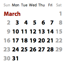
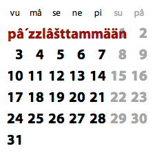
weeks start on a Saturday. Here’s how March 2014 looks in three settings,
English (U.S.), French (France), and Arabic (Saudi Arabia):
The start-of-week day, plus the month and day names, all come for free from
Globalize. (I don’t actually know if people in Saudi Arabia want their months
to look like the one above, but couldn’t find conclusive evidence of a single
preferred style.)
Localize your UI and get fun surprises for free!
One last bit I thought was funny was rediscovering that, even when building
atop a localization library or a localization-aware component, there are
always surprises. I think this can be expressed as a law of UI design:
For any user interface layout that looks good for most cultures, there
exists a culture that will break that layout.
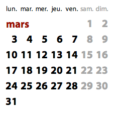
Here, the clever packing of the month name into the first row of a six-week
month (as shown above) looks great in almost all the languages
defined by Globalize. In that layout, the month name can span up to five
columns’ worth of width, which is more than enough in most cases. But per the
above law, there must exist at least one culture for which this layout does
not work without modification. And such a culture does, in fact, exist:
This is the Sami language of northern Scandinavia (“sääm´ǩiõll” in the
calendar’s language/location list), in which the month of March is called
“pâ´zzlâšttammään”. In a year like 2014, where March starts on a Saturday, the
month name will overlap with the date for March 1st. To the 25,000 or so
speakers of Sami: I’m very sorry about this.
I recently announced that I was
halting development on QuickUI, and thought it would be a good idea to do a little post-mortem before
moving on.
The good side: As a framework for web application UI development, QuickUI
measured up to its design goals. It was useful for creating complex
application UIs with a good separation of concerns between UI components. The
core framework was highly reliable with a fairly tight abstraction and
acceptable performance. QuickUI was used in some companies for real production
apps with real users. The very small number of developers who actually used
the framework said they liked it and were impressed by what it could do.
The bad side: As an open source project, QuickUI never achieved critical mass.
QuickUI was my first attempt at kickstarting an open source project to help
establish an ecosystem for component-based web user interfaces. I’d initially
held the naive view that simply publishing something as open source (which I
did in late 2009, two years into QuickUI’s development) would, on its own,
generate community interest and participation. But the universe of open source
development projects is vast, and simply making something free doesn’t make it
popular. Free products still need to appeal to their audience and gain
adoption through a good feature set, great distribution, and substantial luck.
Eventually, QuickUI was overtaken by open web component standards (which is a
good thing), and it no longer made sense to continue investment in QuickUI.
Before moving on, I wanted to write down some of the lessons the QuickUI
project held for me.
People care about the stack of technologies beneath your
project.
I used to think that all that mattered is whether a tool worked and was
easy to use, but most developers make demands the construction of the tool
itself: programming language, runtime platform, dependent libraries, etc.
The most common reason someone will offer for this is that they may need
to diagnose a bug in the code and fix it. That may also be true, but I
think most people have less glorified reasons for considering the
technology behind a tool.
First, simply understanding the vocabulary associated with a given stack
requires investment. Occasionally you come across a tool on GitHub whose
Readme says the tool can be configured via a .foo file, where the location
and syntax of a .foo file is completely obvious to current users of that
tool’s stack. If you don’t already know what a .foo file is, you’re less
likely to adopt that tool.
Second, a developer toolchain is a creaky, cantankerous beast, and
incorporating multiple stacks of tech is a pain. This is less about
debugging than what Bruce Sterling refers to as the
wrangling required to get things to work together.
Third, you trust tools on stacks that have worked for you in the past, and
are skeptical that tools on unfamiliar stacks will actually work as
advertised. For example, I’ve hardly ever used Ruby, and rarely use Ruby
gems. When I see a tool published via npm, I feel comfortable installing
and using it, even if I never look at its source, because I’ve used many
tools that way. If I see a tool that does
the exact same thing published as a Ruby gem, I view its efficacy
as black magic.
Last, people implicitly trust other people who have selected the same
technology stack. “If someone has made the same technology choices I have,
they must be as enlightened as I am!” Conversely, people look askance at
those who make different choices. A die-hard plain JavaScript coder may
view the Clojure community are pot-smoking hippies, while the Clojure
developer may view the original party as a latter-day COBOL dork lacking
sufficient brainpower and awareness.
In the case of QuickUI, when I started on it in late 2007 or so, I was
most comfortable writing in C#, so when I needed to write a build-time
compiler for UI markup, I wrote it in C#. Bad idea. Despite the fact that
there was no run-time need for .NET, and that the compiler ran perfectly
well on a Mac (under Mono), no one would take it seriously with the taint
of .NET on it. I was eventually able drop the compiler altogether, and
rely on a stack of tools which jQuery developers were already familiar,
but that cost the project time and effort.
Using anything other than native web technologies — plain HTML, plain
JavaScript, and plain CSS — significantly constrains your
audience.
This is similar to the above point, but pertains to your project’s source
code rather than the stack of technologies supporting that source. Again,
part of the argument here is that they might theoretically need to dive
into the runtime source to diagnose a problem, but I think the reaction is
usually more instinctive than that.
At one point in the development of QuickUI I discovered that working in
CoffeeScript was much more productive for me than in plain JavaScript. In
short order, I
ported the QuickUI runtime to CoffeeScript. Switching to CoffeeScript was a huge productivity boost for me — but
represented a huge reduction on the potential audience for QuickUI.
For one thing, it seemed nearly impossible for me to get potential
developers to ignore the presence of CoffeeScript. CoffeeScript compiles
to plain JavaScript, but anyone who looked at the QuickUI source repo saw
“CoffeeScript” listed as the primary language… and walked away. They might
say, “Your project looks interesting, but I don’t know CoffeeScript.” I’d
tell them they didn’t need to know CoffeeScript — that was an
implementation detail — but they’d already decided they were uninterested.
Over and over, the general feeling was, “I just don’t want to use
something that uses something I don’t already know.” And then, of course,
for most people who really did want to be able to grok the source,
CoffeeScript was a non-starter.
To build a community around a project, you probably want as many people as
possible to be able to participate. Even if you hate JavaScript, it’s the
web’s lingua franca. Using any other language for an open web project may
not be an insurmountable obstacle, but at the very least it’s a
significant handicap. As much as it pained me, when I started up the
subsequent
Quetzal web components
experiments, I did so in plain JavaScript.
Everyone will insist there is one thing you must do that will make your
library more acceptable — and all those things are different, and all
those things together are probably still insufficient.
Over the course of the past few years, I have given many, many QuickUI
demos, and received feedback on all aspects of the tool, the accompanying
site at quickui.org, the learning process, etc. Very little of this
feedback was consistent; everyone fixated on something different. I
thought, if I just respond to all the feedback, surely at some point the
barrier to adoption will be low enough that people will start adopting the
tool.
On the basis of such feedback, I spent a huge amount of time improving
things. Early on, someone said I should move the source to GitHub, so I
did. Someone said it needed better documentation, so I wrote a lot of
documentation. As discussed above, numerous people suggested moving away
from .NET, so I did. Someone suggested having live examples of UI
components, so I built those. Someone thought a tutorial would be helpful,
so I made an interactive tutorial. (Which many people complimented. Thank
you!) One person’s key complaint with the entire framework was that the
home page didn’t have icons; if the framework was to be successful, the
home page needed little icons to indicate which browsers were supported by
the framework. I did that. I received many, many other suggestions, and I
incorporated almost all of them.
None of it mattered. The feedback was actionable, and probably much of it
was accurate, but even addressing (nearly) all of it wasn’t enough to make
the project successful.
The fact is that most people are unwilling to invest the time to
understand, analyze, and articulate what’s really wrong with your project.
Of the people who gave me feedback, few of them actually looked hard at
it, very few had actually tried it beyond the online tutorial, and very,
very few were willing to speak directly to their key concerns. This is all
understandable — people are busy, spending time on a framework of unknown
value is potentially wasted, and most people want to be nice to you — but
feedback on a project should be accepted with these phenomena in mind.
Paradigm shift is prohibitively expensive. Early on, one
person told me that building UI in a component-oriented fashion
represented a significant paradigm shift — and that represented a
potentially insurmountable obstacle for QuickUI.
The problem with a paradigm shift is that it’s hard to even have a
conversation with someone whose conceptualization of the world doesn’t
even allow them to recognize the problem they have. I spoke with many
developers who viewed the undifferentiated pile of JavaScript generating
their UI as the way things had to be done. They were more concerned with
getting their UI to work across multiple browsers than to worry about
componentization — even though a good component library is exactly the
sort of thing that would have made cross-browser work more manageable.
(The cross-browser hacks could have been folded into the components,
allowing them to work at a higher level of abstraction, etc.)
Interestingly, these same developers would carefully factor their code
into classes or functions with clear lines of responsibility. They applied
good factoring to every other thing they coded
except their web UI.
Over the past year or so, Google and others have been evangelizing a
component-oriented paradigm for web development. At some point, we’ll go
through some phase-change where that paradigm will suddenly become
dominant. I’m betting that change will happen before late 2015. By then,
it will be hard to find a good web UI developer who doesn’t think of their
UI in terms of components.
People are only interested in something if others are already using
it.
This is true for both seasoned developers and novice developers — but for
different reasons. The novice teaches themself jQuery or Backbone or LESS
because experienced people use those things, which means they’re probably
interesting and useful. The seasoned developer picks up a new tool that
others are using because the alternative — using something with a tiny
user base — represents unacceptable risk.
This last point was made to me by the most abrasive person I ever spoke
with about QuickUI. In fact, I think it’s because they were untroubled by
politeness that they could speak the truth. They said: “I would love to
use this, but I can’t. If something were to happen to you, I would be
stuck having to fix your bugs. I made a bet like this in the past, and was
stuck supporting someone else’s framework. I won’t do that again. Come
back when lots of other people are using this.”
So this developer had, at some point, found a great piece of technology,
developed by someone else, and they staked their own reputation on
adopting this technology, only to have it completely fall apart when the
other party went away (went bankrupt, was acquired, whatever). It’s
probably safe to assume that most seasoned developers have had a similar
experience. For every open library, there must exist some critical mass at
which the library’s community becomes self-sustaining.
At that point, if you find a bug in the library, someone else in the
community has probably also found the bug, and maybe even fixed it. Enough
other people are invested in the library that, even if the original
developer disappears, the remaining investors will keep it going for as
long as that makes technological sense.
I’d be very interested if someone could pinpoint the size of that critical
mass. I’m guessing the number is pretty small: perhaps 10 active
contributors might be sufficient to create the perception the library is
well-maintained and not going away. Whatever that size is, I couldn’t grow
QuickUI to that size.
Google could publish a JavaScript library for cloud-based ham
sandwiches and a thousand people would immediately star the repo on
GitHub.
For much of my career, I focused my attention almost entirely on the value
a product created, and gave very little thought to how a product would be
distributed. Distribution is, in fact, at least as important, and maybe
more important, than underlying value. That’s certainly true in the short
term. And, over the long term, well, maybe technology changes quickly
enough that the long term never comes into play.
I’m not saying individuals can’t launch successful open source projects,
but rather that doing so within the context of a company with name
recognition and a developer outreach program makes it much, much easier.
The people working within such a context may not realize it. I once heard
someone describe people who work at big companies as “basketball players
on the moon”. Those people can jump very high, but they may not realize
the extent to which their performance depends on that context.
I have deep respect for a person who can launch something entirely on
their own, without relying on the backing of their company (or industry
name recognition predicated on work they launched previously at some
earlier company). If someone can make a disruptive technology successful
entirely on its own merits, both that tech and that person are impressive
indeed.
Ah, well, live and learn. I’m still looking forward to watching the web’s UI
component ecosystem take shape, because we’ll all get to make awesome stuff
together.
I’ve decided to end further investment in the development of the QuickUI web
user interface framework.
I’ve spent the past half-year experimentally porting various QuickUI
components to HTML custom elements under the rubric of a project called
Quetzal. That project
makes use of Google’s
Polymer project, which supports
the deployment of web components to mainstream browsers. While the Quetzal
element collection doesn’t yet offer the complete set of QuickUI components,
and working on top of Polymer has been shaky at times, Polymer is becoming
good enough for real use, and the advantages of building with web standards
will quickly outweigh any proprietary advantages which QuickUI could offer.
I started QuickUI a number of years ago because it seemed clear to me that a
component-oriented approach to UI design and development would let you create
better and more maintainable user experiences. I didn’t see anyone else
working on that in an open way, and so began my own effort to make progress in
that area.
The current wave of web component standards embody many of the ideas I was
pursuing in QuickUI. For fun, I just dug up from my notes the earliest source
code I could find for the component markup language I thought would be useful
for creating web components. Here’s sample QuickUI markup I wrote at the very
beginning, probably late 2007:
Aside from minor syntactic differences (curly braces are in vogue now instead
of percent signs; “attributes” instead of “arguments”; the style tag needs to
be inside the template instead of outside; the element name requires a
hyphen), the source code is nearly identical. In other words, the source code
I wanted to be able to write in 2007 is essentially the source code I can now
write today. Hooray for the open web!
Going forward I’ll be using web components for my own work rather than
QuickUI. If you have been using QuickUI or were interested in QuickUI, I would
encourage you to look at adopting web components instead, either through the
Polymer project or through similar projects such as Mozilla’s x-tags.
I’ll continue to keep the quickui.org site live for the indefinite future. In
particular, for the time being I’ll continue to use this blog to post thoughts
on developing user interfaces, with a focus on using web components. To those
of you that used QuickUI or provided feedback on it, I’d like to offer my warm
thanks for all of your support. Best, Jan Miksovsky
In a
post a few months back, I discussed how custom elements needed an easy way to fill in slots defined
by their base classes. The capable folks on Google’s Blink team have now fixed
this problem with a small but critical Shadow DOM change, and I wanted to take
a moment to walk through an example of how the feature works and explain why
this is so cool.
What does “filling in a slot” mean, and why does it matter? The crux of the
issue, for us to be able to share web components, I need to be able to create
a new web component that defines some, but not all, of its appearance. I need
be able to define certain places that you can fill in with your content. Those
are the slots: points of visible user interface extensibility.
Example: a series of page templates
The post linked above offers a simple button example, but let’s walk through a
more realistic example using a series of page templates. (If you have Google
Chrome Canary installed, you can follow along with a live demo.) These sample templates will span a range of general-purpose to very
specific. For the sake of clarity, the examples are overly simple, and are intended
just to convey a sense of how such templates might be used to build a simple
online store app. The same principles shown here could easily be extended to
arbitrarily complex interfaces.
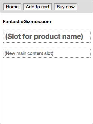
A page-with-toolbar
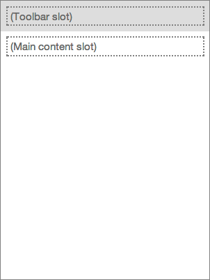
We start with a completely general-purpose <page-with-toolbar>
element that defines a page with a toolbar. For the sake of argument,
let’s suppose there’s something fancy about the presentation here — perhaps
the toolbar starts out at one size, and then, as the user scrolls, the
toolbar becomes smaller and permanently docked at the top of the page.
Regardless of what exactly makes this interesting, let’s assume that
interesting stuff entails web ninja tricks the average designer or developer
doesn’t have the time to learn or implement for themselves. Significantly,
some aspect of the toolbar behavior requires real code, not just CSS
styling.This user interface pattern is completely general-purpose, so
perhaps this template is found in an online library of general-purpose web
components. The key extensibility feature here is that the element defines
two slots which consumers of the <page-with-toolbar> element can fill
in: a toolbar slot at the top, and a main content slot.
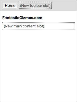
A store-page partially fills in a page-with-toolbar
This second image shows a <store-page> element that forms the
standard base for all pages in our hypothetical online store. This element
subclasses (extends) the general-purpose <page-with-toolbar> element
above, so it automatically picks up the structure defined by that element
and the fancy toolbar behavior. The designer of the store app can fill in
some of that structure with elements that should be visible on every page in
the store, such as a Home button and the story name. That is, the designer
can partially fill in the slots defined by the base class: after adding the
standard elements they want on every page, they can define new slots that
can be filled in by instances or subclasses. The designer can also add
visual styling and any behavior that should be available on every page in
the app. When complete, this page both extends the above element, and is
itself extensible. The element is specific to this company, but could be
used by any team at the company working on their online store.
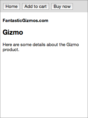
A product-page partially fills a store-page
The third image shows a <product-page> element. This extends the
<store-page> element above to create a template for any page
specifically in the app’s Products area. It fills in the toolbar slot with
buttons that are only available on product pages. It also partially fills in
the main content slot with a header for the product name. Finally, it adds any
styling and behavior shared only by pages in the Products area. This product
page element is still extensible, but an increasing portion of its interface
and behavior are constrained.
A completed instance of product-page
Finally, we have an example of a filled-in <product-page> element.
Presumably the app fills in the page by obtaining product data and used that
to populate various elements on the page (e.g., using data binding). Now the
whole page has been filled in. By factoring our app’s design this way, we’ve
created a good separation of concerns. The <page-with-toolbar> element
doesn’t have to know anything about online stores. Conversely, the
<store-page> element doesn’t have to know anything fancy toolbar
behavior. The <product-page> designers don’t even need to know where the
toolbar behavior comes from — all they need to know is that they get it for
free. If the team at the company that owns the <store-page> element
later decides to change the toolbar behavior, they can do so without the
people who own the <product-page> element needing to do anything.
How does this work?
Until recently, it wasn’t possible for a custom element to fill in slots
defined by a base class this way. An element’s template could contain a
<shadow> element to ask its base class to render its stuff, but there
wasn’t an easy way to pass content to the base class. Over the past couple of
months, the Blink folks working on Shadow DOM features have just addressed
this shortcoming with a new feature in the
Shadow DOM spec and its Blink implementation. Technically speaking, the spec now allows a
custom element to distribute nodes into a <shadow> insertion point and
then reproject those nodes into an older shadow root. To see an example of how
this works, see the live demo.
At the time of this post, you’ll need to use
Google Canary. You’ll also need to open chrome://flags and check “Enable experimental Web
Platform features”. But this feature will likely make its way into production
Chrome in the not-so-distant future, and get polyfilled by the Polymer project
for other browsers. You can look through the code for the complete story, but
the gist is this: if your element puts stuff inside a <shadow>, then
that stuff will be passed to the base class as content. In our
<page-with-toolbar> example element, the template contains a bit for the
toolbar that looks like this:
That <content select=”.toolbar”> bit creates a slot that can be filled in
by instances — or by subclasses. When our <store-page> element subclasses
<page-with-toolbar>, it fills in that slot:
Everything inside the store-page’s <shadow> will look to the
page-with-toolbar base class like regular content. The page-with-toolbar’s
toolbar slot will grab the span with class=”toolbar”, so the store-page’s Home
button ends up in the toolbar. This lets store-page fill in the toolbar slot
defined by page-with-toolbar. So that store-page itself can be extended, it in
turn redefines that toolbar slot. Any toolbar buttons defined by subclasses of
store-page (like the Add to Cart and Buy Now buttons in our product-page
example) will get picked up by store-page’s toolbar slot, which is nestled
inside page-with-toolbar’s toolbar slot.
Conclusion
Sometimes tiny differences in fundamental features, like this refinement to
the <shadow> behavior, can open up new realms of possibility. While it
doesn’t look like much, when combined with subclassing, you’ve just been given
a powerful new tool for creating custom web elements. You’ll be able to create
a wide range of new general-purpose elements that can be filled in by other
people to suit their needs, and you’ll be able to fill in general-purpose
elements created by others to suit your own needs. This is a huge step towards
a
vibrant ecosystem of web user interface components.
Beyond the expanded capabilities enabled here, I’m personally excited to
see this change because I’ve been advocating for it for so long. I made a
pitch for this on a visit to Google back in May 2012, and have promoted the
idea in various forums since then. Other people like Scott Miles at Google
also lobbied for the same thing. Special thanks are owed to Scott and to
Dominic Cooney for contributing their own weight behind this idea and
building the momentum required to make it happen; to Blink developer Hayato
Ito for his work updating the spec and implementing the feature in Blink;
and to Dimitri Glazkov for his careful oversight of the Shadow DOM spec.
This is one spec change that was totally worth the trouble!
As we pass through the transition from paper to electronic books, the humble
book cover seems to have been dropped from important roles in the reading
experience. I’m generally a huge fan of Amazon’s various Kindle devices and
apps, and love the convenience that goes with them. But I’m finding some
aspects of the current Kindle reading experience leave me cold, and make
recalling a book harder than it should be.
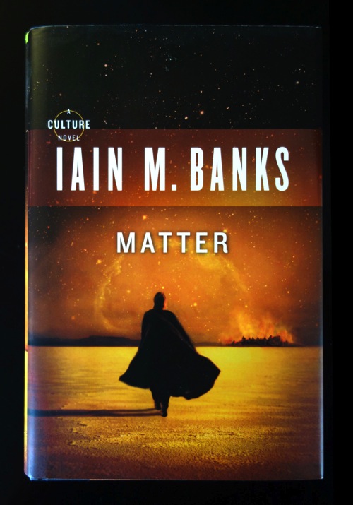
We usually don’t think much about the covers of the books we’re reading, but
each time you reach for a paper copy of a book, you have a chance to see a
cover:
This cover is hard at work. Before you’ve even cracked the book, the art and
typography have played a subtle but useful role in setting the mood
for the reading experience. Yes, the cover is serving as advertising, but it’s
also an earnest attempt to visually establish the tone of what follows.
Details such font choice, text size, color palette, image content, and
composition, all contribute to provoking an emotional shift before you’ve even
reached the primary content. In this light, a cover is something like a
movie’s opening credits. In both cases, subtracting the aesthetic treatment
leaves behind bare content that has to work harder to make an emotional
impact.
More lastingly, the cover helps to repeatedly connect the book’s title,
author, and content in your brain. During the course of reading a book, you
likely see its cover numerous times (even if the cover’s only facing up half
the time). I’d hazard that the cover for a typical paper novel creates
something on the order of 20–40 visual impressions for the average reader
between the time they see it in a store and the time they put that book out of
sight.
In contrast, let’s quickly consider the use of book cover art in Amazon
ebooks. When you buy a book on Amazon’s Kindle store, you can see a small
thumbnail of the cover art:
You can also see a book’s thumbnail in a device or app’s the Library view. But
when you tap on a book to open it, you’re brought straight to the first page
of text:
Jumping to the first page of text seems really efficient — but by
skipping the cover, some things are lost. The title is presented here, but in
such a subdued way that it’s easy to overlook. The author’s name isn’t even
shown in portrait view. (You have to rotate the presentation to landscape,
two-column view for that.) And, once you’ve begun a book, when you return to
the Kindle app or device again, you’ll jump straight back to the page you were
on — skipping even the small cover art thumbnail in the Library view.
The digital cover art is typically still there in the ebook content;
it’s just not shown to you by default. And if you explicitly do view the
cover, you will see an odd thing: the cover art presented as an image sitting
on one of the book’s pages, instead of a cover that’s the same size
as a page. This makes the cover feel less like a cover, and even less
important than the user interface is already treating it.
Overall, I think Amazon’s doing an amazing job with ebooks. I do think the
cover art could be handled more effectively. As it stands, you can lose out on
quite a bit as a reader of an ebook:
If you can’t remember a title or author, you can’t easily recommend the book
to friends. I’ve frequently found myself trying to tell friends about an
interesting ebook I’m reading — a book I may have been reading for a
couple of weeks — only to discover I can recall neither the title nor
the author’s name.
If you can’t recall an author’s name, you yourself might not be able to
later find more books by the same author. Yes, you could dig up the name
through your order history, but maybe you’re not going to bother. It’d be a
lot faster if you could just recall the name and type it into a search box.
The art probably helps aid the recall of the book’s content. Conversely,
failure to show that cover likely means that information is probably harder
to recall. I can still remember some covers for books I read decades ago. I
doubt that persistence will remain true about the ebooks I’m reading today.
Everything on the book’s cover, including the artwork and typography, is
helping to prepare the stage for the reading experience you’re about to
start (or resume). Leaving that out can make the e-book reading experience
feel comparatively colder.
Without a strong visual distinction between different books, the experience
of reading ebook after ebook can make those books blur together in your
mind.
Curiously, Kindle devices do show book covers, but
for the wrong book. When you turn off the device, you’ll get an ad
for some book you don’t yet own. I appreciate Amazon’s business need to sell
more books, but this feels rather pathetic. I’ve never personally found any of
these recommendations useful, and in any event I already have many ways — and
better ways — to find recommendations when I visit the Amazon site. Moreover,
this advertising makes the reading experience so haphazard. Because I get a
different book cover each time I turn off a Kindle device, the lack of
persistence makes it even harder to appreciate a multi-day reading process as
a coherent experience.
What might work better? I’m sure the Kindle designers have already given this
a lot of thought. I’m not an expert in ebook user interfaces, just a reader
who’s been feeling underserved by the current experience, but I think it might
be reasonable for the Kindle apps and devices to:
Flash the book’s cover for second when opening a book for the first time.
Flash the book’s cover for some shorter time (half a second?) when
re-opening a book.
Skip this cover display if the user goes away and then returns to a book
within some short interval, say, less than an hour. If they’ve just flipped
away to check something and come right back, even a short delay might feel
obtrusive.
Let the user turn off this cover behavior through an option if they’re
really obsessed with getting that second back.
On the Kindle devices, the cover of the current book should be shown when
the device is off. Again, if the user really wants to hide which book
they’re reading, perhaps the existing behavior could be retained as an
option.
What has your experience been? If you know anyone at Amazon who’s in a
position to reconsider the current handling of cover art, I’d love it if you
could please point them at these suggestions.
The updated Quetzal home
page shows off a handful of new elements ported from QuickUI:
A quetzal-list-box element that presents its children as items in a list.
This makes it easy to give any collection of DOM elements the semantics of a
single-selection list. The actual tracking of the selection is handled with
Polymer’s own polymer-selector element. On top of this, the Quetzal list box
adds keyboard navigation: the user can navigate the list using the Up/Down
arrow keys, as well as Home/End and Page Up/Page Down. This keyboard
navigation follows the Microsoft Windows model, in which navigation keys
move the selection, which in turn forces the list’s scroll position to
update to show the selected item. This makes it faster to select an item
with the keyboard. (In Mac OS X, paging up and down does not update the
selection.)
A quetzal-combo-box element ties together a text input element, a popup, and
a button to invoke or dismiss the popup. See this post on
the original QuickUI combo box
for details on combo box behavior. Again, a key feature here is keyboard
support: the Down key invokes the popup (if it’s not already open), and the
Escape key dismisses it. Another feature (inherited from the popup-source
element) is positioning the popup above or below the text area as room
allows. This combo box element doesn’t provide a specific popup UI. Rather,
it’s intended to be used as a base class for custom combo box elements.
A quetzal-list-combo-box element combines the two above elements to create a
typical combo box which presents choices as a dropdown list box. This
includes standard auto-complete behavior. In many situations, a combo box
like this is often a better UI solution than a plain text box with
auto-complete: the user has a clearly visible button which can be used to
invoke the complete list of choices. This is more discoverable than
requiring the user to begin typing to see what the possible choices are. The
auto-complete behavior matches against the textContent of the elements’
children, so the list items can be any type of item that has meaningful
textContent. The sample shown uses a custom element that shows a color
swatch next to a color name; typing some text will auto-complete against the
set of color names.
These elements still need more work. For example, the combo box needs a stock
mobile variant in which the element can fill the screen when making a
selection to provide bigger hit targets and maximize the number of visible
list choices. Also, at the moment simply tapping a list box element causes the
Android Chrome browser to crash. This makes it somewhat hard to debug. :(
Nevertheless, I think these element demonstrate that a good set of UI base
classes will make it much easier to create custom UI designs as web components
take hold.
Just an update to the experimental
Quetzal project I posted
about last month. I’ve learned quite a bit, and have changed course on two
significant points, and thought I’d share a bit about my experiences with
others who might be contemplating the creation of a framework or UI component
library on top of web components.
A limitation of the current web component architecture
So far, the greatest challenge in replicating the range of expression in
QuickUI’s UI components has been the inability to easily define HTML custom element subclasses that can fill in base class insertion
points. To their credit, Google’s Blink (rendering engine) and Polymer (web
component framework) teams have been responsive on that point. In response to
a Polymer discussion board thread related to that post, a bug has been filed
to allow one to distribute content nodes into a <shadow> insertion point. Unless you’re already experimenting with Shadow DOM, this entire issue
undoubtedly seems quite arcane, but rest assured, fixing this one problem
would open up a lot of important new territory. I’m sincerely hoping this
proposal is adopted. In the meantime, I’ve been using a workaround to simulate
the effects of that proposal. That unfortunately broke in a recent Polymer update, but such setbacks are to be expected when building on shifting sand.
Trying Polymer elements
I’ve spent some time experimenting with Polymer’s own element layer, and last
month decided to try adopting it. My first cut at creating custom elements for
Quetzal was based directly on Polymer’s lower levels, which take care of
polyfilling (emulating) various web component standards. I’m now trying to use
the higher-level Polymer elements layer, which provides a richer framework for
creating custom elements, and adds a number of features to simplify common
component tasks. These features are not part of any web component standard,
but by virtue of being done by Google, will nevertheless probably become a
common feature of the web component landscape. There are still a number
of QuickUI features that have no parallel in standard web components or
Polymer elements, but most of those missing features appear to be things which
I could implement on top of Polymer elements. For example, a
<quetzal-element> base class could provide those missing features,
making it easy for new element classes to obtain them. Aside from the critical
limitation mentioned above, it now appears to me that most (hopefully, all) of
QuickUI could likely be implemented as Polymer elements. With that change, the
latest Quetzal iteration recreates a handful of QuickUI Catalog
elements as Polymer elements. So far, this approach feels acceptable, and it
would obviously be a big advantage to leave most of the heavy lifting to the
Polymer team, and focus on actually creating new custom elements. Some notes
on switching to Polymer elements:
Using HTML to declare an element template feels quite verbose and cumbersome
compared to QuickUI’s use of CoffeeScript’s concise JavaScript object
format. If you haven’t tried CoffeeScript, it improves over plain JavaScript
object syntax by using indentation instead of requiring tons of curly braces
and commas. Using HTML feels comparatively ponderous and noisy, and to me
all that noise makes custom element source files somewhat less
legible. Still, HTML is the lingua franca of the web, and using a
standard confers a huge advantage over a proprietary format, however
efficient it might be. At some point, the Polymer team says they’ll support
an imperative JavaScript means to define custom elements, but for now I’m
guessing the vast majority of custom elements will use HTML, so that’s what
I want to try.
Speaking of standard formats, one aspect of Polymer that’s recently changed
is that the top-level tag used to define a new element is now
<polymer-element>, instead of the standard <element>. While
Polymer elements are now just as locked into the Polymer framework as
before, this change makes it feel like I’m no longer using a web standard —
it feels like just another proprietary UI framework that happens to use
XML/HTML as its format. It’s surprising what a difference this small change
makes. Using <element> simply felt better.
Going back to plain JavaScript
Switching the top-level component container to HTML instead of script has also
prompted me to give up CoffeeScript, at least for now. I actually tried using
a combination of CoffeeScript and HTML, but it felt like I was working against
the grain, and I ended up giving up on that approach. Going from CoffeeScript
back to plain JavaScript is an excruciating experience. Oliver Wendell Holmes
said, “Man’s mind, once stretched by a new idea, never regains its original
dimensions.” I think the programming language analogue here is: once your
brain has been expanded by a language that lets you more clearly express your
intensions, trying to cram your brain back into the tiny box of a less
expressive language is unbelievably painful. Every single time I have to write
a JavaScript loop instead of a CoffeeScript list comprehension, or type
“function() {}.bind(this)” instead of just “=>”, I physically wince a bit.
JavaScript just feels gross, it looks gross, it is gross. That said,
JavaScript is the standard. One thing I’ve learned from QuickUI is that if
you’re trying to build a community around a common library, creating that
library in a programming language with a narrow audience dramatically limits
the rate at which you can grow. One commenter named “jokester” offered on my
original Quetzal post: “I’ll unfortunately not contribute to a project coded
in CoffeeScript.” Regardless of the advantages I believe CoffeeScript offers
to developers, I’d rather allow orders of magnitude more people to contribute
in the standard JavaScript language they’re already proficient in. Anyway,
that’s about the state of things. This Quetzal project is still just an
experiment, and doesn’t do much useful yet, but it’s proving a good way to
learn.
Wouldn’t it incredibly helpful if we had a library of components providing
solid implementations for all the common, general-purpose, well-designed user
interface patterns found in mobile and web apps? In such a library, how many
components would there even be?
Regardless of the exact number, I think it’s clear that a comprehensive set of
such patterns would be much larger than what’s available in most UI component
libraries. Why is that are most existing UI libraries so small?
There are a few different kinds of UI libraries; let’s look at each in turn.
Operating system UI libraries
Every software operating system (Windows, OS X, Android, iOS, etc.) offers a
library of user interface components. These help the platform’s developers be
more efficient — but more critically, these libraries establish the visual and
behavior language for their respective platforms. That is, they provide
sufficient components such that native and third-party apps can present
customers a reasonably consistent user experience.
OS UI libraries usually aren’t that big, though, often something in the
neighborhood of 20–40 components. These include components for tried-and-true
UI patterns: check boxes, radio buttons, combo boxes, tabs, menu bars,
sliders, progress indicators, and so on.
But OS UI libraries seldom go far beyond that. Once the platform has been
established, the platform vendor has little incentive to invest more work in
their platform’s UI component library. When my startup began working on an iOS
app, for example, I was stunned to discover just how few of the conventions of
that platform were directly facilitated by iOS itself.
Even when an innovation such as, say, pull-to-refresh emerges in a mobile app
like Tweetie and is widely emulated to the point where it becomes a de facto
mobile UI standard, the UI innovation rarely makes it back into the platform
itself. If it does make it into the platform, that step usually takes a very
long time. Tweetie came out in 2008. Apple finally added UIRefreshControl to
iOS 6 in 2012 — an eon later in mobile Internet time.
Another reason why OS libraries may have been so limited historically is that
theming native UI components has been hard. Many operating systems conflate UI
component appearance with component behavior, so it’s impossible (or hard) to
get something that behaves just like a standard toolbar (with docking, etc.),
but looks significantly different. And once you get much more complex than,
say, a text box, a designer wants more control over visual appearance. To get
a visually distinct result, the developer usually have to build something from
scratch. The web has an advantage here with CSS, which helps separate
presentation from structure and behavior. So you’d think web UI libraries
would be bigger — but they’re usually not.
General-purpose web UI libraries
Web UI libraries (e.g., jQuery UI) operate under different constraints.
They’re not really focused on ensuring a consistent user experience; even if a
library is pretty successful, it’s still unlikely to significantly impact the
user experience of the web at large. Rather, the primary goal of most web UI
libraries is increasing developer efficiency. Devs don’t want to spend time
rewriting modal dialog logic that’s been written many times before; a library
providing a pre-authored dialog component can help them create dialogs more
quickly.
Curiously, most web UI libraries still still end up with about the same number
of 20–40 components as platform libraries. Possible explanations:
Web libraries follow the example of platform libraries. It is turns out to
be quite hard to think systematically about a large realm of user interfaces
and identify the best decomposition of atomic elements that could most
efficiently recreate it from scratch. It’s easier to emulate a set of
elements someone else has already worked out in other UI libraries.
The limitations of HTML itself and the legacy of browser incompatibility
have heretofore constrained the set of interesting components which can be
created and easily integrated into other applications. These limitations
have dampened the network effects required for a large component collection
to gain critical mass.
The cost of maintaining the existing components increases with the number of
components. By the time a library approaches a few dozen components, a small
project’s entire bandwidth may be consumed by ongoing maintenance.
It becomes harder to maintain a library’s internal consistency with each
additional component. A library's authors want consistent
implementations and public APIs across all components in the library.
Occasionally a new component forces reconsideration of the existing
components, necessitating refactoring. Eventually the cost of adding a new
component may become prohibitive.
Creating solid, general-purpose UI components is unglamorous, tiresome, and
thankless work. Oh, and unprofitable, too.
The answer may be some combination of these factors, but that doesn’t make the
result any more satisfying. It’s still frustrating that no open web UI library
is really comprehensive. The last three points, in particular, all apply
equally well to any open web library operating below the level of the visible
UI, and many of those have grown quite large.
Framework sample UI libraries
Some web UI libraries exist for a different reason: to provide samples of
components which can be built with a given web framework. Components in such
libraries effectively serve as framework documentation, and also as test cases
for the framework. Their ability to simply function is what ensures other devs
can build interesting, functioning components with the framework. While a few
people may find the components interesting to use in their own right, that’s
not really their main purpose.
To these ends, sample components tend to be somewhat specialized in their
purpose. The trouble with creatint really good general-purpose UI components
as sample is that such components are often fiendishly complex under the hood.
They must exhaustively cover a wide range of configurations and edge cases,
and such complexity can obscure or confuse the use of the underlying
framework, which is the primary goal of the library. The result is that sample
components tend to look visually interesting, but often aren’t directly
reusable.
In any event, here again we see a fairly small number of components. Once the
framework developers have delivered 10–20 examples, they may have already
achieved good coverage of the framework’s features and provided ample sample
code, so there’s little incentive to invest in creating more components.
Why can’t we just do all the common UI patterns?
I think a compelling criteria for a open web UI library would be to say:
"This library tries to provide all the UI patterns in widespread use on
the web." That is, if a UI pattern appears in some reasonably interesting
percentage of popular apps, then the library should provide a component
delivering a solid baseline implementation of that UI pattern.
A comprehensive web UI component library sounds ambitious, but it’s not crazy.
It's probably only an order of magnitude bigger than the tens of
components in the OS and web UI libraries described above.
When I first started on the
QuickUI Catalog, my hope was to
eventually create exactly that: a home for solid implementations of all common
UI patterns. For a while now I’ve been looking at the emerging collection of
web component technology standards to see if they can provide a good substrate
for such a collection. The technologies are still coming together, but it now
appears likely that a comprehensive UI library could indeed be delivered as
standard web components. In the short term at least, such a library would need
to be augmented with Google’s innovative and compelling
Polymer project, which allows
new web technologies like custom elements to function on older browsers.
Compiling a comprehensive list of UI patterns
To help make the case a comprehensive UI library is achievable, I’ve been
compiling a list of every UI pattern I can find that seems common,
general-purpose, and well-designed. Some notes on these criteria:
Common: the UI pattern has to be something you encounter in multiple
apps/sites. If a particular app invents some clever bit of UI, but it’s so
unique to the app’s context that it’s not used (or can’t be used) elsewhere,
it doesn’t belong in the library.
General-purpose: the pattern has to be applicable in multiple contexts and
interesting in a range of products. Broadly speaking, this criteria
generally excludes components which are directly bound to a proprietary web
service. While a Facebook Like button component is certainly interesting and
common, it’s tied to Facebook’s backend, and hence (in this context) not
considered general purpose. In contrast, a UI component that shows blog
headlines via RSS is defined as general purpose, because it can be
used with any backend supporting RSS.
Well-designed. There are some common, general-purpose UI patterns that also
happen to be terrible. There’s no need to make these more prevalent.
Beyond conventional web UI patterns, I want this list to include mobile UI
patterns, even those typically implemented in native code. My belief is that a
mobile web app should be able to do anything a native mobile app can do, so
I’d prefer to include (native) mobile UI patterns from the start.
This list comes from direct experience, as well as combing through various
collections of UI patterns on the web. It’s by no means complete, but I think
it can already serve to help estimate the initial size of such a library.
Without further ado, the list currently stands as follows…
An initial list of common, general-purpose web UI patterns
Accordion. A list that can have a single item or multiple items expanded to
show more detail.
Alphabetic indices. Renders the characters in a culture’s alphabet in
standard order (e.g., as a vertical or horizontal strip). If supplied with a
set of strings, the UI will disable those characters which are not found as
the initial character of any string.
Async operation button. A button whose caption changes to reflect an
operation in progress (e.g., changing from “Sign In” to “Signing In…”)
until the operation completes.
Auto-complete. A text input field that helps the user quickly enter strings
from a known list.
Auto-format. Applies a collection of heuristics for formatting text: adding
smart quotes, converts double hyphens to endashes, etc.
Auto-size text box. A text area that expands to contain its text.
Backdrop. Shows a background region of non-interactive elements behind the
region’s main contents.
Blog. Shows some or all of the entries in the indicated RSS feed.
Blog headlines. Shows the headlines of some or all of the entries in the
indicated RSS feed as links to the full articles.
Breadcrumb bar. Indicates the user’s position in a navigational hierarchy.
Browser specific. Conditionally shows contents based on the browser being
used and/or whether the current browser supports a given feature.
Calendar day. Shows a single day in a calendar.
Calendar month navigator. Lets the user select a date, typically in the near
future, by navigating through calendar months.
Calendar month. Shows a single month from a calendar as a standard
seven-column table, taking care to reflect a given culture’s preference for
the first day of the week.
Calendar months. Shows multiple months from a calendar.
Calendar week. Shows a single week from a calendar as seven days in a row,
taking care to reflect a given culture’s preference for the first day of the
week.
Carousel. Lets user navigate laterally between panels with a sliding
transition.
Central column. A region whose main central column is fixed in width, and
horizontally centered with respect to the viewport.
Checked list box. A list box showing a check box next to each item; the user
can create a multiple selection by checking the boxes.
Close box. A platform-sensitive representation of a button that will close
the current dialog or window.
Closeable panel. Shows information (e.g., a warning, or the result of a
completed operation) that can be dismissed to remove the panel from the
visible page.
Collapsible panel. A region that can be toggled between collapsed and
expanded states.
Color wheel. Lets the user select a color in a variety of color spaces.
Combed text box. A text box sporting tick marks or vertical lines to
visually indicate how many characters should be entered.
Content grid. A region which provides a sense of visual organization by
dividing its width into a number of columns (e.g., 12) which can be variably
spanned by content panels.
Content transition. When supplied with new content, transitions from the
existing content to the new content using a common animated transition
(fade, fade through black, slide, wipe, etc.)
Content with banner(s), such as toolbar (on top) or status bar (on the
bottom).
Content with sidebar(s) on the left and/or right side.
Countdown clock. Represents the time (in days/hours/etc.) until a given
point in time.
Credit card. Asks the user to supply a credit card and performs initial
validation.
Date combo box. Lets the user type a date or choose one from a dropdown
calendar.
Date range calendar. Lets the user select a date range, typically in the
near future.
Date text box. Lets the user type a date in several culture-specific
formats.
Days of week. Shows the names of the seven days of the week using a given
culture’s day names in short/abbreviated/full format.
Delimited list. A list of items interspersed with a decorative element
(bullet, vertical bar, etc.) for cleaner delineation.
Device specific. Conditionally shows contents based on the type of device
being used and/or device capabilities.
Dialog. A popup window, typically modal.
Editable in place. An element that supports its own in situ editing.
Editable text. A piece of static text data which can be clicked to produce a
text box that can then be used to edit the data.
Expandable summary. A block of content with a “More” link at bottom;
clicking this reveals the remainder of the content.
Fader. Instead of clipping content, it fades out content on the right or
bottom edge to suggest additional content exists but could not fit.
File uploader. Allows the user to click or drag-and-drop to supply a single
file for upload.
Full screen region. A region supporting a mode in which the region will
expand to fill the entire screen.
Full size-able. A region which fills the viewport, independent of the size
of the page content.
Infinite list. A list which asynchronously loads additional contents as the
user scrolls.
Labeled input. An HTML input control (generally a check box or radio button)
with an associated clickable label.
Lateral navigator. A panel with previous and next arrows on either side,
allowing the user to navigate laterally through a discrete set of states.
Link list. Uses a platform-sensitive presentation of a set of links (or
items that behave like links).
List. Renders each item in a heterogenous set as a vertically stacked set of
elements.
List box. A list that supports single selection, including keyboard
navigation.
List combo box. A combo box which presents its choices as a dropdown list.
List with detail pane. A list box showing a set of items, paired with a
means of showing properties of the selected item. These properties are
either a pane (usually to the right) on desktop or tablet devices, or a
separate page on mobile devices with smaller screens.
Log. Displays a growing text log showing, for example, the output of an
ongoing process.
Markdown. Renders a block of Markdown as rich text.
Masked text. A text box which only accepts specified input characters.
Menu bar. A row of menus.
Menu item. A command in a menu.
Menu separator. A line separating commands in a menu.
Menu. A popup menu, often in a menu bar.
Mobile date/time picker. Platform-sensitive collection of elements which
emulate the platform’s native date/time picker.
Modes. Shows exactly one item at a time.
Month and year. Shows the month and year of a given date in a format
appropriate for a given culture.
Month name. Shows a given culture’s name for the month of a given date.
Multi list box. A list that supports multiple selection, including keyboard
navigation.
Multiple file uploader. Allows the user to click or drag-and-drop to supply
multiple files for upload.
Number with units. Facilitates entry of a number with units (e.g., “10 in.”,
“5 minutes”, “60 kg”).
Overlay. A transparent or semi-transparent blanket over the entire page
which absorbs interactions outside a modal element.
Packed columns. Packs its children into a dynamic number of columns of
roughly equal height (e.g., see the Pinterest home page).
Page number navigator. Indicates the number of pages, e.g. of search
results, and also allows navigation to a particular page of results.
Palette window. A persistent set of tools adjacent to, or superimposed on, a
work surface, providing tools for manipulating the information on the
surface.
Panel with overflow. A panel fixed in width or height which allows any items
which don't fit to overflow into a dropdown menu.
Password strength assessment. Provides a rough assessment of the strength of
a possible password.
Persistent header. A scrolling list in which the header for the group of
items currently at the top of the visible list remains visible until the
user scrolls the next group to the top. At this point, the new group header
pushes the previous group header out of sight.
Persistent panel. A panel whose contents will bump up against the top or
bottom of a scrolling parent so as to remain always visible.
Person name. A set of input elements for obtaining all or part of a person’s
name.
Phone number. Allows entry of a phone number for a single locale or a range
of global locales.
Popout. An item that can expand (e.g., on hover) without affecting the
visual position of surrounding items.
Popup button. A button that produces a popup when clicked.
Popup source. An element which invokes a popup.
Popup. An element which temporarily pops up over other things. Can be modal
or modeless.
Postal address. Allows entry of a postal address for a single locale or a
range of global locales.
Postal code. Allows entry of a postal code for a single locale or a range of
global locales.
Process steps. Shows a numbered list of steps in a task, disabling steps
which are not yet available.
Progress bar. Indicates the fraction of an operation which has been
completed.
Progress indicator. Platform-sensitive representation of an ongoing
operation whose expected duration is unknown.
Pull to refresh. A region which the user can pull down to reveal a
platform-sensitive “Pull to refresh” and “Loading” representation.
Radio button list. A list box showing a radio button next to each item; an
alternative way to represent selection in a single-selection list.
Repeater. Creates a certain number of instances of another element class.
Ribbon. A space-sensitive presentation of a set of commands.
Rich text editor. Supports the basics: bold, italic, insert link, etc.
Rotating panels with dots. Rotates (once or indefinitely) through a sequence
of horizontally-arranged pages, usually to add visual interest to a home
page.
Search box. A text box with standard decorations (magnifying class,
customizable “Search” hint) to suggest a search field.
Sequence navigator. A lateral navigator that lets the user navigate left and
right through an ordered sequence of items.
Slider. Accepts a discrete number in a constrained range.
Sliding panels with dots. Sliding panels which add a series of dots to
navigate its contents.
Sliding panels. Arranges a set of items on a horizontally sliding strip;
only one item can be fully seen at any time.
Spin box. Accepts a discrete number, potentially in a constrained range.
Splitter. A movable line sitting between two panels which can be dragged to
change their relative sizes.
Sprite. Shows a single image at a time from a strip or grid of images.
Stacked navigation pages. As the user navigates deeper in an app, a small
residual portion of the previous page remains visible (typically on the
left); the user can swipe away the top page to navigate back to an earlier
point.
Star rating. Lets the user rate something (a restaurant, product, etc.)
using the conventional star system.
Tab strip. A set of tab buttons, typically used to navigate among tabbed
pages presenting different content, but which can also be used, for example,
to apply one of a set of filters to a results list.
Tab. A tabbed page which can be hosted in a set of tabs.
Tabs. A set of pages which can be navigated by a set of tab buttons across
the top.
Tag text box. Tokenizes text input into a set of tags, and provides
auto-completion against a set of existing tags.
Text box with button. A control with a content area (usually some form of
text box) and an associated button (“Go”, “Submit”, etc.).
Text condenser. Switches to a condensed font when necessary to squeeze in
more text.
Time combo box. Lets the user type a time or choose one from a dropdown time
picker.
Timeline. Positions items on a horizontal time axis.
Toggle button. A button the user can click to toggle its selected state.
ToolTip. A popup that appears when hovering the mouse over another element,
providing more detail about that element.
Transient message. A message which briefly appears on a page before
automatically disappearing. Typically used to display feedback after an
operation has completed (e.g., “Message sent”) without requiring user
acknowledgement.
Tree view. Visually renders a hierarchy of items as a tree whose branches
can be expanded and collapsed.
Validating text box. Verifies that text box content meets some criteria.
Vote up/down. A pair of buttons to vote something up or down; can reflect
the current state of the user’s vote.
Wizard. Steps the user through a task through a small set of pages.
This seems totally doable
Okay, so there’s a little over 100 UI patterns in this list, suggesting that a
comprehensive, general-purpose web UI library would contain a number of
components of that order. (Some patterns may require implementation as
multiple components.) You and I will likely disagree about the correct
decomposition of a given UI into a set of patterns, or about the best way to
implement a pattern with components, or about what everything should be
called, but I’m guessing that debate won’t change the size of the list much.
More eyes on the problem — more people looking for common, general-purpose UI
components — would certainly increase the size of the list, but probably not
too much. For argument’s sake, let’s assume the list above captures little
more than half of the general-purpose UI components the library should
ultimately deliver. That still puts the list at only 200 components. My
instinct is that any organizational strategy that can produce a library of 100
components can also produce 200 components.
There’s clearly some kind of existing inflection point when a library reaches
approximately 40 components, or else we would see more libraries with more
components. But I’m hoping the next inflection point won’t be reached until a
much higher number of components. Specifically, it’s my contention that the
apparent barrier of 40 components in a UI library can be breached with network
effects.
That is, a key limiting factor to date which has prevent a comprehensive UI
library (or marketplace, or ecosystem, whatever) has been the inability for
one group to benefit from another group’s UI work. I hope web components,
seeded with efforts like Polymer, will change this dynamic, enabling us to
blow through this barrier and create easily sharable solutions to common UI
patterns. As I’ve often said before, that will allow us to stop burning so
much time reinventing things, and focus more of our precious time on
delivering value unique to our apps.
This post presents a little web component architectural puzzle which I’ve come
across in the early stages of creating Quetzal. The puzzle deals with how Quetzal should best deliver an important
component service on an HTML custom element substrate, and relates
specifically to subclassing semantics. Any suggestions or comments would be
much appreciated.
Background on the puzzle
Quetzal is an attempt to deliver key features of the QuickUI component model
in HTML custom elements. One such feature is that an element subclass should
be able to easily populate a slot (insertion points, in HTML parlance) defined
by a base class. In practice, there are many situations in which you want to
be able to say, “This new UI component should be just like that existing UI
component, only with some stuff pre-filled in.” For example:
The QuickUI documentation presents a
simple page template example in which classes in a small page template hierarchy fill in specific bits
of their parents classes.
A DateComboBox fills
in the popup portion of a
ComboBox, which in turn
is filling the content portion of a
PopupSource. This same
facility is also used throughout the QuickUI Catalog. Moreover, it is used
in many QuickUI apps in which a stock Catalog component is specialized for
the app’s context.
Along those same lines, this same issue should crop up in any organization
that tries to create a library of standard components which implement the
organization’s visual design language. Suppose your site’s designer has
created a cool button class as an HTML custom element, and you have used
that to create an Add to Cart button. You write some script so the button
can show inside the button the existing number of items in a
customer’s online shopping cart (to the right of the button label, say). You
now want to package up the Add to Cart button so that it can be used as a
component in its own right. For flexibility, you want the button’s text
label to vary in places.
Well-defined subclassing semantics are essential for creating a UI component
library with a good separation of concerns. If you look at the class hierarchy
depicted for DateComboBox (above), you’ll get a sense of the degree to which
it’s possible to portion out specific roles to a small constellation of
classes, such that each class can focus on just doing one thing really well.
I’m hoping that it is possible to take advantage of such subclassing semantics
in HTML custom elements — but it’s not proving to be particularly easy.
The puzzle
The puzzle is to come up with an architecture for custom element subclasses
that meets the following design criteria:
An instance of a subclass is a proper instance of its base class. All the
normal JavaScript stuff should work: property/method access should go up the
prototype chain, and a subclass instance should report that it is
an “instanceof” the base class. By default, the HTML <element> syntax
permits an “extends” attribute to identify a base class, but a purely
script-based solution that sets up the class hierarchy correctly is equally
valid.
A subclass can put stuff into an insertion point defined by the base class.
That is, the subclass can fill in a slot (or slots) defined by a base class.
In turn, the subclass should be able to redefine such an insertion point so
that the subclass itself can be subclassed.
Unless overridden, all base class behavior should function properly in an
instance of the subclass. E.g., if the base class wires up an event handler,
then this works as expected for subclass instances too.
Base class properties/methods can be overridden by the subclass. A subclass’
property/method implementation should be able to invoke the base class’
implementation by whatever language means are necessary. (CoffeeScript
provides sugar for this; plain JavaScript developers have alternate ways of
achieving the same result.)
The base class can be any HTML custom element class; the base class author
shouldn’thave to do special work a priori to enable this
kind of subclassing. This ensures a Quetzal author can always use someone
else’s element class as a base class — even if that other person has never
heard of Quetzal.
A successful solution needs to meet all five of these criteria. So far, the
approaches I’ve tried can satisfy at most four at a time.
Example
Let’s walk through a example from the small set of custom elements currently
shown on the Quetzal home page. This set includes a base element class called quetzal-button that shows its
content inside a button, and another element class called icon-button which
adds an icon to the plain-button content. For clarity, here let’s just call
that base class plain-button instead of quetzal-button, since the following
source won’t actually involve Quetzal. In any event, we want markup like this:
Where icon-button is reusing all the styling and behavior from plain-button;
it’s not duplicating the styling and behavior. The challenge is to
create the icon-button element so it both inherits (in the class sense) from
plain-button and extends the visual representation of plain-button.
A partial solution to filling in base class insertion points
The first challenge is: how can icon-button add elements to the content shown
by plain-button? Some approaches:
We could try to apply the template for both plain-button and
icon-button to the same host element. The Shadow DOM spec supports multiple shadow trees attached to the same host. This feature alone is insufficient for the above example. Unless one
shadow tree takes care to incorporate the other somehow, the most
recently-added shadow subtree wins. If plain-button renders last, we get a
button but no icon; if icon-button renders last, we get an icon but no
button.
We can include a <shadow> element in the template for icon-button, and
ensure plain-button renders its shadow subtree first. The <shadow>
element allows icon-button to effectively include the representation for
plain-button. Unfortunately, this inclusion effectively wraps the
base representation, rather than filling it in. An icon-button does get a
button and an icon, but the icon and content render outside an
empty button:
We can have icon-button create an instance of its own base class, then have
that instance contain the icon and the icon-button’s own content. (This
approach is based on a suggestion from Shadow DOM spec author Dimitri
Glazkov.)
Approach #3 does what we want from a strictly visual perspective. (Behavior is
a separate matter.) The source for a Polymer element version of this approach
looks something like:
See a live example of this. It
should work in most browsers, but use Chrome if you want to see it working
with real Shadow DOM. (Note: a Chrome bug prevents the buttons from responding correctly to mouse interactions. The
buttons do receive mouse events, but for now it just doesn’t look that way.)
If you open the example and inspect it in Chrome dev tools, you’ll see that an
icon-button has a shadow subtree containing a plain-button; the plain-button
contains its own shadow subtree. Content of an <icon-button> element is
therefore distributed twice: once into the <plain-button>
element, and then again into the native <button> element. The ability of
Shadow DOM to distribute nodes multiple times is called
reprojection. (Or,
at least, it meets the definition of reprojection as I understand it: “when an
insertion point is a child node of another shadow host”.)
Inheritance versus containment
Unfortunately, while this approach looks right, it doesn’t behave quite right.
An icon-button here is not only an instance of plain-button, it also
contains a plain-button. That’s problematic.
When icon-button instantiates its inner plain-button, the inner button has
no way to know its relationship to icon-button. Among other things, this
means icon-button can’t easily override behavior defined by plain-button
(one of the design criteria above). In the JS Bin example, you can turn on
the Console pane to see debug output. The plain-button element class defines
a readyCallback (in Polymer, “ready”) that invokes a base class method
called log(). The icon-button class overrides that log() method, but because
the inner plain-button is just that — a plain-button — its readyCallback
will invoke the base plain-button implementation of log() instead of
icon-button’s specialized log() implementation. Running the demo invokes
log() four times, when: 1) creating an instance of plain-button to use as
the prototype for icon-button, 2) creating the visible plain-button with
text “Plain button”, 3) creating the inner plain-button used by the visible
icon-button, and 4) creating the visible icon-button with text “Icon
button”. It’s #3 and #4 together that are the problem: what we really wanted
to do is invoke icon-button’s log() implementation once.
Automatic element references (a la Polymer, and also in Quetzal) aren’t
inherited by default. If plain-button defines an element with id #foo, then
plain-button methods can access that element via the automatic reference
this.$.foo. Similarly, we want an icon-button to have access to the same
reference this.$.foo defined by the base class. (Or, at least, we can debate
whether such automatic references should be treated as “private” or
“protected”, but it seems to me that “protected” would be useful.) It’s
possible to work around this particular issue for a known set of frameworks
— that is, Quetzal could workaround this problem for its own classes, and
perhaps for those defined by Polymer — but it wouldn’t work in the general
case of an unknown framework.
It’s easy to end up in situations where both icon-button and plain-button
are duplicating work. Suppose an icon-button method invokes a super-method
of the same name defined by plain-button, and suppose the base
implementation of that method performs expensive work or obtains a reference
to some resource. When the inner plain-button is instantiated, it might do
that work — and then the same work or allocation might be repeated by the
outer icon-button when it invokes the super-method. Conventions could be
established to avoid this, but it would complicate otherwise simple
situations, and again make it hard to use subclass elements from other
frameworks.
As a common case of the above point, if the inner plain-button wires up an
event handler, then it’s easy to end up in situations where the event is
bound by both the inner plain-button and the outer icon-button. If the event
bubbles up from something inside plain-button (a click on the button, say),
you would end up handling the same event twice.
We could try to simplify things by just containing an plain-button,
and not deriving from it. This forces us to give up one of the original design
criteria outlined above: an instance of icon-button wouldn’t actually appear
to be an “instanceof” plain-button. Moreover, if plain-button defined some
attributes (“disabled”, say), icon-button would have to explicitly handle
those too and forward their implementation to the inner plain-button.
We could have icon-button create a placeholder element (a <div>, say),
create a shadow root for it, and populate that root with a copy of
plain-button’s template but
without actually instantiating that inner element as a real, live
plain-button. This is the approach that Quetzal currently uses. It solves a
number of problems, but is dependent on knowing how a given base element class
works. Quetzal reaches into the base class’ implementation to obtain its
template and then clones it, which might not be possible with other
frameworks. This violates one of the design criteria above.
We could create a temporary instance of plain-button elsewhere, then clone
just its contents into the icon-button instance. This avoids requiring
detailed knowledge of what the base class is doing. But it could also result
in subtle problems. E.g., the base class might not be expecting to have to
serialize all its state into its shadow subtree, in which case the cloned
content might not represent a coherent instance of the base class.
Looking for suggestions
This post is effectively a form of rubber duck debugging. The simple act of writing this up has forced me to better understand the
problem, and led to consideration of alternate lines of attack. The puzzle
remains unsolved, however. Given my understanding of custom elements, and the
design criteria for the puzzle above, I’m not sure whether a solution exists.
It’s theoretically possible I’ve hit some limit in the expressiveness
permitted to custom elements in their current state. Perhaps that limitation
could be addressed. If not, I’d have to write off a big chunk of the
solutions used by the QuickUI Catalog and QuickUI apps, and find alternate
ways of meeting the same needs.
I’m hoping, however, that I’m just missing something. If you have some passing
familiarity with HTML custom elements and Shadow DOM, and have ideas about how
to approach this problem within the existing technology, I’d love to hear
them!
I love you, jQuery. But maybe it’s time we started spending some time
apart.
Improvements in cross-browser feature set and compatibility are reducing the
need for jQuery, but more importantly, it turns out that a component-based app
needs very little jQuery to begin with. These insights led to one of the first
decisions I hit in
starting Quetzal: should it require jQuery? The answer, so far, is no.
Since its inception in 2007, QuickUI has
relied on jQuery as a crucial browser abstraction layer. Without jQuery,
QuickUI would have never have come to exist. However, the QuickUI runtime
itself only uses a fairly small set of core jQuery functions, and modern
browsers now deliver standards-based solutions for those situations. Moreover,
I’ve noticed that, when building QuickUI component-based apps, component code
tends to rarely require sophisticated jQuery.
Meanwhile, the web has moved forward. The modern browsers — the latest Chrome,
Safari, Mozilla, and Internet Explorer 10+ — are all much, much more
consistent to develop for than browsers were six years ago. Glancing at pages
on
QuirksMode, one
generally sees a see of green compliance, with most of the red markers of
non-compliance for older versions of IE. And according to
StatCounter, market shares for
both IE 8 and 9 have now dropped below 10% (each), so it’s plausible for
mainstream organizations to justify ignoring them.
Let’s break down the things jQuery is good at, and consider how necessary are
in a web component-based application (specifically) targeting the
modern browsers:
Handling an array of DOM objects. It’s convenient to be
able to apply a jQuery function or plugin to a jQuery object containing a
collection of DOM elements. However, modern web languages (CoffeeScript,
ES6, etc.) provide syntax for iterating over a collection, substantially
reducing the need for a special library for this purpose. And, while
jQuery’s array model is easy to consume, it also makes writing components
harder. QuickUI control classes inherit from jQuery, which means every
QuickUI class method has to consider the possibility it’s being applied to
multiple objects at a time, not just one. In practice, that’s been a
consistent source of complexity and bugs.
Selectors. The standard querySelector and querySelectorAll
functions provide a reasonable way to find matching elements. (I believe
those functions were at least partially inspired by jQuery.) I’ve heard that
jQuery’s Sizzle engine provides more power than querySelector, but again, in
a component-based app, you’re rarely doing sophisticated searching of the
DOM. In practice, when I’m writing an app with QuickUI components, I do
very, very little searching of the DOM. Every QuickUI component already has
its own reference to exactly the sub-elements it cares about. Polymer does
something similar with automatic node finding. With such facilities in place, there’s no need to grovel around in the
DOM to find something you’re looking for. In fact, with Shadow DOM, the
things you’re probably looking for aren’t even findable. This is a
good thing; encapsulation is preventing you from writing brittle code. Every
time you do a $(“#foo”), you’re running the risk of picking up the wrong
#foo — maybe not today, but tomorrow, when someone else adds a #foo element
somewhere on the page. In Quetzal or Polymer, you never search for something
like that; a component already has a direct reference (this.$.foo) to the
element you want to manipulate. Unlike a DOM search, dereferencing is
instantaneous and 100% reliable.
Traversing. Ditto. In practice, component subtrees — that
is, the set of elements managed directly by a component — just
aren’t that deep. A deep subtree is, in fact, often an indicator that
component refactoring is in order. It’s exactly analogous to the way a
deeply-nested set of code blocks (conditionals, loops) within a single
function usually indicates the function should be refactored. Nearly all the
time a QuickUI component needs to traverse the DOM, it wants to iterate over
its own set of children — which, as noted above, can now be easily done in a
modern language with decent syntax.
DOM manipulation. As browsers have become more consistent
in the semantics of DOM operations, jQuery feels less necessary here. And
much of the jQuery DOM manipulations one sees are a means to set up all or
part of the DOM. in jQuery, one often sees code like: “Find all the divs of
class ‘.menuItem’, and wrap them, stuff them, and wire them up so that they
turn into menu items.” The existence of web components provides a
much better way to accomplish the same result. All the population
can be done through custom elements that provide a template for their DOM.
That said, jQuery does provide a useful collection of helper functions. For
example, to me it feels easier to use jQuery’s css() method, which can take
a JavaScript object as a parameter, than use the raw DOM “style” property
directly. Generally speaking, the DOM API feels more like an old school C
API, while jQuery feels like a JavaScript API.
Function chaining. jQuery chaining lets you concisely apply
a set of selector, traversal, and manipulation operations. In practice, all
three of those types of operations come up less often in a web
component-based app. In particular, one often sees long chains of jQuery
function calls when populating the DOM, but a <template> is a cleaner
way to do that declaratively. Over the years, in QuickUI apps, I’ve noticed
that I use jQuery chaining less and less often, to the point where I only
rarely take advantage of it today.
Events. Microsoft IE 9 finally added support for
addEventListener, so that it’s possible to wire up event handlers in a
consistent way. I expect there are still many discrepancies lurking in the
details — when each browser decides to fire an event, for example — that
might prove tricky to work around without an abstraction layer like jQuery
that can normalize behavior.
Effects. CSS transitions and transition events now provide
an easy, cross-browser way to do many of the same effects jQuery was first
noted for. For years, the jQuery home page used to have a simple demo which,
when you clicked a button, made a new DOM element appear with a transition
effect. Such effects are now easily achievable without jQuery.
Data. jQuery provided a useful $.data service to associate
data with DOM elements, because a browser’s garbage collector can get
confused when DOM elements and JavaScript objects reference each other. The
various browsers also had myriad bugs and inconsistencies with regard to
extending DOM elements. So UI framework developers like those on Prototype
gave up on extending the DOM. However, as far as I can tell from the way Polymer is tackling things,
extending the DOM now appears to work (generally) as expected. So perhaps
$.data is no longer necessary.
Ajax. I don’t write a ton of Ajax code myself, so for
argument’s sake, let’s stipulate that jQuery’s Ajax wrappers are handier
than directly working with XMLHttpRequest. In particular, jQuery’s use of
promises as a data type simplify the task of writing async code. Perhaps for
the time being, this particular aspect of jQuery is worth using on its own.
A proposed browser standard for
futures may reduce that
benefit, however.
Plugins. Many, many of the jQuery plugins that exist today
essentially create component-like things. These plugins effectively
constitute a DOM template with some packaged behavior. I’d argue that a web
component is a clearer, more maintainable way to achieve the same result.
Encapsulation, in particular, is a huge advance to providing robust
components. Moreover, many other uses for plugins could now be achieved by
extending DOM elements directly.
Generally speaking, in a component-based app, you want to give each component
the responsibility for managing its own appearance and behavior. You don’t
want code walking all over the DOM tree and mucking around with things that
aren’t its direct responsibility. Instead, you talk to the component managing
the part of the DOM you care about, and ask that component to
manipulate the elements it directly owns. In classic object-oriented
programming terms, this is an application of the Law of Demeter.
In practice, compartmentalizing things that way leaves each component doing
very simple manipulations on a comparatively small set of elements:
instantiating a new element; iterating over its own children; applying or
removing a style; etc. If a component wants to do something more sophisticated
to its internals, more likely than not the component should delegate that
operation to one of its own sub-components. The component’s own need to search
is limited, reducing the need for a powerful selector/traversal engine. And,
given a reasonably good programming language, simple DOM manipulations can be
performed effectively — and with better performance — by directly accessing
the DOM API.
I’m no cross-browser DOM API expert, and I’ve only just started to try to do
things without jQuery. I could easily hit a landmine tomorrow, tripping
upon some cross-browser nastiness I’ve been blithely unaware of, which
jQuery for years has been invisibly and reliably been protecting me from. That
said, work on Quetzal is progressing fairly smoothly without jQuery, and a
week or two into this project, I’m not missing most of jQuery. It
would be nice to have a much smaller library of helper functions
which present a more JavaScript-flavored approach to the DOM API, as in
jQuery’s css(), mentioned above.
From one standpoint, you could say I’ve just traded one browser abstraction
layer (jQuery) for another (Polymer’s platform.js). However, platform.js feels
like a pretty different animal than jQuery:
The beauty of Polymer’s approach of polyfilling forthcoming web standards in
older browsers is that you can write code against the abstraction layer
today that should invisibly start working against native implementations
where and when those exist. It’s still early, and that promise remains to be
proven — but that’s a very compelling promise.
Those future standards mean you’re working with facilities that someday
every other developer will have (whether they want them or not). You’re
writing code on top of a library that could get smaller over time, not
larger.
The other difference with platform.js, as far as today’s web component
developers are concerned, is that it’s really the only game in town. Unless
you have the luxury of targeting the latest release of Chrome, you’ll need
to use platform.js (or the complete polymer.js) to run on other browsers.
If one’s goal is to write components that many people will use, it makes
sense to reduce the number of additional dependencies. If jQuery’s not
required, then the lack of that dependency to some degree facilitates
sharing.
We’ll see how the Quetzal experiment evolves, but so far, writing directly to
the DOM API is working out okay.
So, jQuery, maybe we should spend some time apart.Maybe we should see some other people. It’s not you — it’s
me! Don’t worry; I might miss you terribly and come running back. Or maybe
we’ll just be friends.
I’ve started an experiment called Quetzal that considers translating the core concepts from QuickUI to the proposed
web component standards currently embodied by Polymer.
[Update June 13, 2014: The Quetzal project has grown into an open
source project called
Basic Web Components. Please take a look!]
While continuing working on QuickUI, I’ve been tracking the progress of the
Google-led efforts on web components: custom elements, Shadow DOM, and related
advances in the web platform. Those technologies address many of the same
issues QuickUI addresses, so I’ve been trying to chart a path by which QuickUI
and web components could co-evolve.
Until recently, those web component technologies were generally available only
on Google Chrome, which means QuickUI can’t rely on them. However, since the
start of the year I’ve been watching Google’s
Polymer project which, among
other things, offers a suite of polyfills that allows one to create and use
components in the
other “modern” browsers, including recent versions of Safari, Firefox, and Internet Explorer 10+.
Polymer offers a fairly compelling story for using those future browser
technologies today.
I’ve spent a bit of time looking at how to retrofit support for Shadow DOM and
other aspects of web components into QuickUI. While that’s led to some
progress, I’m not entirely sure that that’s the best approach. To ensure this
is being done the best way, I’d like to try an alternative approach build from
scratch directly on top of a custom element substrate. That experiment is
Quetzal.
There are a number of aspects of QuickUI that I believe are quite compelling,
and which are either not easily supported in the proposed web standards, or
appear under-represented in the current body of web components work. My goal
in Quetzal is to explore whether those aspects of QuickUI have meaning in the
world of web components, and what’s the best way to bring those benefits
forward. Some of those aspects of QuickUI I would very much like to see
carried forward to the world of custom elements are:
The ability to concisely define component appearance and behavior in script
instead of markup. While the <element> syntax is part of the standard,
and therefore a useful baseline, markup feels limiting compared to what’s
possible in script. A compact JavaScript object format can be at least as
expressive, and possibly more expressive, than HTML.
Syntactic sugar for quickly defining common types of component properties.
Helper functions for tasks that come up often in UI component design. This
includes, for example, a lightweight model by which an element can respond
to changes in its size in order to perform custom layout.
A significant library of well-designed web user interface components,
including a large number of useful base classes that people can use directly
as the starting point for their own work.
The Quetzal experiment seeks to preserve the above features, while still
allowing a designer or developer to create new custom elements which can
interoperate with custom elements created by any other means (e.g., as Polymer
elements). Some early technical decisions for Quetzal:
I’m leaving jQuery out of Quetzal. I’ll go into that decision in
more detail later, but the bottom line is that jQuery no longer seems absolutely necessary
for web development. When QuickUI began back in 2007, jQuery was a vital
cross-browser abstraction layer, but browsers have become a lot more
consistent in the intervening years. If you look at the browsers currently
supported by Polymer, the core DOM API appears consistent enough that it’s
not overly cumbersome to use directly. And while any custom element
library should support jQuery use, it would be nice if jQuery weren’t a
requirement.
For the time being, Quetzal is written in CoffeeScript rather than plain
JavaScript. I find CoffeeScript much more expressive, more productive, and
easier to think in than plain JavaScript. As with QuickUI (which is also
written in CoffeeScript), Quetzal elements can of course be created and
extended in plain JavaScript. Still, I recognize that using CoffeeScript
limits one’s audience. If Quetzal were to evolve to be a real open source
project, I might feel the need to back-port it to JavaScript.
Quetzal only relies on the lower-level platform.js library created by the
Polymer project, rather than the higher-level polymer.js library or the
(higher still) library of Polymer elements. The
Polymer home page currently
includes an architectural diagram illustrating the relationship between
these two libraries. Quetzal builds on the lowest, red-colored platform.js
level, not the higher yellow or green levels. In this regard, Quetzal is
comparable to Polymer elements. Because both rely on web standards, the
results should be easily interoperable. As a side effect, Quetzal should
also help prove out the ability of someone other than Google to build a UI
component framework on top of platform.js.
I’m currently working and testing primarily in Chrome. At various points, I
check to make sure Polymer is polyfilling everything correctly under other
browsers, but at this early stage, it’s likely stuff will appear wonky in
other browsers.
Quetzal isn’t ready for real use yet: it does just a few things at this stage,
it’s not document, it’s buggy, it doesn’t work cross-browser (even with
polyfilled custom elements), etc. But I wanted to announce the experiment now
so that I can follow up here with additional posts as I go along. Work on
Quetzal is generating questions I want to ask others, and to provide context
for those things it’s going to be helpful to be able to reference Quetzal
posts here and source code on GitHub. After exploring some ideas, Quetzal’s
useful life may come to an end, or its lessons might get folded back into
QuickUI, or it may evolve into a library of Polymer elements.
If you’re interested in following along, subscribe to this blog, and/or follow
me on Twitter and
Google+.
This release fixes a number of small bugs in both QuickUI and the QuickUI
Catalog.
The most significant change is in the Control constructor. QuickUI previously
went through a lot of trouble to
subclass jQuery. This code involved patching up a class when an attempt was made to
instantiate it so that the result would be acceptable to jQuery. Specifically,
the resulting patched-up class could be instantiated without requiring the
“new” keyword. This code was quite complex and brittle, and was eventually
broken by a change to the CoffeeScript 1.5 compiler. The CoffeeScript folks graciously backed out that change in CoffeeScript
1.6 so that QuickUI could continue to function.
Meanwhile, a workaround had already begun to drastically simplify the Control
constructor — in exchange for dropping the ability to instantiate a control
class’ constructor without the “new” keyword. As it turns out, QuickUI
controls are typically instantiated via the framework itself, either
declaratively through Control JSON or imperatively by invoking
Control.create(). Only the framework needed to directly instantiate a control
class, and so the framework source was updated to always make use of the “new”
keyword.
By the time this workaround was ready for deployment, the CoffeeScript 1.6
change made that workaround unnecessary. However, because the workaround was
already working, and had significantly simplified the framework source, it was
decided to keep the workaround. It was probably still correct for CoffeeScript
1.6 to back out the earlier breaking change to control constructors in CS 1.5.
As this experience shows, the change not only dictated what CoffeeScript
developers could do, it prevented or impaired their ability to integrated with
plain JavaScript libraries which made use of “other typed” constructors.
In general, despite this constructor change deep in the framework, QuickUI
developers should generally observe no changes in framework behavior.
The QuickUI Catalog has a few small bug fixes, but the version number has been
bumped to 0.9.4.0 to keep in sync with the new version number for QuickUI
0.9.4.
Bad news: this week’s release of CoffeeScript 1.5 is incompatible with even
the current QuickUI release, 0.9.3.
QuickUI goes through
significant trouble to subclass jQuery
because of jQuery’s complex constructor. jQuery depends on an unusual feature
of JavaScript called an “other typed” constructor: a class constructor that
returns something other than a plain instance of the class being instantiated.
When the CoffeeScript project considered dropping support for such
constructors, cases were made to keep that feature (see CoffeeScript issue #2359, but other people made similar cases on other issues). However, those
arguments did not carry the day, and as of CoffeeScript 1.5, “other typed”
constructors are rejected by the compiler. This effectively breaks the
CoffeeScript source for QuickUI itself as well as for QuickUI Catalog.
Possible fixes are being investigated, but this issue runs very deep, and a
number of straightforward workarounds have already been ruled out. A real fix
will likely require a substantial change to the way QuickUI instantiates
controls. For the time being, it is recommended that QuickUI developers use
CoffeeScript 1.4.0.
I've been considering putting together a video screencast sharing some
thoughts on web UI components, covering the case for why we need them, some
limited solutions today, the prospects for the Web Components standard, and
the principles behind my own work on the
QuickUI web component framework. It's
been my experiencing that producing even a very short video takes gobs of
time, but it occurred to me that I could break up the talk into short
segments, perhaps 5 minutes or less in length. As an experiment, I created
this short (4 minute) intro video:
WheneverI speak in group settings, I always find myself sketching ideas on the
whiteboard, so I thought that a whiteboard talk might be a reasonable format
for a web video – perhaps that can strike a good balance between something
that's engaging while also not incredibly time-consuming to produce. In
the course of considering how to make such a whiteboard talk, I came across an
interesting iPad app called Doceri that lets
you project your iPad sketches onto a desktop computer. Doceri includes its
own complete screencast production tool, but unfortunately the audio quality
of an iPad's built-in mic isn't great, and editing on an iPad is
currently cumbersome. I ended up projecting the Doceri project onto a desktop
window, capturing the window contents with Camtasia, then laying down the
audio narration in Camtasia and doing final editing there.
I hope you find this short video interesting. If this seems worthwhile, I
might follow up with additional segments on a semi-regular schedule.
The QuickUI Catalog has been updated
to version 0.9.3.1. This is a modest update in terms of functionality, but a
significant milestone for the catalog — it represents the culmination of an
effort to port all the Catalog controls to a combination of CoffeeScript and
LESS.
The original QuickUI framework included the use of a local build tool called
the QuickUI markup compiler. This compiled a markup format that was
essentially HTML plus the use of custom tags. (In this, the format was
remarkably similar to the spec’ed format for Web Components.) Because this
format never got any traction, it was eventually deprecated, although still
used for the vast majority of the Catalog controls. 2013 has begun with a
major push to port all these controls to CoffeeScript for content and behavior
and LESS for appearance.
Now that that port has been accomplished, it will be easier to move the
Catalog forward, including the addition of new controls and some refactoring
of existing ones. Along with this port, a handful of other controls were added
to the Catalog:
ToggleButton is a
button that can track a selected state. This can be used as is, or as a base
class for custom toggle classes.
Link wraps a standard HTML
<a> tag, and can be used as a base class for custom link classes.
TextBox wraps a standard
HTML text input element, and can be used as a base class for custom text box
classes.
In many project discussions, it’s been my experience that two calendar-related
questions constantly arise:
On what day of the week will date x fall? Example: We’d like to
make our next release on or around the 15th of next month. Is that a
weekend?
What is the date of a given day of the week n weeks from now?
Example: We usually publish releases on Thursdays. If we want to release
Thursday of next week, what date is that?
For several years, I searched for a large wall calendar I could hang in
meeting rooms used for project discussions, but couldn’t find anything
suitable. Calendar companies still living in the dark ages make the calendar
dates unnecessarily small to leave extra room for
writing information directly on the calendar by hand. That’s useless
to me. I don’t want to track vital project information on the physical wall of
a meeting room; I want to track it online where everyone can see it. Nor does
a meeting room need a calendar decorated with scenic pictures. Finally, a
giant wall calendar that only shows a month at a time is too limited in scope.
All I want is a wall calendar that answers the two questions above.
If you want to design a calendar with only the above two goals in mind, I
think the logical conclusions are:
The dates should be as large as possible so that they can be read from far
away. Ideally, it should be possible for someone sitting across the room to
answer the questions above.
A corollary of the above point is that the calendar should have a minimum
amount of border junk. Borders can be helpful where you’re scrawling
information onto a calendar, so you can keep track of which notes go with
which dates, but aren’t necessary if the only information on the calendar is
the dates themselves.
The calendar should display several months at once. Project management
discussions look beyond the current month, often several months into the
future.
Since I couldn’t find a wall calendar that incorporated these principles, I
put one together myself:
I’ve now used such calendars for a number of years, and they work great. It’s
very easy for anyone in a meeting to quickly answer the key date questions
above. I also find it handy to keep one at my desk — glancing at the wall is
faster than launching a calendar gadget.
Since other people like these, I thought I’d put these into the public domain.
If you find them useful as is, great. Otherwise, feel free to remix to suit
your own needs.
PDF version
(U.S.). For a small room, a standard printer will do fine. If you want to
use this in a large room, print the PDF at a copy service such as FedEx
Office which offers poster printing. I’ve printed these at poster size and
they work great.
Microsoft Word
(U.S.). The gray weekend dates show up in Google Docs’ preview, but they’re
there if you download the file.
The calendars above are U.S.-centric, with the first day of the week on
Sunday, and with U.S. federal holidays highlighted. A friend asked for an
international English version, with the first day of the week on Monday, so
I’ve also created
PDF
and
Microsoft Word
versions of that. These have no holiday highlighting.
This minor release is being made now because it contains a fix for the
forthcoming release of jQuery 1.9. Changes:
A new Control member called Control.browser replicates the behavior of the
now-deprecated jQuery.browser member. jQuery is quite reasonably trying to
encourage people to use feature-detection libraries like Modernizr instead
of looking directly at the user agent to determine behavior, and jQuery 0.9
is removing support for jQuery.browser. However, in developing the QuickUI
Catalog controls, minor bugs have been found time and again in specific
browsers to prevent controls from working correctly. These bugs are the
sorts of things that will never be detectable with a feature-detection
library, and hence checking the browser’s user agent is the only practical
way to ensure cross-browser compatibility.
The corresponding release of QuickUI Catalog 0.9.3 includes some minor
enhancements:
A new
TextBoxWithButton
control covers the common UI pattern of a text box with an adjacent button
(often labeled “Go” or something similar). The existing SearchBox control has been refactored to derive from
TextBoxWithButton.
A new Log control handles the
common need to log text output (e.g., from a background process) to the
page.