Filling in base class slots with the awesome new capability of the shadow element
In a post a few months back, I discussed how custom elements needed an easy way to fill in slots defined by their base classes. The capable folks on Google’s Blink team have now fixed this problem with a small but critical Shadow DOM change, and I wanted to take a moment to walk through an example of how the feature works and explain why this is so cool.
What does “filling in a slot” mean, and why does it matter? The crux of the issue, for us to be able to share web components, I need to be able to create a new web component that defines some, but not all, of its appearance. I need be able to define certain places that you can fill in with your content. Those are the slots: points of visible user interface extensibility.
Example: a series of page templates
The post linked above offers a simple button example, but let’s walk through a more realistic example using a series of page templates. (If you have Google Chrome Canary installed, you can follow along with a live demo.) These sample templates will span a range of general-purpose to very specific. For the sake of clarity, the examples are overly simple, and are intended just to convey a sense of how such templates might be used to build a simple online store app. The same principles shown here could easily be extended to arbitrarily complex interfaces.
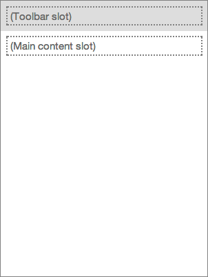
A page-with-toolbar
We start with a completely general-purpose <page-with-toolbar> element that defines a page with a toolbar. For the sake of argument, let’s suppose there’s something fancy about the presentation here — perhaps the toolbar starts out at one size, and then, as the user scrolls, the toolbar becomes smaller and permanently docked at the top of the page. Regardless of what exactly makes this interesting, let’s assume that interesting stuff entails web ninja tricks the average designer or developer doesn’t have the time to learn or implement for themselves. Significantly, some aspect of the toolbar behavior requires real code, not just CSS styling.This user interface pattern is completely general-purpose, so perhaps this template is found in an online library of general-purpose web components. The key extensibility feature here is that the element defines two slots which consumers of the <page-with-toolbar> element can fill in: a toolbar slot at the top, and a main content slot.
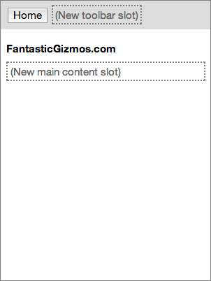
A store-page partially fills in a page-with-toolbar
This second image shows a <store-page> element that forms the standard base for all pages in our hypothetical online store. This element subclasses (extends) the general-purpose <page-with-toolbar> element above, so it automatically picks up the structure defined by that element and the fancy toolbar behavior. The designer of the store app can fill in some of that structure with elements that should be visible on every page in the store, such as a Home button and the story name. That is, the designer can partially fill in the slots defined by the base class: after adding the standard elements they want on every page, they can define new slots that can be filled in by instances or subclasses. The designer can also add visual styling and any behavior that should be available on every page in the app. When complete, this page both extends the above element, and is itself extensible. The element is specific to this company, but could be used by any team at the company working on their online store.
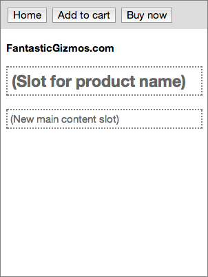
A product-page partially fills a store-page
The third image shows a <product-page> element. This extends the <store-page> element above to create a template for any page specifically in the app’s Products area. It fills in the toolbar slot with buttons that are only available on product pages. It also partially fills in the main content slot with a header for the product name. Finally, it adds any styling and behavior shared only by pages in the Products area. This product page element is still extensible, but an increasing portion of its interface and behavior are constrained.
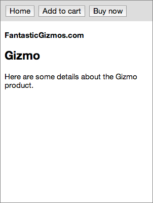
A completed instance of product-page
Finally, we have an example of a filled-in <product-page> element. Presumably the app fills in the page by obtaining product data and used that to populate various elements on the page (e.g., using data binding). Now the whole page has been filled in. By factoring our app’s design this way, we’ve created a good separation of concerns. The <page-with-toolbar> element doesn’t have to know anything about online stores. Conversely, the <store-page> element doesn’t have to know anything fancy toolbar behavior. The <product-page> designers don’t even need to know where the toolbar behavior comes from — all they need to know is that they get it for free. If the team at the company that owns the <store-page> element later decides to change the toolbar behavior, they can do so without the people who own the <product-page> element needing to do anything.
How does this work?
Until recently, it wasn’t possible for a custom element to fill in slots defined by a base class this way. An element’s template could contain a <shadow> element to ask its base class to render its stuff, but there wasn’t an easy way to pass content to the base class. Over the past couple of months, the Blink folks working on Shadow DOM features have just addressed this shortcoming with a new feature in the Shadow DOM spec and its Blink implementation. Technically speaking, the spec now allows a custom element to distribute nodes into a <shadow> insertion point and then reproject those nodes into an older shadow root. To see an example of how this works, see the live demo. At the time of this post, you’ll need to use Google Canary. You’ll also need to open chrome://flags and check “Enable experimental Web Platform features”. But this feature will likely make its way into production Chrome in the not-so-distant future, and get polyfilled by the Polymer project for other browsers. You can look through the code for the complete story, but the gist is this: if your element puts stuff inside a <shadow>, then that stuff will be passed to the base class as content. In our <page-with-toolbar> example element, the template contains a bit for the toolbar that looks like this:
<polymer-element name=”page-with-toolbar”>
<template>
  …
  <div id=”toolbar”>
    <content select=”.toolbar”></content>
  </div>
  …
</template>
</polymer-element>
That <content select=”.toolbar”> bit creates a slot that can be filled in
by instances — or by subclasses. When our <store-page> element subclasses
<page-with-toolbar>, it fills in that slot:
<polymer-element name=”store-page” extends=”page-with-toolbar”>
<template>
  <shadow>
    <span class=”toolbar”>
      <button>Home</button>
      <content select=”.toolbar”></content>
    </span>
    …
  </shadow>
</template>
</polymer-element>
Everything inside the store-page’s <shadow> will look to the page-with-toolbar base class like regular content. The page-with-toolbar’s toolbar slot will grab the span with class=”toolbar”, so the store-page’s Home button ends up in the toolbar. This lets store-page fill in the toolbar slot defined by page-with-toolbar. So that store-page itself can be extended, it in turn redefines that toolbar slot. Any toolbar buttons defined by subclasses of store-page (like the Add to Cart and Buy Now buttons in our product-page example) will get picked up by store-page’s toolbar slot, which is nestled inside page-with-toolbar’s toolbar slot.
Conclusion
Sometimes tiny differences in fundamental features, like this refinement to the <shadow> behavior, can open up new realms of possibility. While it doesn’t look like much, when combined with subclassing, you’ve just been given a powerful new tool for creating custom web elements. You’ll be able to create a wide range of new general-purpose elements that can be filled in by other people to suit their needs, and you’ll be able to fill in general-purpose elements created by others to suit your own needs. This is a huge step towards a vibrant ecosystem of web user interface components.
Beyond the expanded capabilities enabled here, I’m personally excited to see this change because I’ve been advocating for it for so long. I made a pitch for this on a visit to Google back in May 2012, and have promoted the idea in various forums since then. Other people like Scott Miles at Google also lobbied for the same thing. Special thanks are owed to Scott and to Dominic Cooney for contributing their own weight behind this idea and building the momentum required to make it happen; to Blink developer Hayato Ito for his work updating the spec and implementing the feature in Blink; and to Dimitri Glazkov for his careful oversight of the Shadow DOM spec. This is one spec change that was totally worth the trouble!