Paper can be faster than gadgets: a printable 2014 wall calendar for more efficient scheduling discussions
I’ve posted an app that lets you print a free wall calendar that can make your scheduling discussions go faster.
This is based on a printed calendar I created by hand for some years now. As I noted in that post, most wall calendars contain far too much junk. Most professionals I know track future events in an online calendar, not a wall calendar, so among other things, you may not actually need room to write on a wall calendar these days. But it is handy to be able to quickly answer questions about what day of the week a given date falls on, or vice versa. While you can whip out a mobile device and answer those questions, this is one case where I believe paper is faster than gadgets.
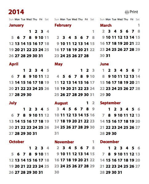
If you hang one of these on your office or conference room wall, I think you’ll find it useful. Each year, the startup I founded continues to print out a huge version of this calendar. (Tip: print it as a poster at Fedex). It works great for planning agile development sprints.
Optimizing for text legibility
I've tried to remove everything from this calendar that’s not strictly necessary to answer the key day/date scheduling questions. In particular, to improve legibility at a distance, I’ve tried to maximize the size of the date numbers so they can be read from far away. In the case where a single month requires six rows to display, I tuck the name of the month on the same row as the first week. Such a week can contain at most two dates on the far right. For example, in a typical U.S. calendar, this situation will come up in March 2014:

This trick lets me save a row for the tall months. Reclaiming that vertical space means the dates can be bigger and more legible at a distance.
A web component wall calendar
Instead of creating another one-off paper calendar this year, I realized I could use web components to create a live app without too much trouble. I already had a month calendar component (available for your own web components app via Bower). This component handles most of the date math, so it was fairly straightforward to just stick twelve instances of this component together, then apply some styling and glue logic, and end up with a live calendar app.
Generally speaking, that process is what I see most web app design and development moving toward: 1) a search for the best components, 2) some wrangling to glue them together, and 3) the application of styling to achieve the desired aesthetic. The core .html source for the app is tiny, weighing in at a little over 13K, and most of that is markup or CSS. Looking just at the JavaScript, there are only about 100 lines of code.
This web app is slightly unusual in that it focuses on printing, and the web isn’t particularly print-friendly. As far as I know, it’s hard to say: “Scale this text to be as tall as possible, subject to this layout, and still have everything fit on a page.” I ended up having to be most conservative than I would have liked, tuning the app for U.S.-centric “Letter” sized paper, which is shorter than the A4 paper used nearly everywhere else. Some space goes to waste which could have been used for more generous text sizing and spacing.
Falsehoods designers believe about time
A while back, Noah Sussman posted a great list of Falsehoods Programmers Believe About Time. Designers make most of the same incorrect assumptions as well. When I read a list like this, the lesson I take away is that most people (including me) shouldn’t be doing date math or creating UI elements that depend directly on it. Instead, they should be building on top of work others have done.
In this particular case, I’d already invested a bunch of time doing the work to be able to create a month calendar component that can easily be reused in other applications. This component avoids at least a few of the Falsehoods About Time listed above. E.g., given a date, to calculate the next date it doesn’t just add 24 hours, but does some gyrations to handle daylight saving time edge cases.
A designer or developer can hopefully drop this month calendar component into their web app and get a useful result with having to worry about (or even be aware of) the edge cases. The component itself undoubtedly has edge cases it fails to handle; there are Falsehoods About Time which aren't addressed yet. But the value of doing this as a component is that at least such work is spread across applications. Others can pitch in, and we can collaboratively work towards a bug-free solution.
Global support for hundreds of languages/locations
In past years, people have asked me for “international” versions of the wall calendar that have Monday as the first day of the week, instead of Sunday the way most Americans prefer it.
Since my month calendar component already leveraged the excellent Globalize.js library, it was actually easier for me to just let the user pick the language/location they want a calendar instead of having to hard-code support for specific formats. To simplify things, I created a component that wraps the Globalize list of supported language/location combinations. Then it was just a matter of wiring the language/location selector to the calendar, and — boom! — the calendar instantly got basic support for hundreds of language/locations.
The results are likely imperfect for many places, but for languages and locations with small populations, this printable wall calendar might already be the best solution out there.
If you’re like me, it’s a good five minutes fun to just pick cultures and see what their calendars might look like. I knew that cultures in the Americas tend to prefer having a calendar start on Sunday, while European cultures tend to prefer that weeks start on Monday. This holds true even when the same language is spoken in both hemispheres: see English (U.S.) vs English (U.K.), or Spanish (Mexico) vs Spanish (Spain). Until I started working with Globalize, though, I hadn’t realized that there were cultures that prefer weeks start on a Saturday. Here’s how March 2014 looks in three settings, English (U.S.), French (France), and Arabic (Saudi Arabia):
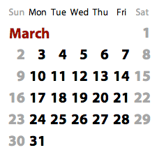
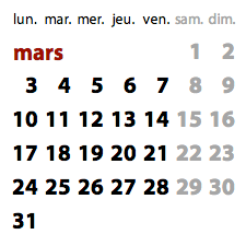
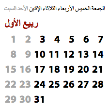
The start-of-week day, plus the month and day names, all come for free from Globalize. (I don’t actually know if people in Saudi Arabia want their months to look like the one above, but couldn’t find conclusive evidence of a single preferred style.)
Localize your UI and get fun surprises for free!
One last bit I thought was funny was rediscovering that, even when building atop a localization library or a localization-aware component, there are always surprises. I think this can be expressed as a law of UI design: For any user interface layout that looks good for most cultures, there exists a culture that will break that layout.
Here, the clever packing of the month name into the first row of a six-week month (as shown above) looks great in almost all the languages defined by Globalize. In that layout, the month name can span up to five columns’ worth of width, which is more than enough in most cases. But per the above law, there must exist at least one culture for which this layout does not work without modification. And such a culture does, in fact, exist:
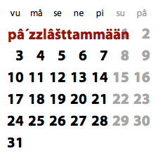
This is the Sami language of northern Scandinavia (“sääm´ǩiõll” in the calendar’s language/location list), in which the month of March is called “pâ´zzlâšttammään”. In a year like 2014, where March starts on a Saturday, the month name will overlap with the date for March 1st. To the 25,000 or so speakers of Sami: I’m very sorry about this.