If you hold or participate in project management discussions, consider
printing out this handy
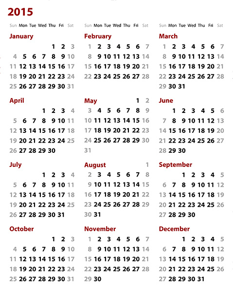
Printable Wall Calendar
that was quickly built with web components.
Jan constructed the original version of this calendar years ago to answer to
two simple calendar questions that often come up in planning discussions:
On which day of the week will a given date fall?
If some asks, “Can you ship this on June 15?”, you often want to know,
“Well, what day of the week is that? Is that even a weekday?”
What’s the date of a given day of the week?
Maybe your agile development group likes to make big releases on Mondays. If
you think you might release something two Mondays from now, what date is
that?
You can answer these questions by pulling out your phone, but sometimes paper
is faster than gadgets. A wall calendar can answer these questions nearly
instantly — as long as the calendar is well designed for this purpose. The
problem is that most wall calendars have way too much clutter. They’re
designed for a previous era in which people
wrote critical scheduling information on a paper wall calendar. No
one does that now. If instead you just want a calendar to answer the questions
above, its design can be much simpler. A simpler design means the actual
calendar dates can be bigger and easier to read across a room.
This calendar was built using the
basic-calendar-month
component, which takes care of all the date math, as well as handling
localized month and day names for a huge number of languages and regional
preferences. To build a year calendar was a simple matter of slapping 12 of
these month calendars together and applying some styling.
This review focuses not on a component, but an aspect of a component
called
basic-list-box. Component Kitchen released that component under the aegis of the
Basic Web Components
project. In our reviews, we want to avoid focusing too much on our own work,
but in this case we can happily feature a small but important contribution to
the project from developer
Marcy Sutton, a passionate
advocate for building an accessible web that can be used by everyone.
An important goal for Basic Web Components is to make all its components as
accessible as possible, for several reasons. You can use these components,
used as is, and reach the broadest possible range of users. You can extend
these components or incorporate them into your own components, and
automatically pick up a degree of support for accessibility. And you can refer
to these components as good examples of how to implement accessibility if
you’re creating a new component entirely from scratch. This work is just
beginning, and by no means perfect, but those are the goals. The good news is
that improvements are made to the components, anyone using those components
can easily pick up those improvements for free.
As a case in point, Marcy recently contributed an enhancement to
basic-list-box (and a lower-level base class called
basic-selector) that improves a list’s accessibility through the use of appropriate
ARIA features on the list
itself and the individual items in the list. The best part about an
improvement like this in a fundamental building block like basic-selector or
basic-list-box means that you can achieve better accessibility simply by using
those components. Even if you know nothing about ARIA and accessibility
technologies, using these components makes your app likely to be more
accessible than one constructed from a undifferentiated pile of divs.
Noteworthy:
Support for keyboard navigation, including Up/Down, Page Up/Down, Home/End.
Appropriate use of ARIA roles and other attributes means that users who are
blind or visually impaired can more easily identify and navigate a list of
items.
ordered-columns implements a packed column layout in the style of Pinterest.
Home pages with cards or modules that vary in height often use this layout to
pack the cards into columns: cards are assigned in order to whichever column
is currently the shortest. Such a layout is quick to compute, produces
visually engaging results, maximizes content that appears above the fold. It’s
a useful responsive design pattern that scales well from small displays to
very large ones. Many JavaScript libraries exist to implement this pattern,
but this is a great example of a pattern that can be delivered as a web
component.
Likes: Author
Steven Skelton
implements this column layout from the ground up as a Polymer web component.
We see many, many web components that simply wrap an existing JavaScript
library, and while that’s a fine way to start, it can also lead to bloat. He
also provides good documentation and numerous examples.
Nits: The component only works with <article> elements
(or elements with role=”article”); it would be nicer if it could work with any
type of child element. The component also moves all the children from the
light DOM (the outer page) to the component’s own shadow DOM. This effectively
removes the children from the main page, complicating styling and the handling
of events generated by the children.
Apologies that we were unable to get our demo working in IE. We try hard to
ensure all demos work in all mainstream browsers, but after spending too much
time wrestling with IE, we decided we’d rather publish this review than keep
debugging. Our issue likely had more to do with our own blog-with-demos
environment than with the ordered-columns component itself.
We love the elegant demos and documentation
filaraujo
is creating for his collection of web components. His akyral-modal component,
for example, addresses the common need to have a modal dialog or other UI
appear in front of other elements on the page. Several other modal components
exist, but none so nicely documented.
Likes:
The author’s taken care to give akyral-modal a bare-bones appearance. We find
often it easier to add our own visual style to a plain component than to try
to override a complex visual styling baked into a component’s default
appearance. We’re also a big fan of interactive demos that can be configured
on the fly. A demo is worth 10,000 words.
Sometimes the simplest approach works best. A number of registered web
components aim to handle the simple task of showing or soliciting a star
rating from a user using the now-convential set of 5 stars. On its own, a
5-star rating system can present serious issues, as users tend to offer
responses only at the extremes, but when managed well (adding users to add
comments to explain their response, etc.), such rating systems can be useful.
We tried three star rating components:
rating-element. We set aside this one aside when we found that it relies on an image
sprite; in this age of responsive design, using an image sprite feels a bit
antiquated.
polymer-star-rating. This is the most full-featured of the three components we looked at: in
particular, it’s the only one that lets you can use different symbols for
each rating, instead of always using a star. We had some difficulties
getting the component to work in a demo of our own. (We filed a bug.) There
were some other confusing points as well: the package name (polymer-
star-rating) doesn’t match the element name (star-rating), and the component
made assumptions about the location of dependencies like polymer.html that
didn’t match up with how we’d set up things. Still, we have high hopes for
this component.
x-rating. This is the simplest component of the lot, but it worked immediately and
did what we wanted. It uses Unicode code glyphs for the stars, which has the
advantage of picking up the current text color. The glyph unfortunately
isn’t a parameter you can change, but that’s nevertheless fine for the many
cases in which you might want to just use a standard star.
Obviously, with any head-to-head comparison like this, it’s hard to say which
component is really “best” for everyone. But for our quick experiment, we
found x-rating did the job simply and well, so that’s the component we’re
showing in the accompanying demo. Nice work,
hershmire!
The voice-elements component gives you easy access to the Web Speech API
natively supported (as of this writing) only in Chrome. This lets you both
read text aloud to the user, and perform basic voice recognition. Users can
quickly tire of repetitive spoken prompts, but voice playback might useful for
short alerts that incorporate dynamic content such as data coming from your
app.
Likes:
This supports multiple accents!
Dislikes:
None of the other browsers — Firefox, Safari, and IE — currently support the
Web Speech API. We still think components like this are an important
indication of the sort of power that components can put in anyone’s hand.
We’ve been eagerly tracking the state of the web components community since we
started Component Kitchen earlier this year. Over that time, it’s been
exciting to watch the number of web components registered with
Bower grow from about 40 to nearly 500 today.
The growth in our component catalog, however, has meant that it’s becoming
harder and harder for someone like you to find interesting components just by
browsing around. We want to help you find the interesting stuff. To do that,
we’re making three changes to our site:
We’ve begun dedicating a portion of our own time to sifting through the
catalog of web components for components that are notable in some way. We
want to highlight components that: solve a common user interface design
problem in a way that can be readily adopted in your own apps, demonstrate
how to write good web components, or show off what’s possible with web
components.
When we find a notable component, we’ll write a small capsule review for
it. Along with the review, we’ll craft our own little demo of that
component being used in some common way. This demo will let us confirm to
ourselves that the component works as advertised, and will also give us a
feel for the component’s strengths and weaknesses. We hope these little
demos will make it easier for you to see on a small scale what a component
might do for you.
We’ve redesigned our home page to feature these component reviews and
other news (like this post). The home page previously featured a complete
list of all registered components; that list is now available in the
Component Catalog
section of our site.
We’ve moved our temporary Component Kitchen blog feed in house. To get off
the ground, we’d hosted our blog on a separate site, but you’ll now find
it here. If you’d like to keep track of what’s happening in the world of
web components,
subscribe to our blog feed
at this new location.
We’ll be scouring the catalog of components for interesting work, but if
you’ve seen something you think is worth highlighting, please give us a shout
at
@ComponentK!
There are already a number of web components that wrap existing slide-based
presentation libraries; slide-page is notable for being written from the
ground up with web components. The
source code
for the core component is little more than a wiring together of existing parts
in a novel combination. That approach is, in fact, exactly right, and
component writing at its best! This component mostly adds sequential arrow
button navigation around Polymer’s core-animated-pages component. For the
buttons, it takes advantage of Google’s Material Design theme, specifically
the Paper floating action button.
Likes:
Great use of existing Polymer and Paper components; some keyboard navigation.
Dislikes:
The stock appearance shows a “Powered by Polymer” banner that few people are
going to want. It’s possible to turn it off through styling, but we like
components whose default appearance is the most practical starting point.
Many companies embed a hard-coded Google Map on their site to show, for
example, the location of their office. This component allows you to easily
create more dynamic maps. You could, for example, combine this with
geo-location
to show your user’s current location.
Likes:
You can combine the basic google-map component with the companion
google-map-directions to provide driving directions from the user
to your store, office, etc. This points toward a momentous promise: a domain-
specific markup language for creating interactive maps.
Dislikes:
In its current state, this component mostly wraps the Google Maps API, which
is powerful but rather complex if you’re not already familiar with it. In many
cases (e.g., a driving route with more than one stop), you’ll be forced to use
the more complex underlying API. Given Google’s preemince in mapping, we’d
love to see them push much further with this library of components.
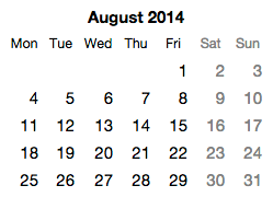
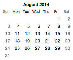
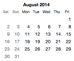
Which of these month calendars looks correct to you?
One of the calendars will probably look right. The other two will just look
wrong — like they’re mistakes, or maybe not even calendars. Setting aside the
basics of which language the words appear in, the simple question of which day
column should be first is a pretty key thing to get right in a calendar.
Depending on where you live or grew up, you may prefer that the first column
of a month calendar be Mondays, Sundays, or Saturdays. (It’s not completely
clear to me, but it appears there may be a community of people — speakers of
Dari, a dialect of Persian — who prefer that the first column be Fridays.) In
some languages, you may want the order of days to go right-to-left as well, in
which case you might want the first column to be the rightmost instead of the
leftmost.
These are the kinds of detail that are nearly impossible for a small team to
get right if they’re writing their own calendar from scratch, and yet the
world is filled with proprietary date picker widgets and calendars. Even if we
ignore the colossal waste of time represented by all those unnecessary
reinventions of the calendar, nearly all of those calendar implementations
will fail to localize basic details (such as the day shown as the first day of
the week). That is, if your app is using a calendar your team wrote from
scratch, there is a very good chance that a substantial number of users
outside your country and language view believe your calendar is just wrong.
And even if you picked up a calendar widget at some point, and it was pretty
good to begin with, if you copied that code, you likely haven't picked up
any of the bug fixes that were made in it since you made your copy.
This is yet another area where a broad web component ecosystem will
fundamentally change things. As discussed on this blog many times before, the
economics of user experience design and engineering will of course change. But
it’s also the case that sharing solid user interface components will finally
allow a broad swath of the software industry to finally get UI details right
on tricky things like calendars.
Open calendar components
With that goal in mind, I’ve contributed a set of calendar components to the
open source Basic Web Components project. Rather than producing a monolithic
monthly calendar component, these components follow the
guidelines for general-purpose components. Among other things, they are factored into components that each try to do
just a single thing well:
basic-calendar-day. This shows a single day in a week/month/year calendar. It has a date
attribute indicating which day to show. By default, it just shows the
number of that day in the month. That is, for August 1, 2014, it just
shows the text “1”. That’s all it does.
basic-calendar-week. This represents a single week. It’s just a collection of 7
basic-calendar-day components whose date attributes are synced to always
be one day apart. (The component takes special care to deal with things
like daylight savings time changes.) Which day of the week is shown first
can be changed to suit the user’s preferred location/culture (see
localization, below). By default, the days are shown in a horizontal
layout. This week is used in the month calendar component described below,
but could also also be used in other situations, such as an
infinitely-scrollable calendar.
basic-calendar-month-days. This shows the days of a single calendar month. This is constructed as
set of 4 to 6 instances of basic-calendar-week. (The number varies based
on the length of the month and the day of the week the month starts on.)
This component does not include any headings. By default, weeks are shown
in a vertical stack. This is done with default styling using a CSS
display: table-row-group rule, so that headings for the day columns can
easily be added and lined up correctly.
basic-days-of-week. This just shows the names for the days of the week in a given language
(see localization, below). The standard CSS styling for this has display:
table-row-group, so it can easily be matched up with a table-row or
table-row-group like basic-calendar-month-days. This component (and some
of the others here) doesn’t have the word “calendar” in its component name
because there might be some situations in which its useful outside the
context of a standard monthly calendar. It could serve, say, as a header
for a table showing weekly specials in a restaurant, or a chore chart of
kids, etc.
basic-month-name. This shows the name of the month in a given language (see localization,
below).
basic-month-and-year. This shows the name of the month and the year for a given date. The
order of the month name and year will match the direction of the text in a
right-to-left language like Arabic or Hebrew.
basic-calendar-month. This component puts together the above elements in a typical layout for
a month calendar. It stacks together headings for basic-month-and-year and
basic-days-of-week on top of a table of days provided by
basic-calendar-month-days. Setting the desired language/culture for this
component updates all the headings as well as the day shown as the first
day of the week.
Note that basic-calendar-month just renders a calendar. It doesn’t handle date
selection, although that could be added through creation of another component.
The month calendar is inline (directly on the page), but could be incorporated
into a dropdown for a typical dropdown date picker. Or you could combine
twelve instances of basic-calendar-month together to create a year calendar,
etc., etc.
Per the guidelines, these components include an absolutely minimal degree of
styling required to get something useful. You would undoubtedly want to style
these further to meet your own application’s brand. This should not be too
difficult, as web components can be styled through CSS.
Localization
To easily and accurately localize these calendar web components, they all make
use of the excellent
Globalize
project sponsored by jQuery. Globalize supports about 350 different languages,
locations, and cultures around the world. As it turns out, Globalize already
defines everything these components need: which day of the week should come
first, the names of the days, and the names of the months. So you can simply
tell Globalize to load the settings for a particular language/culture, and
then hand that pile of settings to the components, and they’ll set themselves
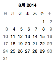
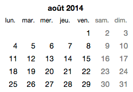
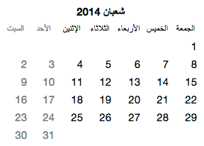
up appropriately. Here’s basic-month-calendar in Japanese, French (in France),
and Arabic (in Saudi Arabia):
Note that all text strings here (the month names, and the names for the days
of the week) are coming from Globalize, not from the application or the
calendar component. Globalize also supports different formats for the names of
the days of the week, so you can choose between full and abbreviated
headings.
[Aside: an open question for me is whether a calendar for a right-to-left
language should have the order of days go from right-to-left as well. I can
find some Arabic calendars, for example, that have the first day of the week
go in the rightmost column — but I can also find plenty of examples
that have the first day of the week in the leftmost column. And all the
examples of Hebrew calendars I can find have the first day of the week in
the leftmost column. This just goes to show that localization will always
surprise you and/or make your head hurt. The Globalize library doesn’t seem
to include information on the preferred direction of time, so for now these
components assume that left-to-right is generally acceptable.]
To simplify the localization of an app using these components, I’ve put
together a simple
basic-culture-selector
component that can dynamically load all the necessary settings based on the
user’s prefered language/culture. (This component can also be used
behind-the-scenes as a language/culture settings loader.) Components such as
these calendar components can then obtain the right settings from an instance
of basic-culture-selector directly through declarative data binding, with no
scripting required.
Reality check: Localization is an incredibly complex topic, and language- and
culture-aware components are just a part of a solution. To really do justice
to a global audience, an app team would need to take a comprehensive approach
to localization. Among other things, an app would need some reasonable way to
set a default language/culture (based on domain, geolocation, and/or apparent
IP location), a way to store language/culture preferences with a user account,
and a UI for switching language/culture. It would also help if browser vendors
participated in a good standard solution, so users aren’t forced to indicate
their preferred language/country/etc. on a site-by-site basis. Still, having
solid, localizable components is a good place to start.
A calendar as a meta-component
Many applications want to render data on a calendar: appointments,
availability, and so on. Most calendar widgets are useless in this regard
outside a narrowly-envisioned range of scenarios, because they make so many
assumptions about what data will be shown. Rather than viewing a week or month
calendar as having a particular visual representation, it seems more helpful
to consider a calendar as a skeleton or abstract structure capable of holding
components for each day whose only requirement is that they can accept a date.
How a day component renders that date is entirely up to them.
For this reason, the basic-calendar-month (and -week) components have a dayTag
attribute that can be used to provide the name of another component class that
will be used to render the individual days of the month/week. The default
dayTag value is basic-calendar-day, but this can be changed to any other
class. The only requirement on the interface of the indicated class is that it
have a property setter called “date” that accepts a JavaScript Date object.
This allows one to easily render arbitrary data into the structure of a
calendar.
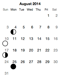
To show this in action, suppose we want to create a month calendar that shows
the major phases of the moon (new, first quarter, full, last quarter, or
nothing special). To keep things well factored, we start by creating a web
component called
moon-phase that just renders the phase of the moon as an icon. It doesn’t shown a
day number, or anything else, because we just want it to do one thing really
well.
We then create a custom day component, either from scratch or, for simplicity,
by extending the existing basic-calendar-day component. We drop an instance of
moon-phase into that class and add a day number so we get both the number and
the moon icon. Finally, we instantiate a basic-month-calendar and tell it to
use that class to render the days. Et voilà, with a teeny tiny bit of work, we
get a perpetual moon calendar. In U.S. English, this would look like:
By building on top of basic-month-calendar, this moon calendar not only avoids
the headaches of date math, it also automatically obtains a high degree of
localizability provided by the underlying Globalize library. As improvements
are made in the underlying basic-month-calendar, the moon calendar picks up
those improvements for free.
Here one web component (basic-month-calendar) allows a portion of its UI (the
rendering of days) to be overridden by accepting a second web component class
as input (via the dayTag attribute). The calendar is effectively an abstract
component or meta-component that defines a structure which is completely or
partially filled in by another class. This UI pattern parallels the use of
abstract classes in programming languages, and seems generally useful in many
other component situations.
Patterns like this may go a long way toward ensuring web components can really
be general purpose, and may ultimately be a key part of managing some of the
date math and localization complexities I’ve touched upon in this post. As
some of the calendar issues raised here suggest, it’s notoriously difficult to
do anything with dates and time, especially when one wants to localize a UI
across a wide range of languages and cultures. The best strategy for ensuring
that someone, somewhere has sufficient motivation to fix tricky issues is to
maximize the audience for the component. And one way to increase the size of
the audience is to make the component as general-purpose as possible. That is,
creating a wide range of scenarios for a general-purpose component like
basic-month-calendar seems critical to ensure that the component gets
sufficient attention to make it reliable in a wide range of circumstances.
[Speaking of open source contributions, I wanted to take this opportunity
to publicly thank a few people who offered early contributions to the
relatively new Basic Web Components project.
@OliverJAsh filed the first bug report on the project,
@PascalPrecht
submitted the first pull request, and
Dave Romero made the first edits to the wiki. Many thanks to the three of
them!]
Creating really good general-purpose components entails more work than
creating components for a single organization or product. You can find a good
list of
principles for great general-purpose components on the site for the open source basic-web-components
project, which is sponsored by Component Kitchen.
I recently contributed a small handful of web components to the
Basic Web Components project, and wanted to share some observations on how designing and
building UI with web components is going to be pretty different from how
you’ve created UI in the past.
The basic photo carousel as a component
The web components I was working on are related to the standard sort of photo
carousel you see everywhere on the web these days:
There are a zillion widgets out there that will create such a
thing for you, but they generally are connected to a specific web platform
(WordPress, SquareSpace, etc.) or require the use of JavaScript.
A carousel web component, on the other hand, lets you construct such a thing
in HTML alone. Here's a carousel component called
basic-sequence-navigator:
You can see a live demo of this component on the Component Kitchen page for
basic-sequence-navigator.
With a web component like this, you just drop your images (or other elements)
inside of the component, and you get a carousel. No styling or JavaScript
required. That’s pretty neat all on its own, but the component’s construction
is also interesting in its own right.
Building up from simple pieces
Existing carousel widgets suffer from trying to present a final solution.
Someone creates a single widget that handles everything: positioning the
images, transition effects, Next/Previous buttons, programmatic API, events,
and more. If there’s anything about that solution you don’t like, you often
have to reject the whole widget, or else spend time fiddling with widget
options in hopes of finding a combination of settings that does what you want.
Given that web components lets you build bigger things from smaller things, I
wanted to try to factor the carousel as a user experience into simple pieces
that you could combine in different ways. Even if you don’t like a specific
end result, you may nevertheless find some of the building blocks useful in
constructing your own solution.
For starters, consider that the Next/Previous buttons shown above are just a
specific answer to the general question: how does a user navigate the sequence
of images? Those buttons aren’t the only answer; there are other common
answers to this same question. An equally common answer might be putting
iOS-style dots along the bottom. So it’s silly to inextricably bundle the
general problem of providing navigation through a sequence with the
specific solution of Next/Previous buttons.
A better answer is to factor the general behavior into one component, and the
specific UI into a separate component. Accordingly, the
basic-sequence-navigator component is really based on a more fundamental
component called basic-sequence. The basic-sequence component handles
transitional effects like sliding or cross-fading, but
doesn’t include its own navigation UI.
That means you can wire up buttons of your own (or any UI you want) to drive
an instance of the more fundamental basic-sequence component. A crude example
of this would be:
You can see a demo of this solution on the page for
basic-sequence. It's not beautiful, but the point is that you can build up your
own UI from simple pieces. You don’t have to write all the code — you
get things like transition effects for free, for example. At the same time,
you can create exactly the user experience you want.
Maybe you don’t want any visible UI, you just want to show one image
after another on a timed basis. There’s a separate component called
basic-slideshow that does just that. It uses basic-sequence under the covers, but adds
the notion of a timer and play/stop semantics:
What if you don’t care about transition effects? You can build on top of an
even simpler component called
basic-modes. That just shows one child element at a time. And even that component is
built from simpler pieces, including
core-selector, a component that just keeps track of which item in a set is selected
(without defining what selecting means or looks like). And
that component is built from even simpler one. It’s components, all
the way down.
The idea here is that UI shouldn’t be delivered as a huge, final thing with a
million knobs on it to cover every conceivable situation. Instead, complex UI
should be built up from simpler pieces, each of which do a great job at one
thing.
Styleability
Of course, if you do like the general idea of Next and Previous buttons, but
want them to look different, you can use basic-sequence-navigator, and then
take advantage of the styleability built into web components. Using CSS rules,
you can override the default styling to better match your app’s aesthetics and
brand.
Get your UI for nothing, and accessibility for free
The basic-sequence-navigator component has a nice feature most carousels lack:
keyboard support! If you press the Left or Right key while the component has
focus, the carousel advances, respectively, to the previous or next image. To
help make that feature more discoverable, the component sports a focus
rectangle when it has the focus.
It’s kind of appalling the web is chock full of photo carousels that can’t be
navigated with a keyboard. That not only shuts out a big chunk of people for
whom a mouse or trackpad is hard to use, it’s also generally inconvenient for
everyone else. If you have to page back and forth through a sequence of
images, using Left/Right keys is simply much faster than moving a mouse or
finger back and forth to hit buttons on either side of the images.
Some web sites, generally big ones with large staff, can afford to spend time
getting accessibility details like keyboard navigation right. But I’m willing
to bet that the vast majority of photo carousels on the web today aren’t
accessible. The problem isn’t just awareness — the software industry has
been talking about accessibility for a long, long time. The deeper problem is
that the economics of implementing accessibility are often terrible. If
everyone has to implement something like keyboard support on their own, for
any single team, the predicted return on the investment is just too low to
pursue.
With web components, the economics could improve radically. Once people can
share UI solutions as components, even small improvements can potentially
benefit thousands of sites. So someone may find it worth their time to add
support for keyboard users, or users with low vision, or screen reader users,
and so on. Even if the original author of a component (say, me) knows just a
tiny bit about the accessibility implications of ARIA support, perhaps there’s
someone else out there (you?) who knows ARIA inside and out and can help get
it right.
The best part is that, if accessibility can be improved for free, everyone
benefits
even if most people won’t know they’re making their products more
accessible. Most people aren’t going to adopt a component like
<basic-sequence-navigator> because it has good accessibility. They’re
going to adopt it for selfish reasons — it’s going to save them time.
That’s fine! If someone can just drop in a photo carousel component because it
saves time implementing a design, they'll use it, even if they know
nothing about accessibility. They don’t even need to know that the
carousel's built-in accessibility features exist for the component to help
them support a broader audience of end users.
Some principles for general-purpose web components
If you’re interested in this approach, and want to learn more about creating
general-purpose web components, the Basic Web Components site has a page on
10 Principles for Great General-Purpose Components. If you’d like to take a shot at contributing to the project, the
home page provides a long list of components the world could use.
We recently added live demos to the Component Kitchen site for all components
that define a demo. Components with demos are marked on the
home page with a “DEMO” indicator, so
you can check out all the demos.
We always want to make it as easy as possible to find interesting components,
and demos are obviously the quickest way for someone to really understand what
a component can do for them. From the beginning of our work on the service,
we’ve wanted to host demos in situ on the pages we build for
components. We want to let a user looking for a component to see the demos
front and center (without having to link off to another site just to see a
demo) so they can quickly find what they’re looking for.
As described in our evolving
developer documentation, for the time being, you’ll need to host the demo at a site you maintain
(e.g., a GitHub Pages site for your component repository). You can then
include a @demo line in the comments at the top of your component’s main
source file to indicate where the component is. We’ve also seen some
conventions emerge whereby a component can imply the location of a demo, and
we try to detect when one of those conventions is in use as well, but use of
the @demo indicator is the clearest way to point to a demo.
We host demos within an iframe, but traditional iframes make it hard to
seamlessly incorporate content from another site, and in particular, the page
hosting the iframe can’t know how tall the framed page is. While it’s
fine for us to define a default height for a framed demo, we really want demo
authors to be able to control how tall the demo is. Some components, for
example, are really small, and so it’d be nicer to have the iframe showing the
demo be exactly the height it needs to be.
The standard way to securely communicate across a frame boundary is a facility
called window.postMessage(). That approach is somewhat cumbersome to use,
however. What we really wanted was a way to package that communication up. A
web component was, of course, a great way to do that! We’ve published our
solution through our companion of open source project,
basic-web-components.
There you’ll find two components that work together,
basic-seamless-iframe, which goes on the framing page, and
basic-framed-content, which goes on the framed page. These components cooperatively
communicate across the frame boundary so that, among other things, the outer
page can correctly adjust the height of the frame.
So, if you’d like to have your demo auto-size when shown on our site, just add
the basic-framed-content component to your project, and wrap the contents of
your demo in an instance of <basic-framed-content>. The latter won’t
interfere with anything when someone views the demo on your site, but when
someone views your component on Component Kitchen, the demo will communicate
its height to the framing page so that the demo looks just right.
Today we’re excited to publicly announce the launch of a preview edition of
our site at
https://component.kitchen.
At Component Kitchen, we think web components are fundamentally a great way to
create apps and sites that run across an enormous range of desktop and mobile
devices. We’re eager to help a mainstream audience learn about this
technology, and discover for themselves how this technology is going to
amplify their own creative capabilities as designers, developers, writers,
students, business people, and more.
Earlier this year, we observed that most of the material and tools related to
web components was intended for a fairly experienced technical audience. We
feel that, since web components extend what’s possible with plain HTML and
CSS, web components is actually fundamentally interesting to a much broader
audience: anyone who is comfortable editing HTML. That’s a lot of people!
Additionally, we believe that people creating web components are going to need
a range of services to help promote and distribute their components to a broad
audience that includes both hardcore developers and people who work at the
HTML level.
We’re starting with a few basics:
A
catalog of components
which have publicly registered for use. The preview release is quite basic,
but includes some interesting features such as image previews for many
components, and an ability to search the catalog.
A
discussion board for talking about web components. There are some other public forums for web components, but they focus on
a highly technical audience. Lots of people will want to use components who
have never heard of developer hangouts like GitHub or StackOverflow.
We have a number of interesting features ahead:
Live, interactive, configurable component demos. You can see an example on
the page for the basic-autosize-textarea component. This lets you play with the component and see how its
customization options will affect its appearance and behavior.
Web component hosting. Many people create HTML in environments like blogging
platforms or mainstream web hosting platforms that don’t allow complete
control over the site. If that’s you, we want to allow you to still take
advantage of web components by hosting the components on Component Kitchen.
Again, visit the
basic-autosize-textarea
component for an example of component hosting. Click the Copy to Clipboard
button, then paste the result in any HTML editor or environment. This will
paste in the <script> and <link> tags that let you use that
component from its hosted location on Component Kitchen.
Our core mission is to help people create great products using web components.
While we have many ideas for how we can do that, we’re most interested in
hearing from you. If you have questions or suggestions for our site, let us
know at @ComponentK on Twitter,
or on our discussion board.
This is going to be such an exciting time to work on the web!