Deconstructing the standard photo carousel into general-purpose web components
I recently contributed a small handful of web components to the Basic Web Components project, and wanted to share some observations on how designing and building UI with web components is going to be pretty different from how you’ve created UI in the past.
The basic photo carousel as a component
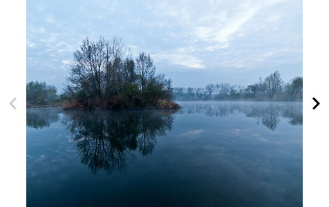
The web components I was working on are related to the standard sort of photo carousel you see everywhere on the web these days:
There are a zillion widgets out there that will create such a
thing for you, but they generally are connected to a specific web platform
(WordPress, SquareSpace, etc.) or require the use of JavaScript.
A carousel web component, on the other hand, lets you construct such a thing in HTML alone. Here's a carousel component called basic-sequence-navigator:
<basic-sequence-navigator>
<img
src=”image1.jpg”>
<img src=”image2.jpg”>
<img src=”image3.jpg”>
…
</basic-sequence-navigator>
You can see a live demo of this component on the Component Kitchen page for basic-sequence-navigator.
With a web component like this, you just drop your images (or other elements) inside of the component, and you get a carousel. No styling or JavaScript required. That’s pretty neat all on its own, but the component’s construction is also interesting in its own right.
Building up from simple pieces
Existing carousel widgets suffer from trying to present a final solution. Someone creates a single widget that handles everything: positioning the images, transition effects, Next/Previous buttons, programmatic API, events, and more. If there’s anything about that solution you don’t like, you often have to reject the whole widget, or else spend time fiddling with widget options in hopes of finding a combination of settings that does what you want.
Given that web components lets you build bigger things from smaller things, I wanted to try to factor the carousel as a user experience into simple pieces that you could combine in different ways. Even if you don’t like a specific end result, you may nevertheless find some of the building blocks useful in constructing your own solution.
For starters, consider that the Next/Previous buttons shown above are just a specific answer to the general question: how does a user navigate the sequence of images? Those buttons aren’t the only answer; there are other common answers to this same question. An equally common answer might be putting iOS-style dots along the bottom. So it’s silly to inextricably bundle the general problem of providing navigation through a sequence with the specific solution of Next/Previous buttons.
A better answer is to factor the general behavior into one component, and the specific UI into a separate component. Accordingly, the basic-sequence-navigator component is really based on a more fundamental component called basic-sequence. The basic-sequence component handles transitional effects like sliding or cross-fading, but doesn’t include its own navigation UI.
That means you can wire up buttons of your own (or any UI you want) to drive an instance of the more fundamental basic-sequence component. A crude example of this would be:
<button
onclick="document.querySelector('#sequence').previous()">Previous</button>
<button
onclick="document.querySelector('#sequence').next()">Next</button>
<basic-sequence id="sequence">
<img src=”image1.jpg”>
<img src=”image2.jpg”>
<img src=”image3.jpg”>
…
</basic-sequence>
You can see a demo of this solution on the page for basic-sequence. It's not beautiful, but the point is that you can build up your own UI from simple pieces. You don’t have to write all the code — you get things like transition effects for free, for example. At the same time, you can create exactly the user experience you want.
Maybe you don’t want any visible UI, you just want to show one image after another on a timed basis. There’s a separate component called basic-slideshow that does just that. It uses basic-sequence under the covers, but adds the notion of a timer and play/stop semantics:
<basic-slideshow effect=”reveal”>
<img src=”image1.jpg”>
<img src=”image2.jpg”>
<img src=”image3.jpg”>
…
</basic-slideshow>
What if you don’t care about transition effects? You can build on top of an even simpler component called basic-modes. That just shows one child element at a time. And even that component is built from simpler pieces, including core-selector, a component that just keeps track of which item in a set is selected (without defining what selecting means or looks like). And that component is built from even simpler one. It’s components, all the way down.
The idea here is that UI shouldn’t be delivered as a huge, final thing with a million knobs on it to cover every conceivable situation. Instead, complex UI should be built up from simpler pieces, each of which do a great job at one thing.
Styleability
Of course, if you do like the general idea of Next and Previous buttons, but want them to look different, you can use basic-sequence-navigator, and then take advantage of the styleability built into web components. Using CSS rules, you can override the default styling to better match your app’s aesthetics and brand.
Get your UI for nothing, and accessibility for free
The basic-sequence-navigator component has a nice feature most carousels lack: keyboard support! If you press the Left or Right key while the component has focus, the carousel advances, respectively, to the previous or next image. To help make that feature more discoverable, the component sports a focus rectangle when it has the focus.
It’s kind of appalling the web is chock full of photo carousels that can’t be navigated with a keyboard. That not only shuts out a big chunk of people for whom a mouse or trackpad is hard to use, it’s also generally inconvenient for everyone else. If you have to page back and forth through a sequence of images, using Left/Right keys is simply much faster than moving a mouse or finger back and forth to hit buttons on either side of the images.
Some web sites, generally big ones with large staff, can afford to spend time getting accessibility details like keyboard navigation right. But I’m willing to bet that the vast majority of photo carousels on the web today aren’t accessible. The problem isn’t just awareness — the software industry has been talking about accessibility for a long, long time. The deeper problem is that the economics of implementing accessibility are often terrible. If everyone has to implement something like keyboard support on their own, for any single team, the predicted return on the investment is just too low to pursue.
With web components, the economics could improve radically. Once people can share UI solutions as components, even small improvements can potentially benefit thousands of sites. So someone may find it worth their time to add support for keyboard users, or users with low vision, or screen reader users, and so on. Even if the original author of a component (say, me) knows just a tiny bit about the accessibility implications of ARIA support, perhaps there’s someone else out there (you?) who knows ARIA inside and out and can help get it right.
The best part is that, if accessibility can be improved for free, everyone benefits even if most people won’t know they’re making their products more accessible. Most people aren’t going to adopt a component like <basic-sequence-navigator> because it has good accessibility. They’re going to adopt it for selfish reasons — it’s going to save them time.
That’s fine! If someone can just drop in a photo carousel component because it saves time implementing a design, they'll use it, even if they know nothing about accessibility. They don’t even need to know that the carousel's built-in accessibility features exist for the component to help them support a broader audience of end users.
Some principles for general-purpose web components
If you’re interested in this approach, and want to learn more about creating general-purpose web components, the Basic Web Components site has a page on 10 Principles for Great General-Purpose Components. If you’d like to take a shot at contributing to the project, the home page provides a long list of components the world could use.