Delegate brain-melting date math and localization to general-purpose calendar web components
Which of these month calendars looks correct to you?
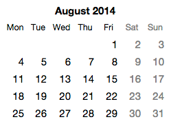
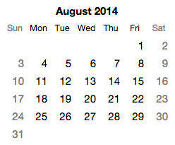
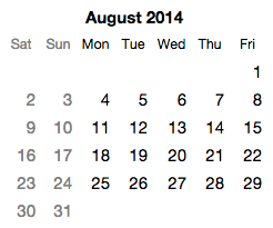
One of the calendars will probably look right. The other two will just look wrong — like they’re mistakes, or maybe not even calendars. Setting aside the basics of which language the words appear in, the simple question of which day column should be first is a pretty key thing to get right in a calendar. Depending on where you live or grew up, you may prefer that the first column of a month calendar be Mondays, Sundays, or Saturdays. (It’s not completely clear to me, but it appears there may be a community of people — speakers of Dari, a dialect of Persian — who prefer that the first column be Fridays.) In some languages, you may want the order of days to go right-to-left as well, in which case you might want the first column to be the rightmost instead of the leftmost.
These are the kinds of detail that are nearly impossible for a small team to get right if they’re writing their own calendar from scratch, and yet the world is filled with proprietary date picker widgets and calendars. Even if we ignore the colossal waste of time represented by all those unnecessary reinventions of the calendar, nearly all of those calendar implementations will fail to localize basic details (such as the day shown as the first day of the week). That is, if your app is using a calendar your team wrote from scratch, there is a very good chance that a substantial number of users outside your country and language view believe your calendar is just wrong. And even if you picked up a calendar widget at some point, and it was pretty good to begin with, if you copied that code, you likely haven't picked up any of the bug fixes that were made in it since you made your copy.
This is yet another area where a broad web component ecosystem will fundamentally change things. As discussed on this blog many times before, the economics of user experience design and engineering will of course change. But it’s also the case that sharing solid user interface components will finally allow a broad swath of the software industry to finally get UI details right on tricky things like calendars.
Open calendar components
With that goal in mind, I’ve contributed a set of calendar components to the open source Basic Web Components project. Rather than producing a monolithic monthly calendar component, these components follow the guidelines for general-purpose components. Among other things, they are factored into components that each try to do just a single thing well:
-
basic-calendar-day. This shows a single day in a week/month/year calendar. It has a date attribute indicating which day to show. By default, it just shows the number of that day in the month. That is, for August 1, 2014, it just shows the text “1”. That’s all it does.
-
basic-calendar-week. This represents a single week. It’s just a collection of 7 basic-calendar-day components whose date attributes are synced to always be one day apart. (The component takes special care to deal with things like daylight savings time changes.) Which day of the week is shown first can be changed to suit the user’s preferred location/culture (see localization, below). By default, the days are shown in a horizontal layout. This week is used in the month calendar component described below, but could also also be used in other situations, such as an infinitely-scrollable calendar.
-
basic-calendar-month-days. This shows the days of a single calendar month. This is constructed as set of 4 to 6 instances of basic-calendar-week. (The number varies based on the length of the month and the day of the week the month starts on.) This component does not include any headings. By default, weeks are shown in a vertical stack. This is done with default styling using a CSS display: table-row-group rule, so that headings for the day columns can easily be added and lined up correctly.
-
basic-days-of-week. This just shows the names for the days of the week in a given language (see localization, below). The standard CSS styling for this has display: table-row-group, so it can easily be matched up with a table-row or table-row-group like basic-calendar-month-days. This component (and some of the others here) doesn’t have the word “calendar” in its component name because there might be some situations in which its useful outside the context of a standard monthly calendar. It could serve, say, as a header for a table showing weekly specials in a restaurant, or a chore chart of kids, etc.
-
basic-month-name. This shows the name of the month in a given language (see localization, below).
-
basic-month-and-year. This shows the name of the month and the year for a given date. The order of the month name and year will match the direction of the text in a right-to-left language like Arabic or Hebrew.
-
basic-calendar-month. This component puts together the above elements in a typical layout for a month calendar. It stacks together headings for basic-month-and-year and basic-days-of-week on top of a table of days provided by basic-calendar-month-days. Setting the desired language/culture for this component updates all the headings as well as the day shown as the first day of the week.
Note that basic-calendar-month just renders a calendar. It doesn’t handle date selection, although that could be added through creation of another component. The month calendar is inline (directly on the page), but could be incorporated into a dropdown for a typical dropdown date picker. Or you could combine twelve instances of basic-calendar-month together to create a year calendar, etc., etc.
Per the guidelines, these components include an absolutely minimal degree of styling required to get something useful. You would undoubtedly want to style these further to meet your own application’s brand. This should not be too difficult, as web components can be styled through CSS.
Localization
To easily and accurately localize these calendar web components, they all make use of the excellent Globalize project sponsored by jQuery. Globalize supports about 350 different languages, locations, and cultures around the world. As it turns out, Globalize already defines everything these components need: which day of the week should come first, the names of the days, and the names of the months. So you can simply tell Globalize to load the settings for a particular language/culture, and then hand that pile of settings to the components, and they’ll set themselves up appropriately. Here’s basic-month-calendar in Japanese, French (in France), and Arabic (in Saudi Arabia):
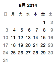
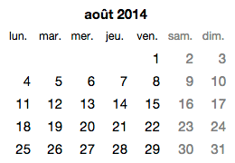
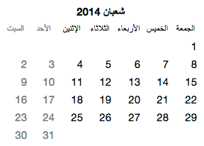
Note that all text strings here (the month names, and the names for the days of the week) are coming from Globalize, not from the application or the calendar component. Globalize also supports different formats for the names of the days of the week, so you can choose between full and abbreviated headings.
[Aside: an open question for me is whether a calendar for a right-to-left language should have the order of days go from right-to-left as well. I can find some Arabic calendars, for example, that have the first day of the week go in the rightmost column — but I can also find plenty of examples that have the first day of the week in the leftmost column. And all the examples of Hebrew calendars I can find have the first day of the week in the leftmost column. This just goes to show that localization will always surprise you and/or make your head hurt. The Globalize library doesn’t seem to include information on the preferred direction of time, so for now these components assume that left-to-right is generally acceptable.]
To simplify the localization of an app using these components, I’ve put together a simple basic-culture-selector component that can dynamically load all the necessary settings based on the user’s prefered language/culture. (This component can also be used behind-the-scenes as a language/culture settings loader.) Components such as these calendar components can then obtain the right settings from an instance of basic-culture-selector directly through declarative data binding, with no scripting required.
Reality check: Localization is an incredibly complex topic, and language- and culture-aware components are just a part of a solution. To really do justice to a global audience, an app team would need to take a comprehensive approach to localization. Among other things, an app would need some reasonable way to set a default language/culture (based on domain, geolocation, and/or apparent IP location), a way to store language/culture preferences with a user account, and a UI for switching language/culture. It would also help if browser vendors participated in a good standard solution, so users aren’t forced to indicate their preferred language/country/etc. on a site-by-site basis. Still, having solid, localizable components is a good place to start.
A calendar as a meta-component
Many applications want to render data on a calendar: appointments, availability, and so on. Most calendar widgets are useless in this regard outside a narrowly-envisioned range of scenarios, because they make so many assumptions about what data will be shown. Rather than viewing a week or month calendar as having a particular visual representation, it seems more helpful to consider a calendar as a skeleton or abstract structure capable of holding components for each day whose only requirement is that they can accept a date. How a day component renders that date is entirely up to them.
For this reason, the basic-calendar-month (and -week) components have a dayTag attribute that can be used to provide the name of another component class that will be used to render the individual days of the month/week. The default dayTag value is basic-calendar-day, but this can be changed to any other class. The only requirement on the interface of the indicated class is that it have a property setter called “date” that accepts a JavaScript Date object. This allows one to easily render arbitrary data into the structure of a calendar.
To show this in action, suppose we want to create a month calendar that shows the major phases of the moon (new, first quarter, full, last quarter, or nothing special). To keep things well factored, we start by creating a web component called moon-phase that just renders the phase of the moon as an icon. It doesn’t shown a day number, or anything else, because we just want it to do one thing really well.
We then create a custom day component, either from scratch or, for simplicity, by extending the existing basic-calendar-day component. We drop an instance of moon-phase into that class and add a day number so we get both the number and the moon icon. Finally, we instantiate a basic-month-calendar and tell it to use that class to render the days. Et voilà, with a teeny tiny bit of work, we get a perpetual moon calendar. In U.S. English, this would look like:
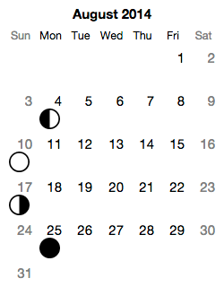
[See the live demo]
By building on top of basic-month-calendar, this moon calendar not only avoids the headaches of date math, it also automatically obtains a high degree of localizability provided by the underlying Globalize library. As improvements are made in the underlying basic-month-calendar, the moon calendar picks up those improvements for free.
Here one web component (basic-month-calendar) allows a portion of its UI (the rendering of days) to be overridden by accepting a second web component class as input (via the dayTag attribute). The calendar is effectively an abstract component or meta-component that defines a structure which is completely or partially filled in by another class. This UI pattern parallels the use of abstract classes in programming languages, and seems generally useful in many other component situations.
Patterns like this may go a long way toward ensuring web components can really be general purpose, and may ultimately be a key part of managing some of the date math and localization complexities I’ve touched upon in this post. As some of the calendar issues raised here suggest, it’s notoriously difficult to do anything with dates and time, especially when one wants to localize a UI across a wide range of languages and cultures. The best strategy for ensuring that someone, somewhere has sufficient motivation to fix tricky issues is to maximize the audience for the component. And one way to increase the size of the audience is to make the component as general-purpose as possible. That is, creating a wide range of scenarios for a general-purpose component like basic-month-calendar seems critical to ensure that the component gets sufficient attention to make it reliable in a wide range of circumstances.
[Speaking of open source contributions, I wanted to take this opportunity to publicly thank a few people who offered early contributions to the relatively new Basic Web Components project. @OliverJAsh filed the first bug report on the project, @PascalPrecht submitted the first pull request, and Dave Romero made the first edits to the wiki. Many thanks to the three of them!]