The latest Elix 8.0 release now lets you control how the Elix components are registered as custom elements. This post provides a summary of the complex topic of registering elements, then describes how Elix 8.0 addresses those complexities.
Background: Why you need to register components as custom elements
The browser standard for Custom Elements lets you create your own HTML elements in two steps: 1) create a class that inherits from HTMLElement, and 2) register that class with the browser using a unique tag name. You can then instantiate the class:
classMyElementextendsHTMLElement {} // Step 1: create class
customElements.define("my-element", MyElement); // Step 2: register classconst myElement = newMyElement(); // Ready for use
The registered tag name (above, my-element) gives the browser a way to represent instances of the element in the DOM, where all element nodes must have a tag (a.k.a. localName). That tag lets the browser know how it should represent the node in HTML representations, such as in the innerHTML of some containing element. The requirement that a class only gets registered once ensures a clear mapping from DOM to HTML.
That said, the fact that each class must be registered once — and only once — creates a burden for component users. It would be great if, instead, you could define components like the ones in the Elix library in one step:
importCarouselfrom"elix/src/Carousel.js"; // Import classconst carousel = newCarousel(); // Use class
but this will throw if the element class hasn’t been registered.
Aside: the thrown exception is “Illegal constructor” in Chrome/Edge/Firefox, and “new.target is not a valid custom element constructor” in Safari. I find both of those wordings to be extremely unhelpful. The problem has nothing to do with your constructor, but with your failure to invoke customElements.define. I don’t hit that exception very often, but every time I do, I waste time looking for the problem in the wrong place before I finally remember why that exception occurs.
Registration can be particularly bothersome if you yourself instantiate components using only constructors. Most of the code we’ve written that creates components happens to do so through their constructors. We’re never actually using the components’ tags, so it’s a chore to have to worry about them. We wish the browser would just generate a unique tag for any component class that’s instantiated without registration. (Someone else has proposed support for anonymous custom elements, and while I think that proposal is very likely to be shot down, I’ve come to think it would be nice to have.)
Auto-registering component modules
To avoid the hassle of registering every component, Elix components in releases prior to 8.0 followed a common auto-registration pattern. Each component class was defined in a separate JavaScript module; the default export of each module was the corresponding component class. When you imported one of those modules, you obtained a reference to that class and as a side effect that class was registered with the browser.
For example, the Carousel class in Elix 7.0 was defined in a module /src/Carousel.js that conceptually looked like this:
// Define and export the class.exportdefaultclassCarouselextendsHTMLElement { ... }
// Register the class as a side-effect.
customElements.define('elix-carousel', Carousel);
So if you imported that module like this:
importCarouselfrom"elix/src/Carousel.js";
the import would return the Carousel component class and as a side effect register the Carousel class with the tag elix-carousel.
That was rather convenient, especially as it let you load a module with a script tag and then immediately use that component entirely in HTML, without having to write any JavaScript:
<scripttype="module"src="./node_modules/elix/src/Carousel.js"></script><elix-carousel><!-- Carousel items such as img elements go here. --><imgsrc="image1.jpg" /><imgsrc="image2.jpg" /><imgsrc="image3.jpg" /></elix-carousel>
Problems with auto-registering components
But while auto-registering components are convenient, they lead to some problems:
It seems like a bad idea to have importing a module make changes to global state like the custom element registry. At the very least, it can be surprising.
Given a component module, there’s currently no standard way of predicting what tag name will be used to register that component as a custom element. Likewise, given a defined component class, there’s no way of asking the browser whether that class has already been registered and, if so, what tag was used to register it. (An open issue tracks whether a new API should be added to find out the tag which which a class was registered.)
Forcing the use of a specific tag name creates an undesirable point of entanglement between a project and a component. Imagine that you’re working on the FooBar project and would like to use the Elix Carousel component. You’d like the flexibility to swap out which carousel you’re using at some later point in time. But if Elix Carousel registers itself as “elix-carousel”, then you need to bake that tag everywhere into your HTML. It’s be better if you could register the Elix Carousel as “foo-bar-carousel”, and use that in your HTML so that you can more easily migrate between carousel implementations.
It doesn’t allow multiple component versions to be loaded at the same time. People who work on big projects know that it can be extremely difficult to force every team to use the exact same version of a library. As a result, the lack of support for multiple versions can quickly become a deal-breaker for any UI component model. This is a particularly critical issue for small, general-purpose components (like buttons, combo boxes, and context menus) that might make their way into many larger components in a single big project.
It doesn’t allow the same component to be used in multiple bundles. Even when two parts of your project are using the same component, it’s possible that your project’s bundling architecture will make it challenging to actually reference the same instance of the component module. If that module gets bundled into two different packages, they can’t both be loaded. Arguably that just means you need a better bundling strategy, but it’s nevertheless unfortunate that a limitation of the low-level customElements DOM API is forcing high-level constraints on how you build your application.
One complicating factor with duplicate element registration is that there’s bad locality of reference. Imagine you’re working on a big project, and manage to trigger a situation in which a component is trying to register itself twice. The second attempt to register the class will throw an exception — but depending on the load order of the modules, that new code might happen to get loaded first. If that happens, the exception will be thrown by the old code when it tries to load later. That’s really surprising! “This old code worked fine before. I changed something else far away in this new file, and yet I somehow managed to break the previously-working old code.”
Anticipating scoped custom element registries
The proposal for scoped custom element registries will let you register a class with a tag that’s local to your own code. That will definitely be a huge help for the versioning/bundling conflicts described above.
When that feature arrives, auto-registering components could be a minor nuisance, because an auto-registered component might get registered twice: once when the module auto-registers in the global custom element namespace, and a second time when your code registers the class in a scoped custom element registry. If you consistently use scoped registries, registrations in the global registry are unnecessary, and just present an opportunity for potential problems.
If a component library like Elix wants to be ready for scoped custom element registries, it’s worth figuring out how to move away from having all components auto-register themselves.
Elix component modules, now in two flavors: normal and auto-registering
Given the wide variety of situations and architectures in which web components may be useful, Elix 8.0 supports both the convenience of auto-registration and the freedom to control registration yourself. To this end, all Elix component modules now come in two flavors:
The modules in the project’s /src folder now only export a component class, and do not register that class as a custom element. You have to register it yourself. These /src modules are intended for use in apps that have some complexity, and where you want complete control over your components.
The modules in the project’s new /define folder export the corresponding class and register that class as a custom element. Example: elix/define/Carousel.js exports the Carousel class and registers it with the tag elix-carousel. The tag name is always the prefix elix- followed by the class name in kebab case, so ComboBox becomes elix-combo-box. These /define modules are a convenient way to use components in straightforward apps where you’re more concerned about getting things done than having complete control, and the constraints of auto-registration are acceptable.
This is, unfortunately, a breaking change for people that use Elix components in their projects. Generally speaking, if they want to preserve the previous auto-registering behavior, they need to replace /src in their component import paths with /define. The other modules in the library — for the extensive set of component mixins and helpers — aren’t implicated in component registration, so still exist only in the /src folder as before. If you are migrating an Elix project, see the release notes for details on migrating to 8.0.
Likewise, the pure HTML use of an Elix component should now reference the /define modules, like so:
<scripttype="module"src="./node_modules/elix/define/Carousel.js"></script><elix-carousel><!-- Carousel items such as img elements go here. --></elix-carousel>
These /define modules each simply import the corresponding /src module, derive a trivial subclass, export that, and register it. So the source for /define/Carousel.js is:
Why does this code derive a trivial subclass before registering it? Read on…
Registering components with your own custom element tag names
In any case where you are importing a component from a module, it seems like a good practice to not assume you are the only one who will ever want to register that component. If you try to do the obvious thing:
that will run — but then you are effectively declaring that you will always be the only one who will ever want to register that class.
That assumption could someday cause problems. If someone working in a different part of your project (or maybe you yourself, later) also tries to register Carousel as a component class, then one of you will lose the registration race, and end up trying to register a class that’s already been registered. As noted earlier, that will throw an exception whose poor locality of reference may make it hard to diagnose.
So a reasonable defensive pattern might be to always define a trivial subclass and register that:
// Defensive approach, lets other people register Carousel tooimportCarouselfrom"elix/src/Carousel.js";
classMyCarouselextendsCarousel {}
customElements.define("my-carousel", MyCarousel);
If you compare this with the code in the previous section, you’ll see this is, in fact, the technique used by the Elix auto-registering components. That means you can decide to register the Elix Carousel as my-carouseland still let someone else import the elix-carousel auto-registering component from the Elix /define folder. Since both are registering trivial subclasses, those two subclasses can be registered in the global custom element registry without triggering exceptions.
If everyone on your project does the same with the components they import, you should always be able register a custom element class using the tag name you want.
We can use the same technique to load different versions of the same Elix component. We’ve posted a sample showing an Elix 7.0 component and an Elix 8.0 component running side-by-side.
We’ve made breaking changes in the new Elix 7.0.0 to solidify our component APIs. Specifically, our components no longer expose internal methods or properties with string names.
As usual, we’re much less concerned with promoting our own library as a general-purpose component framework than we are in delivering great web components. We’re documenting the thinking behind this change in this post for the benefit of anyone creating components with an eye towards reusability outside their organization.
A component’s framework should be an invisible implementation detail
We try to write all our components so that they conform to a high quality bar. We use the native HTML elements as a reference point to measure how robust and flexible our components should be. We call that approach the Gold Standard checklist for web components.
To meet that standard, we’ve concluded that it’s important for a web component to expose only its officially supported public API. That’s what the native HTML elements do! So that’s what we want to do too.
But like most web component frameworks today, Elix components previously exposed a number of internal methods like render and internal properties like state. Virtually all component libraries today do the same thing, exposing a substantial number of methods and properties which are only ever intended to be invoked internally.
In hindsight, exposing framework internals that way (even prefixed with an underscore, etc.) seems like a bad idea:
Component users might decide to hack around component limitations by directly invoking internal methods or properties. The framework implicitly becomes part of the component’s public API, whether or not that’s what the component authors intended.
The framework used to create a component should be an invisible implementation detail. If a component author decides to someday change the framework in which they create a given component, they should be able to do so without any fear that they’re going to break someone who — rightly or wrongly — decided to depend on inadvertently-exposed component internals.
Exposing framework details makes a custom element feel kludgey compared to native HTML elements. This is a softer issue, but might nevertheless contribute to a lack of confidence in the quality of a component. If native elements don’t expose their details, we don’t want our components to do that either.
Deliberately exposing only those members that belong in the public API is good practice for any library. To date, the fact that component authors haven’t worried about exposing framework internals most likely indicates that authors have been primarily focused on using their own components than on sharing them. But if web components are to find general reuse in a wide audience, authors should carefully review exactly what is visible in a component’s public API.
Hardening our component APIs
With the above in mind, we’ve made breaking changes in Elix to better hide all internal methods and properties.
Elix has long used Symbol keys instead of strings to identify various internal members that one mixin or class may need to invoke in another mixin or class. Using symbols that way hides those methods and properties from the debug console’s auto-complete list. Those symbols are still accessible via Object.getOwnPropertySymbols, but someone has to work harder to do that. Symbols also avoid potential name conflicts if a component user wants to extend a custom element with their own data or methods.
We’re expanding this use of Symbol keys to better hide all methods and properties which are meant for internal use only.
All internal operations, like the setState or render methods, and the state property, are now behind symbols.
We’ve renamed our collection of Symbol keys from symbols.js (which focused on the data type) to internal.js (which focuses on the intended purpose). So an element accesses its state via this[internal.state].
We’ve renamed our shorthand function that looks up shadow elements by ID. Previously, you could write this.$.foo to get a reference to a shadow element with the ID “foo”. The equivalent new code is this[internal.ids].foo.
A simple example component in Elix 6.0 and earlier exposed some component internals with string names:
import * as symbols from"elix/src/symbols.js";
import * as template from"elix/src/template.js";
importReactiveElementfrom"elix/src/ReactiveElement.js";
// Create a native web component with reactive behavior.classIncrementDecrementextendsReactiveElement {
componentDidMount() {
super.componentDidMount();
this.$.decrement.addEventListener("click", () => {
this.value--;
});
this.$.increment.addEventListener("click", () => {
this.value++;
});
}
// This property becomes the value of this.state at constructor time.getdefaultState() {
returnObject.assign(super.defaultState, {
value: 0,
});
}
// Render the current state to the DOM.
[symbols.render](changed) {
super[symbols.render](changed);
if (changed.value) {
this.$.value.textContent = this.state.value;
}
}
// This template is cloned to create the shadow tree for a new element.
get [symbols.template]() {
return template.html`<buttonid="decrement">-</button><spanid="value"></span><buttonid="increment">+</button>
`;
}
// Provide a public property that gets/sets state.getvalue() {
returnthis.state.value;
}
setvalue(value) {
this.setState({ value });
}
}
In Elix 7.0, all internals are now identified with Symbol keys obtained from internal.js, so the above example now looks like:
import * as internal from"elix/src/internal.js";
import * as template from"elix/src/template.js";
importReactiveElementfrom"elix/src/ReactiveElement.js";
// Create a native web component with reactive behavior.classIncrementDecrementextendsReactiveElement {
[internal.componentDidMount]() {
super[internal.componentDidMount]();
this[internal.ids].decrement.addEventListener("click", () => {
this.value--;
});
this[internal.ids].increment.addEventListener("click", () => {
this.value++;
});
}
// This sets the component's initial state at constructor time.
get [internal.defaultState]() {
returnObject.assign(super[internal.defaultState], {
value: 0,
});
}
// Render the current state to the DOM.
[internal.render](changed) {
super[internal.render](changed);
if (changed.value) {
this[internal.ids].value.textContent = this[internal.state].value;
}
}
// This template is cloned to create the shadow tree for a new element.
get [internal.template]() {
return template.html`<buttonid="decrement">-</button><spanid="value"></span><buttonid="increment">+</button>
`;
}
// Provide a public property that gets/sets state.getvalue() {
returnthis[internal.state].value;
}
setvalue(value) {
this[internal.setState]({ value });
}
}
In addition to better hiding component implementation details, we really like that the above class definition makes clear that the component has only one public member: the value property. Everything else is an implementation detail of interest to the component author only.
Even though JavaScript engines are gaining support for private methods and properties, we can’t use those for our purposes, because private members are only accessible within the class that defines them. We need a mixin or class somewhere along the class hierarchy to be able to invoke a member defined elsewhere along the hierarchy. In other words, what we really want are protected members, but those aren’t coming to JavaScript soon, if ever.
Debugging
Since state is an internal matter, a component’s state is now hidden behind a Symbol. By design, that makes it much harder to access! But when debugging, it’s really helpful to be able to inspect component state easily.
To facilitate debugging, Elix now looks to see if the current page has a URL parameter, elixdebug=true. If found, then Elix components will expose a string-valued state property as before. If the page is opened without that parameter, the state property disappears again.
We’ve been looking at how to make the Elix web component library easier to use in a React application. We recently posted a React example to show using an Elix web component in a simple React app, but we can do more.
HTML custom elements don’t feel quite at home in React today
As noted on Custom Elements Everywhere, React currently has some well-known issues interacting with custom elements:
Properties passed to HTML elements, including custom elements, get passed as strings. This makes it hard to pass complex properties like objects and arrays.
Listening to events raised by custom elements requires a somewhat awkward workaround.
Based on our experience, I’d also add a third issue:
Custom elements have to be referenced by their string tag name. E.g., the Elix Carousel must be referenced as the string elix-carousel instead of the class Carousel.
That’s unfortunate. React components are referenced by class, and the inability to do the same with custom element classes makes them feel alien in the context of React. It also makes it harder to do proper linting and type-checking.
To use a web component in React today, you do something like the following:
// In custom-element.jsexportdefaultclassMyCustomElementextendsHTMLElement {}
customElements.define("my-custom-element", MyCustomElement);
// In app.jsximportReactfrom"react";
importMyCustomElementfrom"./custom-element.js";
classAppextendsReact.Component {
render() {
return<my-custom-element></my-custom-element>;
}
}
The import MyCustomElement statement will generate a lint error complaining that MyCustomElement is unused, because it can’t know that the string name my-custom-element is an indirect reference to the MyCustomElement class.
You could suppress the error by dropping the class name from the import:
import"./custom-element.js";
But that simply masks the problem: there’s no type-safe way to confirm the JavaScript code in the React app is interacting correctly with the custom element class.
It’d be preferable to refer to HTML custom elements by class just like one can with React component classes. Specifically, it’d be nice if JSX and the underlying React.createElement could be extended to accept any subclass of the standard HTMLElement base class:
// In custom-element.jsexportdefaultclassMyCustomElementextendsHTMLElement {}
customElements.define("my-custom-element", MyCustomElement);
// In app.jsximportReactfrom"react";
importMyCustomElementfrom"./custom-element.js";
classAppextendsReact.Component {
render() {
return<MyCustomElement></MyCustomElement>; // This would be nice!
}
}
This would open up type safety and the attendant edit-time benefits of features like auto-complete and inline documentation.
Trying out React versions of the Elix web components
In the meantime, we’re considering maintaining React versions of the Elix web components that address some of the interop issues mentioned above. They let you listen to custom events raised by an Elix component using the standard React on syntax. They also let you set properties using React-standard camelCase property names instead of hyphenated attribute names. (However, properties still only accept types that can be coerced to and from strings.)
As with the regular Elix web components, the React versions provide full keyboard, mouse, touch, and trackpad support, plus ARIA accessibility.
We’re trying to decide if we should maintain the React versions of the Elix components on an ongoing basis. If that would be interesting to you, please tweet to the Elix project at @ElixElements.
We recently released Elix 6.0. This includes a simple state-based recalc engine that lets our components know what they should update when their internal state changes.
We were inspired by Rich Harris’ Rethinking Reactivity talk on version 3 of the Svelte framework, which advances the idea of building user interface components upon a spreadsheet-like recalc engine. Significantly, the recalc engine supports forward references — when one piece of data changes, the engine can efficiently determine what else must be recalculated. Svelte entails a complete toolchain that we’re not ready to adopt, but we like the idea of recalc as a useful service for web components.
As it turns out, Elix already had much of what we need to build a recalc engine, and it was relatively straightforward to expand that to form a new core for our Elix components. We worked this into a core Elix mixin called ReactiveMixin, which can now let a component know exactly what state has actually changed since the last render. This in turn lets the component efficiently decide what it needs to update in the DOM.
The smallest amount of framework we can get away with
Elix has had to develop its own core library so that we can create reliable, polished, general-purpose web components. Our framework happens to be composed of JavaScript mixins. We don’t particularly care to push this framework on other people, but we do discuss it from time to time in case the work we’ve done can help write their own framework-level code better.
We only ask a few things of our framework:
Support a functional-reactive programming model. We want to represent a component’s current state with a single immutable state object. When a request is made to change the state, the component should be told to render that new state to the DOM. This is handled by ReactiveMixin. This is the part of our framework that now contains a small recalc engine.
Populate a Shadow DOM tree with an HTML template. A template is a convenient way to express a component’s subelements, and copying a template into a shadow tree is handled by ShadowTemplateMixin.
Let HTML authors set HTML attributes on our components. When a foo-bar attribute is set, we want to invoke a corresponding fooBar property setter. That’s the job of AttributeMarshallingMixin.
The second and third things are boring but necessary; the first part is the only interesting bit. For convenience, all three of these mixins are bundled together in a base class, ReactiveElement. But each piece is usable separately.
Example
A simple increment/decrement web component in Elix 6.0 looks like this:
import { ReactiveElement, symbols, template } from"elix";
classIncrementDecrementextendsReactiveElement {
componentDidMount() {
super.componentDidMount();
this.$.decrement.addEventListener("click", () => {
this.value--;
});
this.$.increment.addEventListener("click", () => {
this.value++;
});
}
// This property becomes the value of this.state at constructor time.getdefaultState() {
returnObject.assign(super.defaultState, {
value: 0,
});
}
// Render the current state to the DOM.
[symbols.render](changed) {
super[symbols.render](changed);
if (changed.value) {
this.$.valueSpan.textContent = this.state.value;
}
}
// Define the initial contents of the component's Shadow DOM subtree.
get [symbols.template]() {
return template.html`<buttonid="decrement">-</button><spanid="valueSpan"></span><buttonid="increment">+</button>
`;
}
// Provide a public property that gets/sets the value state.// If an HTML author sets a "value" attribute, it will invoke this setter.getvalue() {
returnthis.state.value;
}
setvalue(value) {
this.setState({ value });
}
}
The interesting new bit in Elix 6.0 shows up in the method identified by symbols.render. That method is invoked when the component’s state changes. (Aside: We identify internal methods with Symbol instances to avoid name collisions with other component code.)
The render method now gets a parameter, changed, that has Boolean values indicating which state members have changed since the last render. If changed.value is true, then this.state.value contains a new value, so the render method knows it should display the new value in the DOM as the span’s textContent.
Computed state
In simple cases, a computed property can be recalculated each time it’s requested. But a number of Elix components have computed state that is expensive to recalculate. In those cases, we can define a rule in our recalc engine that indicates how to recalculate a given state member when other state members change.
A toy example might look like:
classTestElementextendsReactiveMixin(HTMLElement) {
getdefaultState() {
const result = Object.assign(super.defaultState, {
a: 0,
});
// When state.a changes, set state.b to be equal to state.a + 1
result.onChange("a", (state) => ({
b: state.a + 1,
}));
return result;
}
}
The onChange handler is associated with the component’s state object, and runs whenever state.a changes. That handler returns an object containing any computed updates that should be applied to the state. Here it returns an object with a new value for state.b.
A more realistic example comes up in SingleSelectionMixin, which maintains a selectedIndex state member used to track which item in a list of items is currently selected. If the items array changes, we want to ensure that the selectedIndex state still falls with the bounds of that array.
functionSingleSelectionMixin(Base) {
returnclassSingleSelectionextendsBase {
getdefaultState() {
const state = Object.assign(super.defaultState, {
selectedIndex: -1,
});
// Ask to be notified when state.items changes.
result.onChange("items", (state) => {
// Force selectedIndex state within the bounds of -1 (no selection)// to the length of items - 1.const { items, selectedIndex } = state;
const length = items.length;
const boundedIndex = Math.max(Math.min(selectedIndex, length - 1), -1);
return {
selectedIndex: boundedIndex,
};
});
return result;
}
};
}
Defining a rule like this to keep an index within bounds is an important ingredient in allowing us to factor our complex components into constituent mixins. It lets one mixin or class update an aspect of state without having to know about all the secondary effects that will have.
You can see this recalculation of state in action if you open a demo like the one for Carousel and invoke the debug console. If you use the debugger to remove one of the carousel’s images from the DOM, the Carousel will recalculate which item should now be selected. If the last image is selected in the carousel and you remove that image, the above code will ensure that the new last image becomes the selected one.
This isn’t just an abstract experiment. This kind of resiliency is called for in the Gold Standard Checklist for Web Components criteria for Content Changes. Such resiliency is exactly the kind of quality that custom elements will need to deliver to be as reliable and flexible as the native HTML elements. The simple recalc engine in our Elix 6.0 core makes it easier for us to deliver that level of quality.
To me, the story behind the standard HTML
<slot>
element illustrates the complexity of producing standards, the importance of talking with people face-to-face, and the value of compromise.
Like any standard, the <slot> element didn’t just appear out of thin air. It emerged out of a contentious discussion in which people fought hard for the position they thought was best. In the particular case of that element, it’s possible that a fairly small point of disagreement might have prevented the larger web components technology from reaching the level of support it now has.
I wanted to write down some of that <slot> history while I can still recall or reconstruct the details and much of the original content is still publicly visible. This is just my perspective on the events. The other people involved surely recall the events differently, but I’ve done my best to be as objective, complete, and accurate as I can.
2011: Shadow DOM v0 and <content>
As I understand it, people at Google including Dimitri Glazkov and Alex Russell began drafting the ideas that became known as web components in 2010 and early 2011. In various posts during 2010–11 on the
W3C public-webapps mailing list,
Dimitri laid out early thinking on web components. He summarized the state of that work in a January 2011 blog post,
What the Heck is Shadow DOM?
At the end of the year, Dimitri posted an updated summary,
Web Components Explained.
That summary roughly describes what eventually became known as Shadow DOM v0, which includes several key differences from the final Shadow DOM v1 standard. Among those differences was a proposed
<content>
element for indicating where light DOM nodes should rendered inside a shadow tree and which nodes should be rendered.
Example: if an element has a Shadow DOM tree that contains
Hello, <content></content>!
and that element’s light DOM content is the text “world”, then what the user sees is
Hello, world!
The proposed definition of the <content> element allowed the developer to specify which light DOM nodes should be included by using a CSS selector:
<contentselect="img"></content>
The above would arrange for that <content> element to show the <img> elements in the light DOM.
The strongest reaction to Google’s early web component proposals came from Apple. Apple’s Maciej Stachowiak
posted
several objections to the API, including that the API didn’t provide robust encapsulation. Later posts from Maciej indicate support for the general idea of Shadow DOM, but not the v0 API.
2012
I first came across web components in early 2012, and wrote a
blog post about web components
that March. At the time, I was working on an open source component library based on jQuery, and was excited by the prospect of a native UI component model for the web.
On the other hand, I was concerned it might take a long time for web components to reach broad adoption across the major browsers. By 2012, the iPhone had become a major point of access to the web, and it was not clear whether Apple would ever implement support for Shadow DOM v0. Shadow DOM was already proving extremely difficult to polyfill. Without native Shadow DOM available on Mobile Safari, developers might avoid the technology altogether, and it might never take off.
Google’s strategy seemed to be: once web developers discovered the benefits of using web components in Google Chrome, those developers would pressure Apple to support the technology too. It’s impossible to say whether that strategy would have worked. We can note that Apple has declined to implement other web standards (e.g., web animations), and those decisions have almost certainly dissuaded developers from adopting those technologies. [Note added on April 22, 2019: Apple did release initial production support for web animations last month in Safari 12.1.]
The tool given to the developer for [selecting light DOM nodes] is CSS selectors, which at first glance seems powerful. Unfortunately, it’s also a recipe for inconsistency. Every developer will have the freedom—and chore—to approach this problem their own way, guaranteeing the emergence of a handful of different strategies, plus a number of truly bizarre solutions. …
It’s as if you were programming in a system where functions could only accept a single array. As it turns out, we already have a good, common example of such a system: command line applications. … [Using CSS selectors] leaves devs without a consistent way to refer to component properties by name, thereby leaving the door wide open for inconsistency.
Instead, I was hoping that the spec could be modified to support named insertion points to which light DOM nodes could be assigned by name.
While I’m very enthusiastic about Shadow DOM in the abstract, I think things have gotten really complex, and I’d like to seriously propose that we simplify the feature for 1.0, and defer some complexity to the next level… I think we can address most of the use cases of shadow DOM while seriously reducing the complexity of the feature by making one change: What if we only allowed one insertion point in the shadow DOM?
Tess is saying that, if a shadow tree could only have one <content> element, there’d be no need to support CSS selectors on it. That would make it much easier for Apple and other vendors to implement and ship Shadow DOM. That in turn would let the browser vendors gain feedback from early adopters before attempting to add more complex features.
Tess’ comments were echoed by Apple colleague Ryosuke Niwa, who voiced
concerns about the performance
of a <content> element with CSS selectors. In later conversations with me, Ryosuke also spoke of his desire to avoid adding unnecessary complications to HTML and the DOM, because such broadly-supported specs dictate that any complexity has to be supported for the rest of time. He referenced this reluctance in the linked post:
I don’t want to introduce a feature that imposes such a high maintenance cost without knowing for sure that they’re absolutely necessary.
Ryosuke, it turned out, was also interested in
supporting subclassing web components.
Towards that end, he also thought it would be useful for a web component class to identify insertion points by name. That would make it easier for a subclass to override or extend what appeared in that insertion point. Overall, he was keenly interested in simplifying the Shadow DOM specification, e.g., by dropping support for multiple shadow roots on a single element.
For these reasons and others, Apple continued to show little interest in implementing Shadow DOM v0 in WebKit.
2015: Shuttle diplomacy
While Google was moving towards shipping Shadow DOM v0 in production Chrome, Apple remained adamant about not supporting that spec. Ryosuke described the situation this way: “Shadow DOM as currently spec’ed is broken and won’t adequately address the use cases we care about.”
From the outside, Google and Apple both seemed to be talking at each other without much progress. This impasse concerned me, because I was hoping to use web components as the basis for a component-oriented consulting practice at my startup,
Component Kitchen.
At the same time, I felt there was room for a compromise that would reduce the complexity that concerned Apple, while still allowing Google to achieve much of its original vision.
The W3C WebApps working group was scheduled to hold a F2F (Face-to-Face meeting) in Mountain View, CA, on April 24. To me that meeting seemed like a good opportunity to make a compromise, and I wanted to do what I could to make that happen.
I began to wonder if conducting Shadow DOM discussions mostly online was reducing the potential for compromise. In February, I shared this thought with Dimitri, who had previously introduced me to Ryosuke via email. I reached out to Ryosuke and asked if he’d be interested in meeting. Ryosuke agreed and invited Tess to join as well.
The hope I expressed to Dimitri in email was that “Ryosuke and I [could] work as a tiny team… come to agreement on something, and then jointly propose that for consideration at the F2F [web components face-to-face meeting] in April.”
April 3: Meeting with Apple
I met with Ryosuke and Tess at a conference room I rented for the morning in Palo Alto, not far from Apple’s headquarters. Our discussion was productive.
I proposed that we simplify the <content> element design to use a simple name instead of a CSS selector, and Ryosuke and Tess felt this would be a good step forward. For the sake of differentiating the proposed design from Shadow DOM v0, I wrote “slot” on the whiteboard as a working name. I offered to write up the new design as a joint proposal from Apple and Component Kitchen, and Ryosuke and Tess agreed.
Having the discussion in person — and not in the tightly-constrained medium of a mailing list — made an enormous difference. It was also helpful to ask Apple basic questions about their opinions and goals (What do you want? What’s important to you?) rather than constraining discussion to feedback on another company’s proposal (Why won’t you adopt this design?).
April 21: Draft proposal
With feedback from Ryosuke and Tess, I posted a joint
draft proposal
on GitHub, and Ryosuke
shared the proposal on the webapps mailing list.
The proposal suggested several changes to Shadow DOM, including a new “syntax for named insertion points”:
In this proposal, the attribute for defining the name is called “slot”. The word “slot” is used both in the name of an attribute on the <content> element, and as an attribute (content-slot) for designating the insertion point to which an element should be distributed. The word “slot” should just be considered a placeholder. it could just as easily be called “name”, “parameter”, “insertion-point”, or something similar. We should focus first on the intent of the proposal and, if it seems interesting, only then tackle naming.
Eventually, the <content> element would be
renamed<slot>, and the syntax <content slot="foo"> was replaced with <slot name="foo">.
This definition of <slot> was intentionally simpler than the definition of <content>. Where <content> could specify a CSS selector, nodes could only be assigned to a <slot> by name.
I just pre-flighted the ideas… and we don’t hate them! :)
Actually, the slot-based thing was received positively. It’s something that would also definitely reduce the complexity of the code.
These were good words to hear. Still, Google is a big company comprised of individuals with their own opinions. Given Google’s considerable investment in Shadow DOM v0, many Googlers were still committed to pushing forward with that design.
Coincidentally, at this time my company was doing contract work for Google. To the extent that Google didn’t like the compromise proposal I had worked out with Apple, that disagreement was complicating our business relationship.
April 24: W3C WebApps Face-to-Face
This was a critical meeting. Beforehand, Dimitri summarized the
Contentious Bits
of the Shadow DOM spec that included all the points on which Apple disagreed with Google. The <slot> proposal was listed under the question of removing support for multiple shadow roots.
This was my first W3C meeting, so I didn’t have other meetings to compare it to, but to me the discussion seemed fairly tense. Dimitri deftly and diplomatically started the meeting off on a positive note — by getting agreement on points that were not contentious or had been previously negotiated. He also began with an important concession, indicating that he would drop his original design that called for multiple shadow roots. From the meeting
minutes:
This [multiple shadow roots] has been a big sticking point for the Shadow DOM spec. I was the one arguing for it. … I think most usage isn’t that good, so I am okay with removing it.
That said, there was contention on whether the <slot> proposal was an adequate way to address the scenarios originally intended for multiple shadow roots.
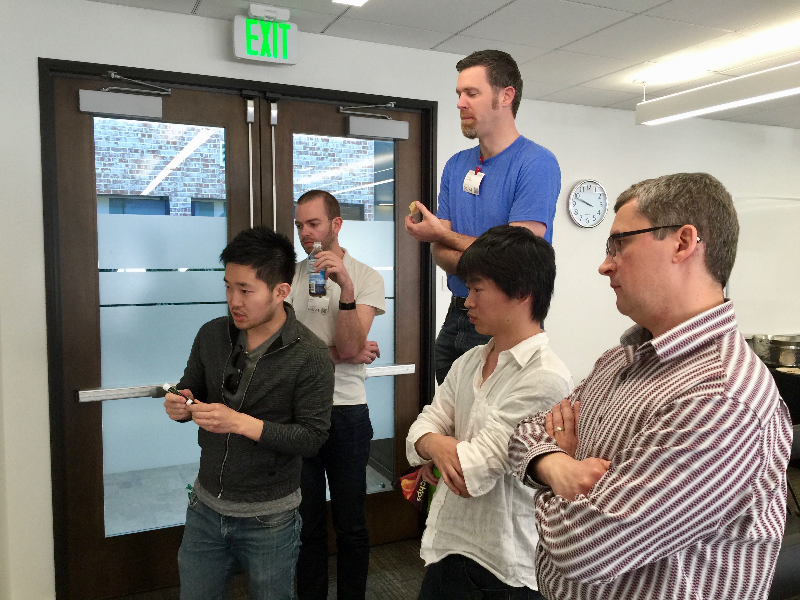
Whiteboard discussion at the April 2015 F2F. From left to right: Ryosuke Niwa (Apple), Anne van Kesteren (Mozilla), Hayato Ito (Google), Travis Leithead (Microsoft), Dimitri Glazkov (Google)
Throughout the day, Ryosuke and Maciej argued Apple’s positions. Although I don’t see it captured in the minutes, I recall Ryosuke making it clear that the alternative to a negotiated agreement was that Apple would not implement Shadow DOM v0.
Google, for its part, was not enthusiastic about redesigning the <content> element. To keep track of the browser vendor positions on the points of contention, during the meeting I put together a spreadsheet tracking a
Summary of positions on contentious bits of Shadow DOM.
At the end of the day, the score for the <slot> proposal looked like:
Slots Proposal
Apple: Proposed it / Mozilla: Like it / Microsoft: Like it / Google: Opposed
Still, substantial progress had been made during the F2F meeting towards addressing Apple’s concerns. From this meeting on, Apple seemed fully committed to resolving its remaining differences. Ryosuke and Dimitri left the meeting with a plan to meet again to discuss some of those. And Dimitri seemed very encouraged by Apple’s renewed level of interest in implementing Shadow DOM.
May 15
A few weeks later, Scott Miles at Google posted a surprising message on the webapps mailing list, with the subject:
How about let’s go with slots?
We think the ‘slot’ proposal can work… We would like for the working group to focus on writing the spec for the declarative ‘slot’ proposal.
Google was indicating their acceptance of Apple’s desire to replace <content> with <slot> in order to secure Apple’s support of the Shadow DOM standard in WebKit.
While I don’t have specific knowledge of Google’s internal deliberations, it seems likely that Dimitri played an important role in shifting Google’s position on this point. He had been apprehensive about the possibility Apple might walk away from the table again. If that happened, the Shadow DOM specification, and web components as an general idea, might founder and never receive significant adoption.
In contrast, yielding on this relatively small point would keep Apple not only involved, but emotionally invested in a successful outcome. Reaching a compromise was worth more in the long run that the specific merits of the competing <content> and <slot> designs.
[Note added on April 22, 2019: Ryosuke commented that, “I don’t think we ever really considered ‘walking away’ from implementing web components per se. We just felt that what was being proposed (v0 APIs) were the wrong primitives… Fundamentally, Apple’s WebKit team always liked the basic idea of web components… I think the large part of contention was really miscommunications.”]
Aftermath
In the months after the April F2F, Apple and Google were reconciled their remaining differences. The Shadow DOM spec was rewritten as v1, which included the <slot> element as the way light DOM nodes would get displayed within a shadow tree. Ryosuke at Apple and Hayato Ito at Google began implementing Shadow DOM v1 support in WebKit and Blink, respectively.
Support from other vendors was slower to come. Mozilla finally
shipped Shadow DOM v1 in Firefox
in October 2018. That same month, Microsoft publicly indicated that they had finally begun implementing Shadow DOM v1 in their EdgeHTML engine, but it’s unclear how much progress they ever made towards that end.
In December 2018, Microsoft announced that they were abandoning EdgeHTML in favor of using the same Chromium engine used by Chrome, so they’ll pick up Shadow DOM v1 by default. When Microsoft releases a Chromium-based version of Edge (presumably later this year), all major browsers will finally support Shadow DOM v1.
Retrospective
Web components are still a fairly new technology, so it’s a little early to assess the strengths and weaknesses of Shadow DOM v1 across a broad range of products. I can at least say that, having now led the open
Elix web component library
for several years, the <slot> design has met the Elix project’s needs to date. The project has yet to encounter the need for the sort of flexibility and complexity entailed by the original <content> element design. So as a technical solution, I think that <slot> has worked out fine so far.
Looking back, I think the <slot> proposal achieved what it meant to. It produced a fairly small shift in the definition of a standard but minor HTML element, and was rather unimportant on its own. But it nevertheless represented a breakthrough in the discussion. It renewed Apple’s interest in implementing Shadow DOM and the related Custom Elements specification, and ultimately ensured Apple’s support for Shadow DOM on the critical Mobile Safari web browser. While <slot> was just a small piece of a complex set of negotiations, I believe that, without agreement on that one point, it’s likely Apple would have not gone forward with Shadow DOM support.
At the same time, the <slot> compromise allowed Google to preserve much of their Shadow DOM investment and deliver Shadow DOM v1 support in a timely manner. In the grander scheme of things, it let Dimitri, Alex, and other farsighted visionaries at Google achieve their goal of finally giving the web a native UI component model. And for that, I think, we can all be grateful.
On a larger scale, it’s remarkable to consider that HTML has something like 100 standard elements, and each of them has a range of features. CSS and JavaScript are similarly complex. When we’re developing for the web, we take these standard elements and features as facts on the ground. For all we know or care, they’ve always been there — but all of them likely hold their own equally complex histories about how they came to be.
Special thanks to Dimitri Glazkov and Ryosuke Niwa for reviewing drafts of this post.