MomBoard: E-ink display for a parent with amnesia

Today marks two years since I first set up an e-ink display in my mom’s apartment to help her live on her own with amnesia. The display has worked extremely well during those two years, so I’m sharing the basic set-up in case others find it useful for similar situations.
Note: unless you have specific experience caring for someone who has amnesia but not dementia, please do not offer care suggestions.
The patient
In June 2022 the side-effects of a long surgery left my mom with permanent anterograde amnesia: she can no longer form new long-term memories. Memory isn’t just one neurological system, so very occasionally she will be able to remember certain types of things. But for the most part, if she hears or sees something, a few minutes later she will no longer remember it.
To medical professionals her condition looks a lot like dementia — amnesia is a common symptom of dementia — but she doesn’t have dementia. One difference is that (as I understand it) dementia is a progressive disease, while this amnesia is stable. There is no cure.
Someday I might post about the experience about caring for her, but for now I’ll just say that this type of amnesia is not something one should wish on one’s worst enemies.
Needs
My mom still lives on her own in an apartment. Because she cannot remember things, she goes through each day in a state of low-grade anxiety about where her grown children are and whether they are all right. She feels she hasn’t heard from any of us in a long time. This anxiety manifests as extremely frequent attempts to call or text us.
Paper notes and other forms of reminders didn’t seem to help, and would become out of date even if they weren’t misplaced. My siblings and I would call to let her know we were okay, but five minutes later she’d be back to being worried. She wasn’t in the habit of scrolling back through text messages, so once she’d read a message, it was immediately forgotten and effectively lost.
I thought some sort of unobtrusive, always-on device installed in her apartment might be able to show her notes written by my siblings and me.
Design goals
My goal was to find a display that:
- Could stay on for months on end
- Would let my siblings and I easily post short messages to it that would remain visible until replaced
- Was large enough and easy enough to read without glasses
- Required no interaction to wake or read and was relatively foolproof (touching it wouldn’t disrupt it)
- Was resilient to network failures
- Didn’t glow at nighttime
- Didn’t require hardware hackery (I’m a software person)
- Would boot directly into displaying messages (no interaction needed to start an app)
- Was not enshittified with a subscription service or proprietary app store
- Was reasonably affordable
- Would not look out of place in a home
Device
Given the above design goals, I searched for a tablet-size electronic ink display with Wi-Fi connectivity and a decent web browser.
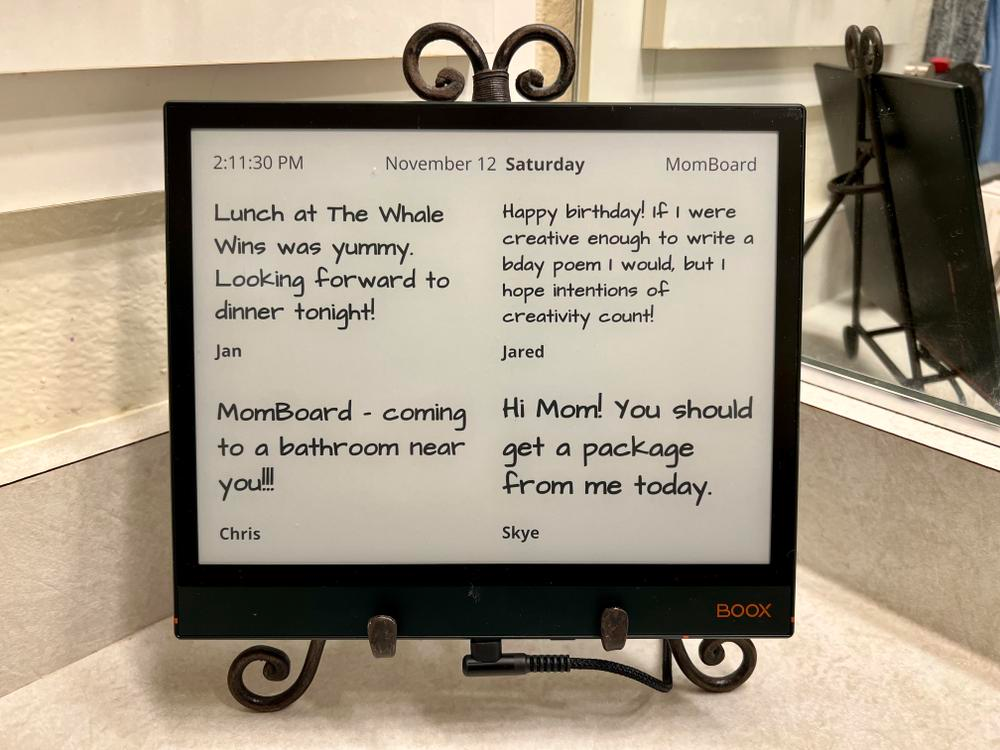
One device that seemed to fit my parameters was the BOOX Note Air2 Series. At the time it cost US$500, which is expensive but is still far cheaper than screens intended for use as commercial retail displays. It’s marketed as a note-taking device and ebook reader, but it also has a capable web browser. It’s big enough to read from a few feet away.
A critical question I couldn’t answer online was whether I’d be able to have the device automatically start its web browser and have that browser display a designated start page. Happily, when the device arrived I was able to confirm it could do both of those things.
The physical case of the Note Air2 looks reasonably nice and not particularly tech-y. The e-ink display is clear and legible; it refreshes quickly enough to not be distracting. By default the device’s backlight was turned on but I could turn it off.
I found a small metal stand to serve an easel for the display so that it felt more like a picture frame.
Web software
Since the physical device was satisfactory, the next step was writing a simple website that could drive the display. The site would have two pages:
- A Board page showing the messages. The e-ink device would boot into showing this page. This is the only page my mom needed to see.
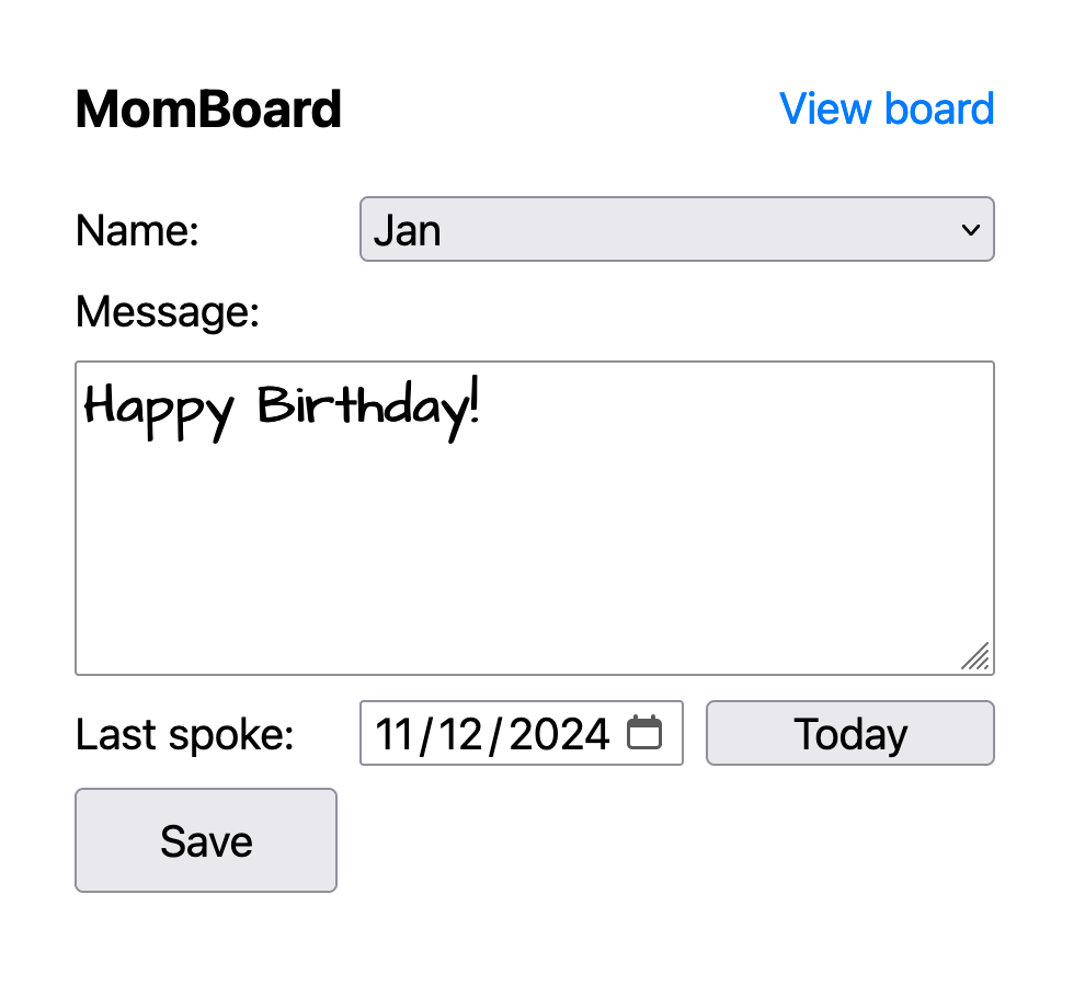
- A Compose page my siblings and I write messages and save them to be displayed.
The device needed to run for months, and needed to be resilient in the case of network and service failures. At the same time, I also needed to be able to remotely update not only the messages being displayed, but the software displaying those messages.
With that in mind, I factored the Board page into an outer frame and an inner page:
- The top-level outer frame acts as a thin shell around the inner page. At top of every hour, the outer frame reloads the inner page to pick up potential software changes. If the network is down and the inner page doesn’t reload, the frame just tries again an hour later. To maximize reliability, the outer frame has very little logic and no external dependencies.
- The inner page actually displays the messages. Every 5 minutes it queries a simple web service for message data and displays the messages. The inner page contains a small amount of logic, but as few dependencies as possible.
Since it’s essentially impossible to debug anything that happens on the device, I made as much use of vanilla HTML and CSS as possible. I used a small amount of JavaScript but no framework or other libraries.

The Compose page presents a simple web form my siblings and I can use to compose and save a message. I designed the form to work well on a phone screen so that we can write messages when we’re out and about. A small web app manifest lets us save the Compose page to a phone’s home screen as an icon for quick access.
The whole site is tiny, entails no build process, and with the exception of the service (below) is just static files.
Visual design
I was concerned about the possibility of e-ink burn-in, so the Board page randomly changes which message appears where. Other visual elements like the date and time alternate from side to side, with the intention that no single pixel is always on.
To style the note text I chose the free Architect’s Daughter font for a handwritten feel. This font works well on the e-ink display. Labels are displayed in Open Sans.
One small challenge was maximizing the size of the message text. Sometimes a message is just a word or two; other times it might be several sentences. A single font size can’t accommodate such a wide range of text content. I couldn’t find a pure CSS way to automatically maximize font size so that a text element with word wrapping would display without clipping.
I ended up writing a small JavaScript function to maximize font size: it makes the text invisible (via CSS visibility: hidden), tries displaying the text at a very large size, and then tries successively smaller font sizes until it finds a size that lets all the text fit. It then makes the text visible again.
Service
Just a tiny amount of text data is necessary to drive the display, so I was happy to find the minimalist JsonStorage service that was perfect for this project. A single JSON object stores the text and metadata for the current set of messages. The Compose page can save to the service with a POST request, and the Board page can retrieve the data with a GET.
The service has a free tier that I started with, but I liked the service so much that I eventually paid for a $1/month basic tier. (It appears that tier is now $5/month.)
Trial and installation
I spent a couple of weeks working on the software and letting it run for long periods of time. I was pleasantly surprised that the Boox display worked as well as it did and seemed to stay up indefinitely.
I brought the display over to my mom’s apartment on November 12, 2022, turned it on, joined it to her Wi-Fi, and rebooted it to confirm everything worked in the new environment.
I thought the bathroom counter might be a good place for it, but my mom thought she’d rather have it in her bedroom, so we found a home for it on a windowsill.
My mom was happy with the display right away.
Retrospective
Despite her amnesia, my mom came to remember that this display exists and what it’s for. She looks forward to seeing updates from her children on it.
If we tell her about something that’s coming up, she often asks whether we’ve already put that event on the MomBoard. On the flip side, we have to be careful to keep it up to date; if we fail to take down a message that no longer applies, it confuses her.
Looking back, the display is essentially the only intervention of any kind we’ve tried that’s actually been successful at improving her quality of life (and ours). One reason it’s worked so well is that it didn’t require her to learn anything new. Without the ability to remember new things, it’s virtually impossible for her to learn a new skill or to form new habits.
The device’s reliability has surpassed my expectations. There was one period where the device seemed to stop working, but I traced the problem to a faulty Wi-Fi hub; after that was replaced, it’s worked flawlessly since. For my part, keeping the software as simple as possible and sticking to vanilla web technologies surely helped avoid bugs.
The display still looks great, and it still displays messages day in and day out.
If you want to try to set up something similar to what I describe here, I’m happy to answer technical questions or share advice.
Update: I’ve published the MomBoard source code on GitHub.