It’s easier to imagine hiding an ad than completely redesigning a UI
August 9, 2010
Over the past week, I’ve seen an uptick in feedback from Cozi’s users, some of it responding to a recent change we made in Cozi’s standard page template. It seems some users have perceived a significant loss of vertical screen real estate on the main family calendar page. The odd thing is that the new layout has roughly the same vertical amount of calendar data as the old design:
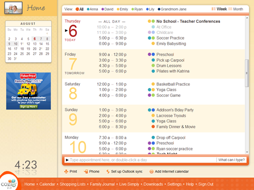
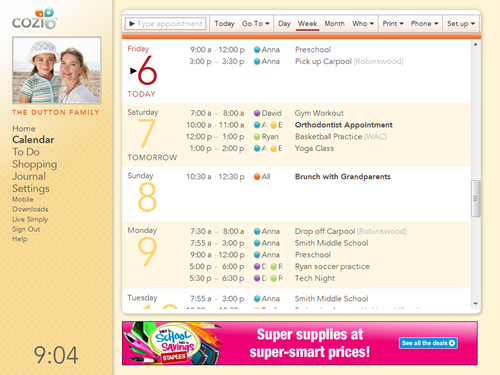
Old Cozi design
New Cozi design
Two main changes are at work here:
- We simplified the layout of our calendar UI controls so that they take up less room. The new design consolidates three rows of calendar controls (one from the top, two from the bottom) into a single row at the top.
- We redesigned our standard page template. Among other things, we moved the navigation controls from a footer at the bottom to the left side. At the same time, we moved our standard display advertising unit from the left side to the bottom. Specifically, we upgraded the unit from an IAB 180x150 Rectangle to a IAB 728x90 Leaderboard. The latter is worth more to advertisers, and hence commands higher revenue for Cozi.
The new design should address some long-standing usability issues, while simultaneously increasing revenue — a win/win. So I was surprised when users contacted Cozi to complain that the new design showed significantly less vertical room for calendar data than the old one. There is a loss, it’s true: at 1024x768, the old design allows for 560px of vertical height for calendar data, whereas the new design only allows 553px. This is a loss of seven vertical pixels of data. (As it turns out, the new design could easily gain that space back if we get rid of the rounded corners in the visual design. We’re working on that.)
I don’t think users begrudge the loss of seven pixels. I think the main issue is that the new design makes it really apparent that Cozi has to make a trade-off between the needs of its users and its advertisers. That trade-off is just a fact of life for an ad-driven business, and most people would prefer that Cozi to keep its product free for users. Virtually every user I’ve interviewed on this specific point has indicated that, in the abstract, they’re comfortable with this trade-off.
Here, though, the user can readily see what the ad is costing them. It’s very easy for them to imagine that, if only that Leaderboard at the bottom were hidden, they’d be able to see more data. Compare this with the old design: it’s hard for someone to imagine what they would gain if the small Rectangle ad on the left were hidden. It’s harder still for a user to imagine what would need to happen at the bottom of the old design, with its multiple stacked toolbars, to allow them to see more data. The lesson here is that it’s easier to imagine turning off an ad than to envision a complete redesign of the user interface. (That’s, um, actually a good thing for me, or else I wouldn’t have a job designing user interfaces.)
We’re in the midst of making further page layout and calendar UI improvements, so I’m looking forward to being able to gives users a design that they can see is unequivocally better than the old one. In the meantime, we’ve learned a valuable lesson in the user perception of advertisements in screen layouts.