UI Control of the Week: Straight-up DateComboBox (and why your browser won't solve your date picker needs)
November 7, 2011
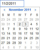
Once again, it’s amazing how hard it is to get the small stuff right. Building on both last week’s CalendarMonthNavigator post and the earlier ComboBox post, this week’s control is the standard date picker found in countless web sites and applications. Date pickers are generally optimized to pick a date in the near future, such as a date of travel or a date for an upcoming appointment. Here’s a typical example from Google Calendar:
Key attributes
- The control always includes a text box. In the control's normal state, this may be all that is visible. Generally speaking, clicking in the text box or moving focus to it opens the dropdown calendar.
- The control may include an icon, often a downward-pointing arrow, to the right side of the text box to indicate that the user can interact with the control to make a selection from a set of choices (i.e., the popup calendar). Some controls that offer an icon will require the user to click there to open the calendar, and will not dropdown the calendar when the user clicks in the text box.
- The input portion of the combo box and the dropdown portion are generally kept in sync. As the user types, the calendar reflects the new date. As the user navigates the calendar, the text box shows the new date.
- The user is generally expected to enter dates in short date format. In the U.S., this is month/day/year.
- The control validates the user’s typed text to verify it represents a date. This validation may occur as the user types, after they move the focus away, or when they try to save the form.
- Some variants of this control (e.g., Expedia’s) show two calendar months at a time. This makes it easier to select a date in the next few weeks when the current month is almost over.
- Ideally, the dropdown should implicitly close if the user tabs away from the field or switches to a different window.
- The dropdown calendar may offer a “Today” button that lets the user quickly select, or jump back to, the current date.
Given the wide variety of implementations, and the complexity of this control, it’s not surprising to see wide variation of the quality of implementations. Some do a terrible job dealing with loss of keyboard focus, some don’t parse dates very well, some can’t keep the text and calendar in sync, and so on.
Commentary
Date pickers seem boring, but I think there’s something quite fascinating about them: they may represent a theoretical maximum of complexity possible in a monolithic approach to creating user interface elements. Nearly every user interface framework will offer a date picker — but they will rarely offer something more complex. Why is this?
- Apps need to let people enter valid dates that a program can understand. This means constraining input and/or parsing dates, and usually rendering a month calendar — and all these tasks turn out to be pretty hard. The problem gets even harder when one wants to handle multiple cultures.
- The standard combo box solution for a date picker means that, in its normal state, the control to look very boring. It’s just a text box. This lets it fit in with pretty much any application’s visual style.
- The popup calendar month navigator may not always look elegant, or fit in with the app’s visual style, but since it’s only a transient part of the user experience, design teams decide they can live with it — especially when confronted with a realistic development cost for something better.
- The variety of situations that come up when picking a single date in the near future is small enough that a monolithic control can handle most of the common situations. Suppose you want to constrain the selected date to a weekday. You can probably find a date picker that lets you handle that specific constraint.
The problem is that, once you get outside the narrow set of common scenarios, you’re out of luck. Suppose you want to let the user pick two dates that are usually close together. In the example above, they want to let the user pick the departure and return dates for a trip. But picking a date range is beyond the complexity of most date pickers. Even if they wanted to support that scenario, the variety of needs would quickly multiple out of control. Some apps would want to force the two dates to be within a certain number of days of each other, others would want to force the two dates to be a minimum number of days apart, and so on. There’s just no way to build a monolithic date picker than can handle all the common cases with a big pile of properties governing control behavior. So user interface frameworks give up on this problem, offer the single-date date picker, and let everyone cobble together multiple date pickers to get the desired result.
In an extensible user interface framework, you could simply provide all the building blocks required to construct a date picker, then let app designers snap those together to get the control they want. So if they want a stock single-date picker, fine, that’s provided, but the same parts can also be snapped together to produce a two-date date picker, or whatever else is needed. Those in turn can be offered as reusable user interface controls.
HTML 5 is not going to solve your problem
The HTML 5 spec defines a new “date” input type, allowing the browser to provide a standard date picker UI. That effort is laudable, but so far inadequate for all but the most basic needs.
The stock date picker controls in the mainstream browsers are god-awful. (Try your own browser’s date control.) Here’s a screen shot of Chrome’s date control:

This is an unadulterated user interface disaster. The format Chrome’s
decided to support (YYYY-MM-DD) is one that might be helpful to programmers,
but I expect essentially zero consumers actually use it in their personal
lives. I can’t think of a single situation in normal life where that format is
even seen. In the U.S., at least, people expect to enter a short date like
“11/7/2011”, but this format is rejected by Chrome’s control. So this
browser’s standard date picker fails to support its home country’s single most common input format. And the little up/down spinner arrows are completely out of place here.
They only advance the day portion of the date, they’re tiny hit targets, they
don’t let people think in calendar terms, etc., etc. And let’s not overlook
the fact that so little attention has been paid to this control that the “up”
spinner button is missing its top border.
If you take a look at Opera’s date picker, it’s more functional (it adds a dropdown arrow, a real calendar navigator, etc.) but, visually speaking, it still looks terrible. It’s hard to imagine a design team happy including this bit of UI in a consumer-facing application.
If these controls represent the sorts of designs which browser creators are capable of creating, that doesn’t bode well for the notion that adding more semantics to HTML is going to solve any meaningful user interface problems. Either the browser designers don’t care about those controls, or they don’t have the expertise to design them well, or they don’t see a payoff in doing so. It’s worth noting that having the browser try to solve everyone’s date picker needs is an even more implausible answer than having a monolithic date picker control solve everyone’s date picker needs. Browser controls are less flexible than nearly every date picker control out there.
Whatever the case, in their current state, I wouldn’t advise anyone to use these controls on a web site where even modest usability or aesthetics are a requirement. For reference: Even Google Calendar doesn’t even use Google Chrome’s own date picker.
The situation is different on mobile platforms, where the browser can fall back to the OS’ native date picker UI. They are generally well-designed, or at least have received a considerable amount of design attention (those are different statements).
On all platforms, it should be observed that there’s nothing that says a dropdown combo box is the ultimate UI for picking a date. In fact, in many applications, an inline calendar might actually be preferable. If you have a page that’s all about getting the user to pick a date in the near future, why force them to have to dropdown the calendar first? This is just to say that the right control for the job really depends on context. If anyone tells you that you must use the stock HTML 5 elements to let users enter data, I’d think very hard about whether that person actually has the interests of your users (and your business) in mind, or are simply touting a standard because it’s a standard.
The DateComboBox control
I’ve posted a DateComboBox control to the QuickUI Catalog. (Taxonomy note: this control is called DateComboBox instead of DatePicker to reflect the fact that it’s a combo box, and the fact that there are many other UIs possible for picking a date.)
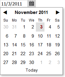
As noted last week, the generic appearance of these controls is minimalist by design; they’re meant to be useful and unobtrusive as is, but can also receive further styling, subclassing, etc.
Usage
Use DateComboBox in situations where you want to let the user type or choose a single date (especially one in the near future) and space is a concern or you don’t want to focus too much attention on the date. If picking a date is, in fact, the focus of a UI, then it may be more appropriate to use an inline calendar, such as a CalendarMonthNavigator.
Note that, if the user omits a year, the current year will be assumed. In applications I’ve worked on that let users enter dates (Microsoft Money, Cozi), we always found that users generally expect dates without a year to reflect the future. E.g., if it’s November 2011, and a calendar user in the U.S. creates an appointment with a date of “2/15”, they expect the appointment to end up on February 15, 2012 (in the future) and not February 15, 2011 (the current year, but in the past). At some point, this might be worth fixing in DateComboBox, but for now the control makes the more simplistic assumption about current year.
DateComboBox uses asymmetric validation, which is to say that it will be slow to complain and quick to forgive. By default, if the user types an invalid date, this fact is not reflected visually by an error state until the user leaves the field (or, depending on the UI, saves the form). However, any error state is removed immediately upon the keypress that fixes the error; the user doesn’t have to leave the field to see whether their date entry is now acceptable to the app.
Because the content of the days in the dropdown calendar can be customized, you’re not limited to just showing dates in the calendar. You could show a small amount of date-specific information (e.g., room availability) in the calendar itself, helping the user make a more informed initial date choice.
Implementation notes
To me, the most interesting aspect of the implementation here is that the DateComboBox is assembled by snapping together three main controls, are three of which are interesting in their own right:
- The dropdown portion of the combo box is a CalendarMonthNavigator, the exact same control used to create the FlickrInterestingnessNavigator last week.
- The input portion of the combo box is a DateTextBox. This is a subclass of ValidatingTextBox, and is responsible for parsing typed dates.
- The above elements are joined in a ComboBox. This is the same parent class which was used to create the ListComboBox and ColorSwatchComboBox discussed earlier.
Since I already had the first and third controls in the catalog, the bulk of the work this week was building a reasonable solid date-parsing text box. The hardest part of that work was handling tricky event interactions to ensure, among other things, that the user could navigate within a dropped-down calendar; that behavior to some extent conflicts with the desire to have the dropdown automatically close whenever the user moves the focus away from the text box.
I was happy I could delegate much of the date parsing responsibility to the fantastic jQuery Globalize library mentioned last time, which covers a huge range of culture-specific date formats. In addition to supporting a standard short date format, Globalize also parses a number of other date formats, which is nice even if most users won’t ever use them. (If the culture is set to English, for example, you can type “January 2012”, and that will get parsed and shown as 1/1/2012.) If Globalize is not present, then the control falls back to a simpler parser that supports U.S.-style short dates (e.g., 12/31/2011).
I extended the supported abbreviated formats to handle short years (e.g., 12/31/11) and missing year (12/31). Those formats come up daily in people’s normal lives, so I thought it was important that a date control handle them. (It drives users absolutely nuts that, when scheduling a flight or booking a hotel, they have to enter a full four digit year. Is there some other century they’re going to be traveling in?) The supported abbreviated formats are sensitive to the local culture, so in France those examples would look like 31/12/11 and 31/12, respectively.
This control is designed for full web browsers only. At noted above, mobile browsers already provide fairly good date pickers. It should be straightforward to create a control that uses the HTML 5 date field on a mobile browser and a DateComboBox otherwise.